Customizable UI Components on iOS Using UIKit
As a framework vendor, we at PSPDFKit always have to keep in mind that we don’t have full control over the context of where the user interface (UI) of our SDK is used. We aren’t the ones making the decision on how an app should look — our customers are. Additionally, customers need to adapt the UI to the needs of their own apps to make them fit in.
In this post, we’ll go into details of how we make sure UI components are styled to have sensible defaults right out of the box, while also providing customization and styling options so that app developers can make the UI components we offer seamlessly blend into their apps’ styling. We’ll demonstrate this with our PSPDFKit for iOS framework, using an example of a UI component that we recently redesigned with UIKit.
Choosing Sensible Default Styling
A UI component can be any self-contained part of an interface that’s displayed onscreen — ranging from a simple button, to more complex parts like a toolbar or a list view. Usually on iOS, when using UIKit, such elements are descendants of UIView.
It’s often preferable for a framework to, for the most part, not make brave choices, and to stick to the behavior and design expected from the system. It’s also ideal to leverage as many of the system’s integrated options as possible — for example, Dynamic Type, Night mode, and the various accessibility options on iOS — to keep the UI adaptive to a user’s setting.
We try to find a good balance between keeping styling across our product palette on multiple platforms similar while still adopting platform features and aligning on the UI guidelines for any given platform as much as possible.
Making UI Components Customizable
Alongside making sure a UI component has a good default appearance, it might also be useful to add APIs that allow customizing the style of those components.
When using UIView subclasses for your customizable component, there are some built-in properties, like the tintColor or the backgroundColor. If you make use of those properties in your UI component, some parts of it might already be customizable out of the box, without the need to provide any additional APIs. PSPDFKit makes use of this approach in many UI components, including TextSelectionView and ToolbarButton. However in most cases, these customization options aren’t sufficient enough or might not be appropriate for the view you’re creating.
Using UIAppearance is another great approach for customization. For more information on this, refer to our Adopting UIAppearance in Custom Views post.
Usually, providing APIs to specify the style or the color directly on your UI component is the way to go. In cases where you want to offer deep customization, it’s also a good approach to directly expose a view property that customers can swap out — like a background view that, by default, has a certain styling — while also allowing customers to set their own background view for a component to handle all the styling themselves. There are also a quite a few UI components with these customization options in PSPDFKit, including Toolbar and NoteAnnotationViewController.
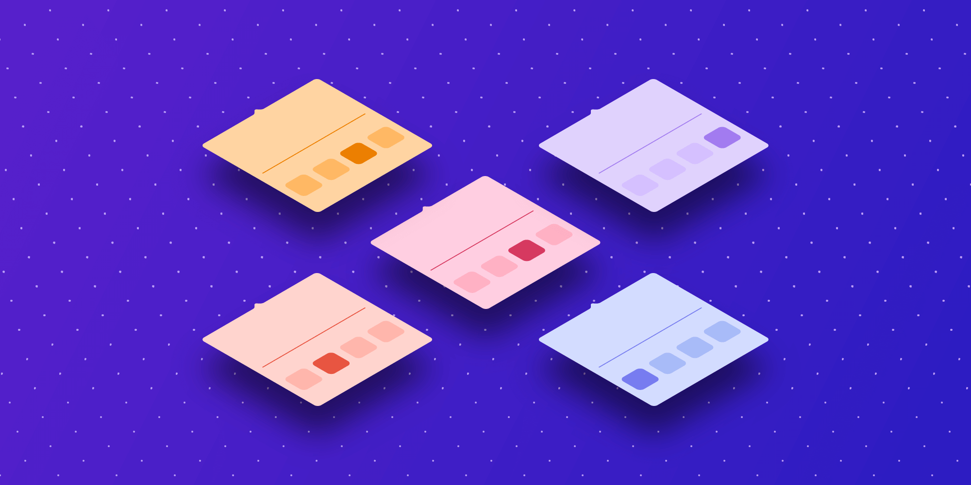
Redesigning the Tabbed Bar to Resemble the Navigation Bar
Recently, we redesigned the tabbed bar used to show multiple tabs of simultaneously open documents next to each other, along with the annotation toolbar, which shows tools available for annotating a document. When weighing how we could proceed, we decided to go in a direction that’s less opinionated on design language and that chooses a sensible default that blends in to the surrounding elements when integrated.
Providing a default option out of the box that fits within customers’ view hierarchies without explicit customization was an important goal. At the same time, we still wanted to allow certain customizations, so as to make the UI feel right at home on an app that uses a custom style.
| After the Redesign | Before the Redesign |
|---|---|
 |
 |
In this particular case, we wanted to match the look of the tabbed bar to the UINavigationBar it’s attached to as closely as possible. To do this, we relied on UIToolbar and setting its appearance to the same values as the navigation bars. This included the UIBarAppearance properties on the navigation bar and adapting them so they work for the toolbar. Luckily, there’s a quick way to translate between them by using the init(barAppearance:) initializer:
func matchAppearance(from navigationBar: UINavigationBar) {
    self.backgroundToolbar.standardAppearance = UIToolbarAppearance(barAppearance: navigationBar.standardAppearance)
    if let compactAppearance = navigationBar.compactAppearance {
        self.backgroundToolbar.compactAppearance = UIToolbarAppearance(barAppearance: compactAppearance)
    }
}
This results in the tabbed bar background using the same styling as the navigation bar. So no matter what styling a customer’s app uses for the navigation bar — like being opaque, having a background color, etc. — it’ll all be matched in the toolbar we use for the tabbed bar.
Since we wanted to have different colors on tabs that are selected compared to tabs that aren’t, we needed to find a way that looks good no matter what the navigation bar styling looks like. Using a hardcoded color wasn’t an option, since that wouldn’t look great in conjunction with different styles of the navigation bar.
We worked closely with our Design team to come up with a solution that works for all common use cases. We use an overlaid visual effect view on the tabs that should look like they aren’t highlighted, which takes care of adapting to various navigation bar appearance configurations automatically without us needing to specify an actual color. Since we apply the navigation bar appearance to the tabbed bar, it automatically adjusts to the set background color, blur effect, and other styling-related properties.
Let’s consider an app that has the following navigation bar appearance configuration:
let appearance = UINavigationBarAppearance()
appearance.configureWithDefaultBackground()
appearance.backgroundColor = .systemGray2.withAlphaComponent(0.2)
navigationController.navigationBar.standardAppearance = appearance
The resulting UI would look like the following. Notice how the selected tab has the same background effect as the navigation bar.
| Light Mode | Dark Mode |
|---|---|
 |
 |
Conclusion
In this post, we went over the importance of providing UI elements that fit in on iOS. We also discussed approaches on how to make these components customizable on iOS using UIKit, how to choose proper out-of-the-box styling defaults, and how to let customers of your SDK provide custom styling options for those components as well. Furthermore, we took a look at how we approached the redesign of a specific view in our SDK while keeping all of this in mind. We at PSPDFKit take this approach seriously, and we offer a wide range of customizable components. To learn more about customizing the UI in PSPDFKit for iOS, take a look at our UI customization guide.

Stefan began his journey into iOS development in 2013 and has been passionate about it ever since. In his free time, he enjoys playing board and video games, spending time with his cats, and gardening on his balcony.