Presenting Popovers on iPhone with SwiftUI

In our SwiftUI In Production blog post, we wrote about our learnings from first using SwiftUI in a product we shipped. This included some workarounds, explanations, and issues we faced.
In this blog post, we’ll dig deeper into one of those issues and provide a more sophisticated approach to solving it: presenting popovers on iPhone using SwiftUI.
To summarize the problem: By default, it’s currently not possible to present a standard popover on an iPhone — or rather on any environment that uses a compact width size class, including some Split View configurations on iPad — when using pure SwiftUI.
In some cases, presenting a popover on iPhone could still be useful, and it could be a better option in your app’s UI than showing a modal screen. That was also the case for our product, as we wanted to have a coherent design across all devices. As such, we did some digging into how to solve presenting popovers in all scenarios while still using SwiftUI.
Out-of-the-Box Behavior
Consider using the following code to present a popover with SwiftUI’s popover(isPresented:content:) view modifier:
struct ContentView: View {
    @State var showsPopover = false

    var body: some View {
        Button("Standard Popover") {
            showsPopover = true
        }
        .popover(isPresented: $showsPopover) {
            Text("This should be a popover")
                .font(.subheadline)
                .padding()
        }
    }
}
This would result in the content shown in a sheet presentation in compact-width environments, which might be confusing, and which would definitely not be the expected behavior in some cases.

On iPad — and in all regular-width environments — this correctly yields a popover.

Considering this behavior, our goal in this post is to create an API that works the same as the standard SwiftUI popover modifier, but always shows the content in a popover, even on iPhone.
Using UIKit
While it’s possible to reimplement popovers completely in SwiftUI, getting all of the details and behavior right isn’t trivial. Also, it’s more work than using an existing approach to force popovers on iOS.
Popover Presentation Delegate
To always use popovers, we’re using UIPopoverPresentationControllerDelegate to prevent the presentation from being adaptive, by implementing the following delegate method:
func adaptivePresentationStyle(for controller: UIPresentationController, traitCollection: UITraitCollection) -> UIModalPresentationStyle {
    return .none
}
When a popover presentation controller with a delegate using this implementation is used, view controllers are always shown as popovers — even on iPhone and in compact-width size class environments.
Custom View Controller
To use the popover presentation delegate, we created a custom subclass of UIHostingController. This subclass implements the delegate and sizes the popover to the correct size.
Using UIHostingController as the superclass instead of a standard UIViewController allows us to show the SwiftUI view we want to present directly in the popover, without doing any child view controller containment:
class ContentViewController<V>: UIHostingController<V>, UIPopoverPresentationControllerDelegate where V:View {
    override func viewDidLoad() {
        super.viewDidLoad()

        let size = sizeThatFits(in: UIView.layoutFittingExpandedSize)
        preferredContentSize = size
    }
}
Since we want to mimic the default behavior of the SwiftUI popover modifier as closely as possible, we also need a way to keep track if the popover is dismissed. To also track the state of the presentation, we added this to the subclass:
var isPresented: Binding<Bool>

init(rootView: V, isPresented: Binding<Bool>) {
    self.isPresented = isPresented
    super.init(rootView: rootView)
}

func presentationControllerDidDismiss(_ presentationController: UIPresentationController) {
    self.isPresented.wrappedValue = false
}
Creating the View Modifier
Our goal is to create a feature that can be used similarly to the existing popover(isPresented:content:) SwiftUI ships with. Therefore, we create a custom view modifier that — depending on the value of the isPresented binding — will show a popover with the content provided via a closure:
struct AlwaysPopoverModifier<PopoverContent>: ViewModifier where PopoverContent: View {

    let isPresented: Binding<Bool>
    let contentBlock: () -> PopoverContent

    private func presentPopover() {
        let contentController = ContentViewController(rootView: contentBlock(), isPresented: isPresented)
        contentController.modalPresentationStyle = .popover

        let view = store.anchorView
        guard let popover = contentController.popoverPresentationController else { return }
        popover.sourceView = view
        popover.sourceRect = view.bounds
        popover.delegate = contentController

        guard let sourceVC = view.closestVC() else { return }
        if let presentedVC = sourceVC.presentedViewController {
            presentedVC.dismiss(animated: true) {
                sourceVC.present(contentController, animated: true)
            }
        } else {
            sourceVC.present(contentController, animated: true)
        }
    }
}
You can see that we use the ContentViewController from before to show the popover, and we configure the presentation controller. We also use a helper called closestVC() to traverse the responder chain. It looks for the closest view controller, which in turn presents the popover.
However, since we need to have a UIView we can use as an anchor for the popover, we have to insert a view via UIViewRepresentable inside the SwiftUI hierarchy. In that case, we use a plain UIView that can be wrapped like this:
private struct InternalAnchorView: UIViewRepresentable {
    typealias UIViewType = UIView
    let uiView: UIView

    func makeUIView(context: Self.Context) -> Self.UIViewType {
        uiView
    }

    func updateUIView(_ uiView: Self.UIViewType, context: Self.Context) { }
}
This leaves us with configuring the view modifier using the anchor view. Then, we add it to the content as a background so that it’s sized the same as the SwiftUI view that uses the view modifier:
// Workaround for the missing `@StateObject` in iOS 13.
private struct Store {
    var anchorView = UIView()
}
@State private var store = Store()

func body(content: Content) -> some View {
    if isPresented.wrappedValue {
        presentPopover()
    }

    return content
        .background(InternalAnchorView(uiView: store.anchorView))
}
For some syntactic sugar on the call site, we create a simpler view modifier as an extension on the SwiftUI View like this:
extension View {
    public func alwaysPopover<Content>(isPresented: Binding<Bool>, @ViewBuilder content: @escaping () -> Content) -> some View where Content : View {
        self.modifier(AlwaysPopoverModifier(isPresented: isPresented, contentBlock: content))
    }
}
Use
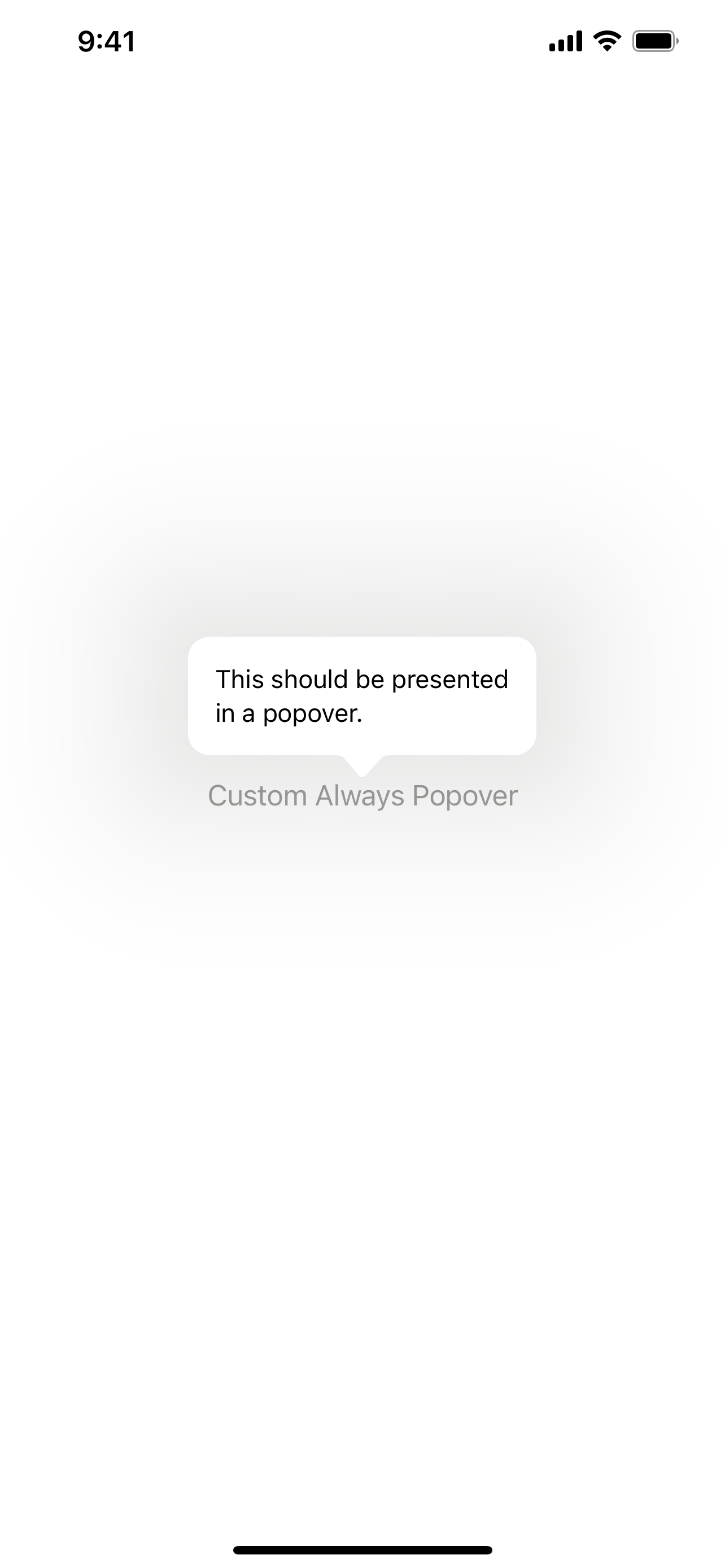
All of the implementation has been done for a view modifier that always uses a popover. We can now use it on the call site via the added alwaysPopover(isPresented:content:) API, which is similar to the existing popover modifier, like this:
struct ContentView: View {
    @State var showsAlwaysPopover = false

    var body: some View {
        Button("Custom Always Popover") {
            showsAlwaysPopover = true
        }
        .alwaysPopover(isPresented: $showsAlwaysPopover) {
            Text("This should be a popover")
                .font(.subheadline)
                .padding()
        }
    }
}
This results in a button that shows a popover when tapped on all devices, even on iPhone.
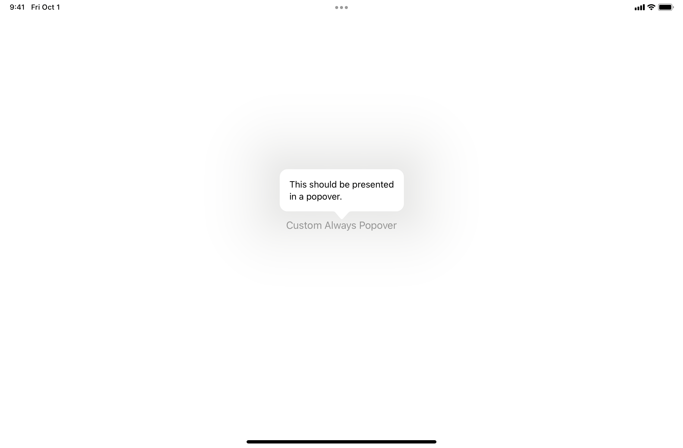
On iPad, the behavior is exactly the same as that of the default popover.
Conclusion
In this post, we went over an approach of how presentations can be customized in SwiftUI by always showing a view in a popover. For a complete sample Xcode project showing the implementation and use, you can download this ZIP file.

Stefan began his journey into iOS development in 2013 and has been passionate about it ever since. In his free time, he enjoys playing board and video games, spending time with his cats, and gardening on his balcony.