Adding Custom Fonts to HTML Documents

This article was first published in April 2022 and was updated in June 2024.
This post will look at a cool feature of our PDF Generation component: adding custom fonts in HTML to your generated documents as a way to express your brand identity.
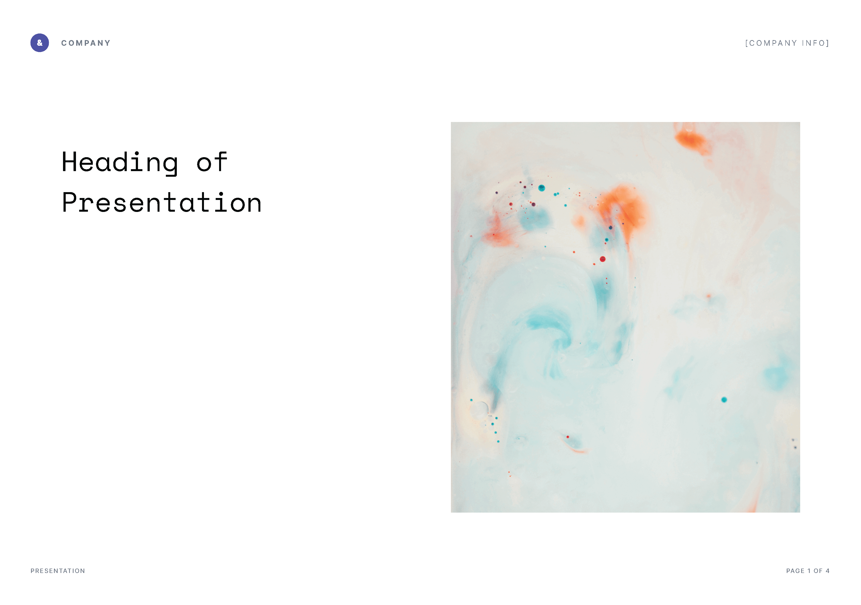
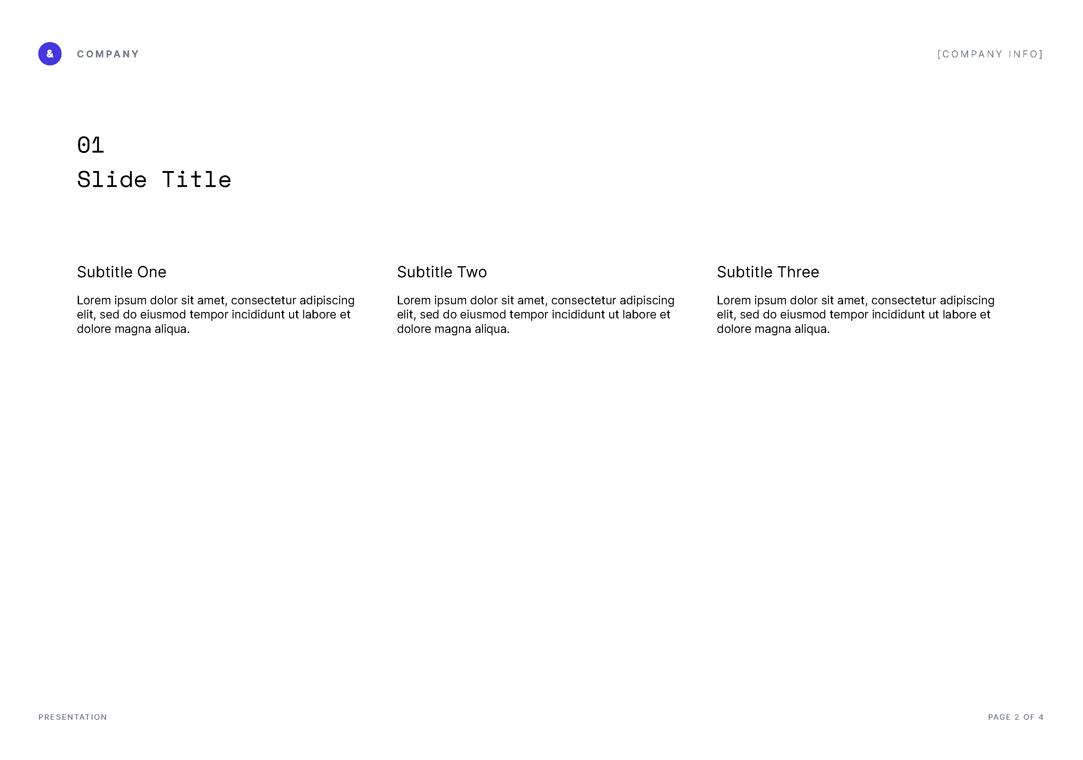
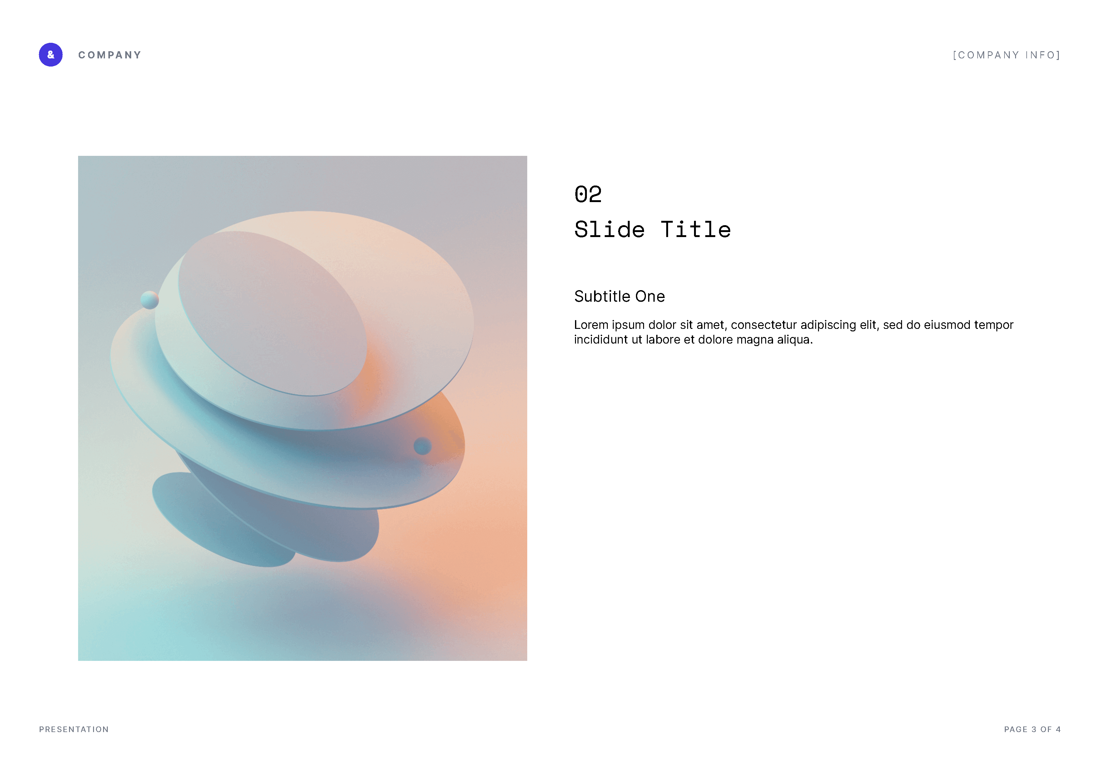
To help you get started with our PDF Generation component, we created a series of sample HTML documents you can use as templates. We’ll be taking a closer look at the Presentation template, and we’ll see how you can add your custom fonts to it.
First, download the template. Your downloaded folder should contain the following files:
-
index.html -
Inter-Bold.ttf -
Inter-Medium.ttf -
Inter-Regular.ttf -
logo.svg -
OFL.txt -
README.md -
slide-1.png -
slide-3.png -
SpaceMono-Regular.ttf
Now, before we get started, let’s discuss what a font is and why you’d want or need to add a custom font to your document.
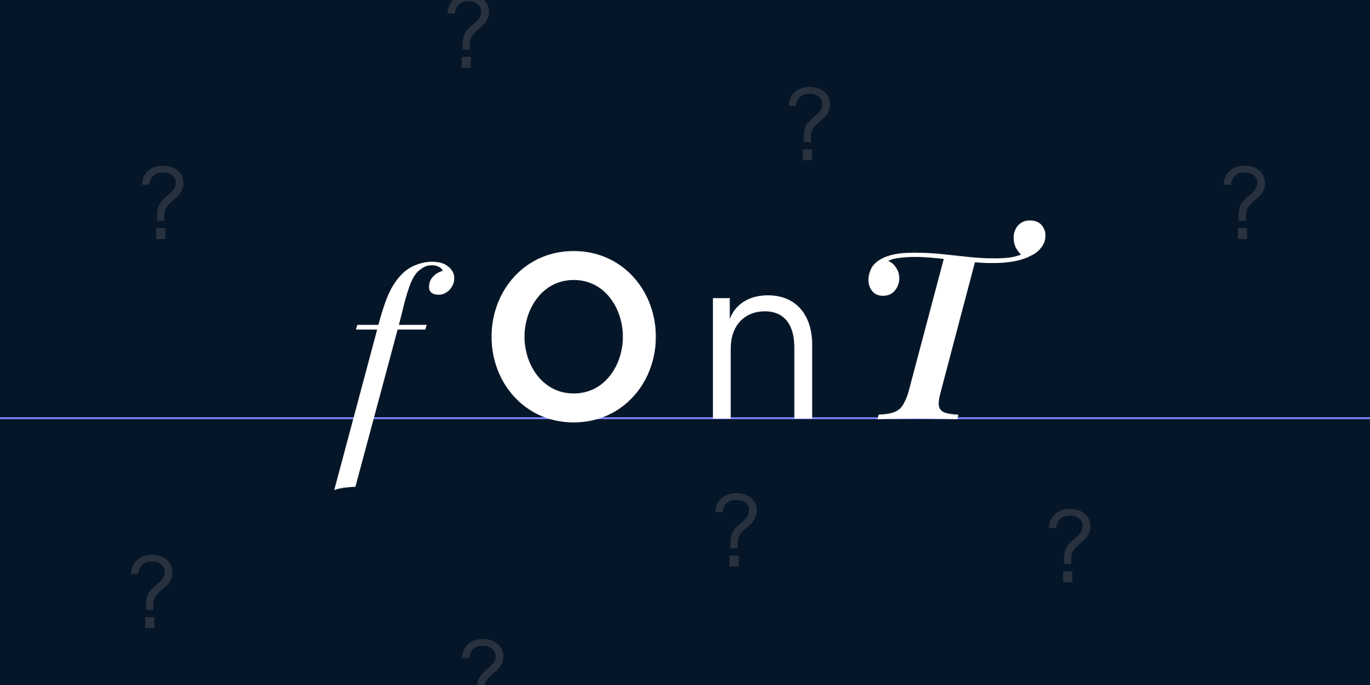
What’s a Font?
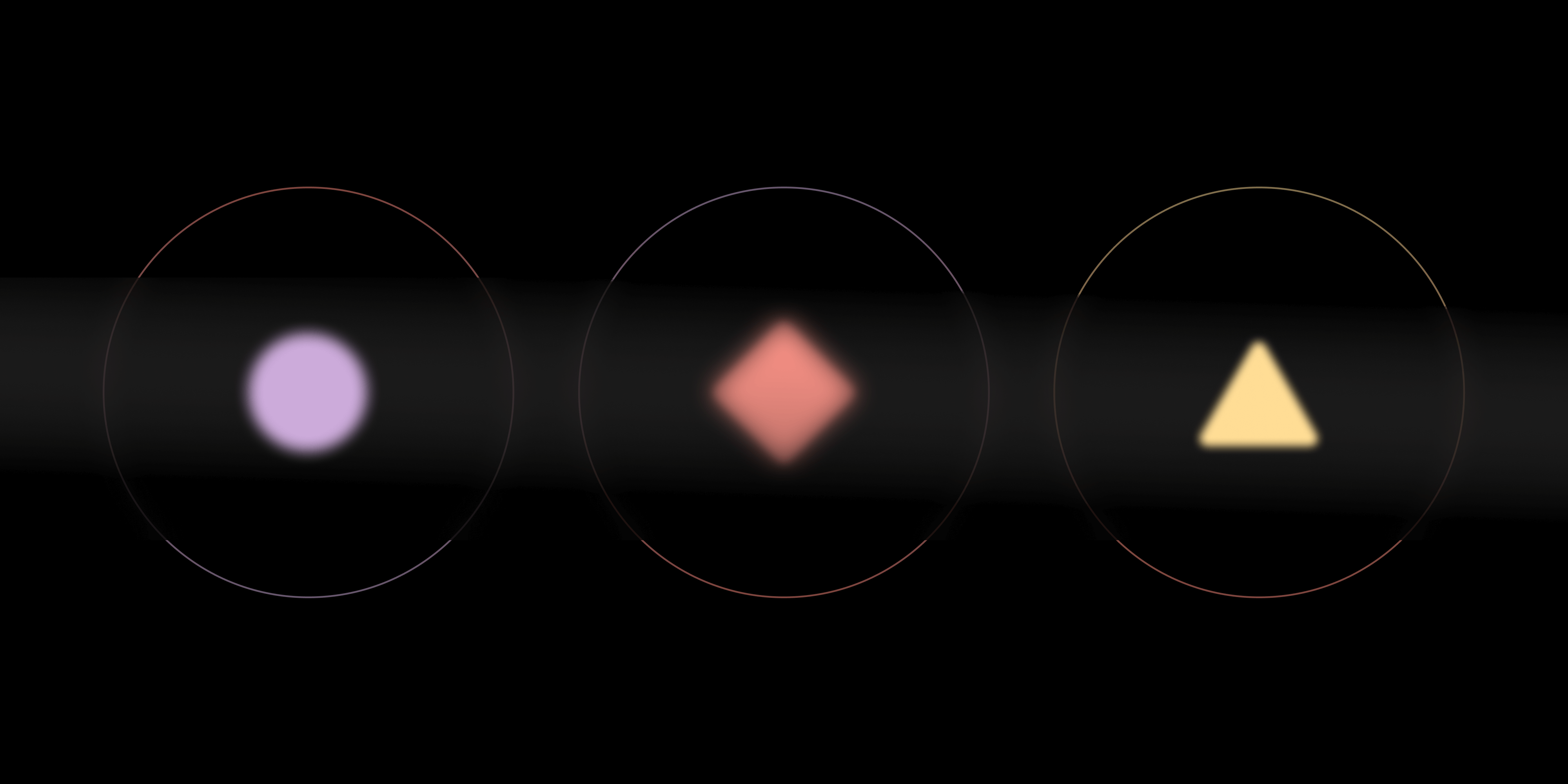
A font is a particular style of a typeface consisting of glyphs. Fonts that follow the same visual characteristics, but that are distinguished by their weight and/or stylized form (italic), form a font family.
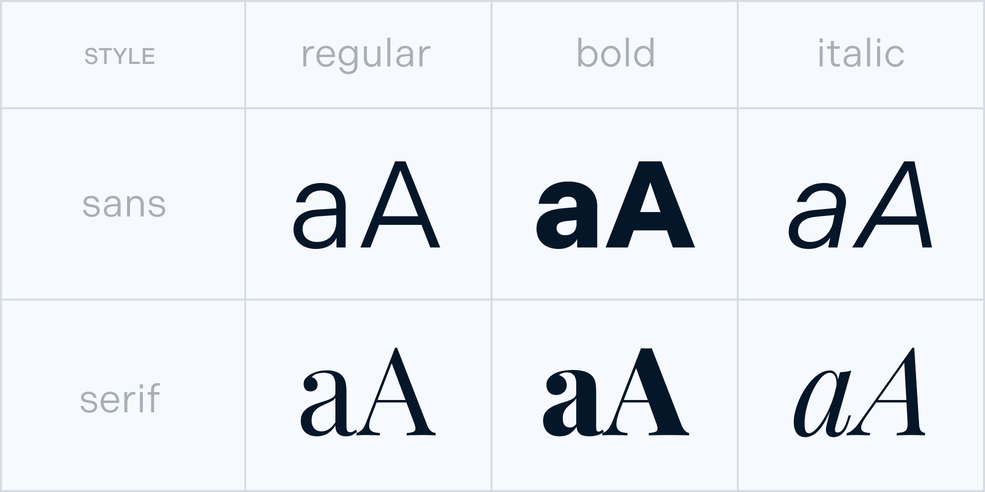
But a font is so much more than that. Using the correct font will allow you to express your brand and strengthen your brand identity. Designers usually select fonts to cater to the right audience and to express what a company is trying to convey with its vision and values. If you have a defined brand identity, your brand fonts are most likely defined in a brand book. To create a consistent brand experience, it’s important to use those fonts whenever possible.
In addition to being a carrier of brand, the main objective of text is to be legible and readable. Using the appropriate font, weight, size, and color will help users understand information.
Now that we’ve covered the basics, we can look into our example that uses custom fonts.
Adding Fonts to the Example
Open the index.html file in your preferred code editor to follow along. If you have them defined, you can of course replace the fonts we picked out with your brand’s fonts. Or, browse extensive libraries like Google Fonts or numerous other type foundries to find a font that suits you.
Here are some tips for choosing the right font:
-
Check if the font has all the glyphs you need — some fonts only support capital letters, while other fonts might not include numbers.
-
Make sure to select the fonts that support the languages you intend to use.
-
Check if the font has a substantial family that will cover all your future needs, and not just the current project.
-
Make sure the fonts are available for use on desktop, web, and/or mobile apps if you need them.
-
Last but not least — check that you have the permission to use the font, or make sure to purchase a license.
For our Presentation template, we decided to go with two different Google fonts which are licensed under an Open Font License: Inter and Space Mono.
You can add a custom font to your HTML document using the @font-face rule:
@font-face {
font-family: "Inter";
src: url("Inter-Regular.ttf") format("truetype");
}

h1 {
font-size: xx-large;
font-family: "Inter", sans-serif;
}
If you want to add different font weights of the same font family, define the desired font weight and make sure to set the font-style to normal for all font weights that you’re adding:
@font-face {
font-family: "Inter";
src: url("Inter-Regular.ttf") format("truetype");
font-weight: 400;
font-style: normal;
}

@font-face {
font-family: "Inter";
src: url("Inter-Medium.ttf") format("truetype");
font-weight: 500;
font-style: normal;
}

h1 {
font-size: xx-large;
font-family: "Inter", sans-serif;
font-weight: 500;
}

p {
font-size: xx;
font-family: "Inter", sans-serif;
font-weight: 400;
}
Paragraph Styles
Now that you’ve added the fonts in HTML, you need to define a few paragraph styles, which you’ll use to communicate the hierarchy of information.
It often happens that we feel like everything in our content is important, which makes it difficult to decide which content to emphasize. Try to guide a user’s eye from the most important to the least important information, and use different paragraph styles to add visual punctuation.
It’s most common to define between one and six heading styles (H1 to H6), at least one style for the body text (p), and a style for hyperlinks (a). You can use the paragraph styles to organize pieces of information about the same topic into groups:
h1 {
	font-size: 36px;
}

h2 {
	font-size: 24px;
}

h3 {
	font-size: 21px;
}

h4 {
	font-size: 18px;
}

h5 {
	font-size: 16px;
}

h6 {
	font-size: 14px;
}

h1, h2, h3, h4, h5, h6 {
	font-weight: 600;
}

p {
	font-size: 16px;
	font-weight: 400;
}

a {
	text-decoration: underline;
	color: #4537DE;
}
Page Breaks
In some cases, you’ll want a section of the document to start on a new page. In the presentation example, you might want to separate out the different topics and start each one on a new page. But how to define that in the HTML?
Simple! To specify the exact content that fits on the page and where the page breaks, wrap the content of one page into an HTML division tag and add style="page-break-after: always":
<div class="page" style="page-break-after: always">
This won’t be visible in the HTML, as there’s no concept of pages there, but it’ll be applied to the final PDF document.
Interactive Elements
One of the great features of the PDF format is that you can add interactive elements to it, and achieving this is easy with the PDF Generation component. You can add hyperlinks to emails, websites, and phone numbers in the same way that you can add them on a website.
In the Presentation example, this is a great way to add links to external information, sources, etc. And if you decide to share the information after your presentation, your users will always be able to easily access these resources.
Some Final Design Tips and Tricks
Finally, we gathered a few design tips and tricks that will help you create better documents, even if you aren’t a layout design specialist.
Use Negative Space
Negative space is the empty space around and between objects. Think of negative space as a pause while you speak; you need to leave room to let the words breathe a little. In the same way, space is a design tool that creates relationships between groups of information, defines hierarchies, and helps emphasize content.
Mind the Alignment
Avoid using too much center text alignment. Center alignment can make reading more difficult because it creates odd shapes, and it forces a user’s eye to search for the beginning of the next line in a different position every time. If you’re located in a country where users read left to right, it’s best to use left-aligned text. And if your users read right to left, then your safest bet is to go with right-text alignment.

That doesn’t mean to avoid centering completely, but use it carefully for emphasizing a short portion of content, such as when you want to catch the reader’s attention and break up the reading pattern like we did above. Just try to avoid setting the whole document or longer paragraphs in centered text.
Using All Caps
Be careful with using all caps — using a little is fine, but using it for long paragraphs will have a huge impact on readability. Also, users might feel like you’re shouting at them. So unless your document is a children’s book, or you’re trying to make a strong statement, DON’T USE ALL CAPS!
Rule of Three
Use no more than two fonts (a maximum of three if one font serves a specific purpose — for example, a separate monospace code font) to cover all your company’s needs. To achieve variety, choose a font with an extensive family.
Number of Characters Per Line
Having a certain amount of characters in each line of text is essential for readability. The optimal length of the body line is considered to be 50-60 characters, including spaces.1
Generating a PDF File
Now that you’ve learned how to add custom fonts to your presentation file, it’s time to convert it to a PDF using our PDF Generation component.
Here’s what the end result looks like when we convert our sample Presentation file into a PDF.

If you’d like to try converting the HTML file you just prepared into a PDF with all the options enabled — including your own images and fonts — you can do that with our PDF Generation component that’s available for our Web PDF SDK, Document Engine, and PSPDFKit API. Sign up for a free account on PSPDFKit API, and follow the instructions on the PDF generation API page.
Or, get started with a free trial of PSPDFKit and be sure to check out the following guides for detailed instructions on how to use PDF Generation:
Conclusion
In this post, we talked about the importance of fonts and laying out your documents, and we walked through the process of adding custom fonts in HTML using the Presentation template. We’ve also prepared HTML templates for other commonly used documents, which are available for you to download. Feel free to customize or add any CSS to the template to fit your use case or reflect your company’s brand.
For more information on this topic, you might also want to read the HTML-to-PDF Invoice Generation with Headers and Footers blog post.
-
“Typographie,” E. Ruder ↩

Maša is super fond of the challenges of the digital day and age. Her approach to design is driven by curiosity. You might also find her at a dance studio or exploring the streets to find inspirational architecture and design.

Petra loves to take on complex design problems. She believes that good design is a reflection of a company’s vision. When not designing, she can be found in nature or experimenting in the kitchen.