Adding Manual Alignment to the Comparison Workflow
In this article, we’ll look at how we recently enhanced our Document Comparison component by adding the option of manually aligning two documents.
Our Document Comparison component is optimized for industries that require and regularly work with vector-based plans or designs. It enables two versions of a design to be overlaid, allowing users to quickly spot differences between different file versions. Using comparison can improve and speed up review processes, in turn optimizing a company’s workflows.
At PSPDFKit, we believe in continuous improvement, and being able to work closely with our customers and learn about their workflows helps us make improvements that truly matter and have a strong impact. This enhancement is no different; it was built as a direct response to feedback from a customer in the construction space.
Area of Focus
With multiple users working on the same visualization, changes are often made to a document where certain elements are moved, deleted, and/or added to a page. These changes might not be easy to spot by simply looking at two versions of what was once the same document.
Not only that, but sometimes, in addition to making changes to the vector elements on a document, users crop pages, change the file dimensions, or even rotate the complete visualization.
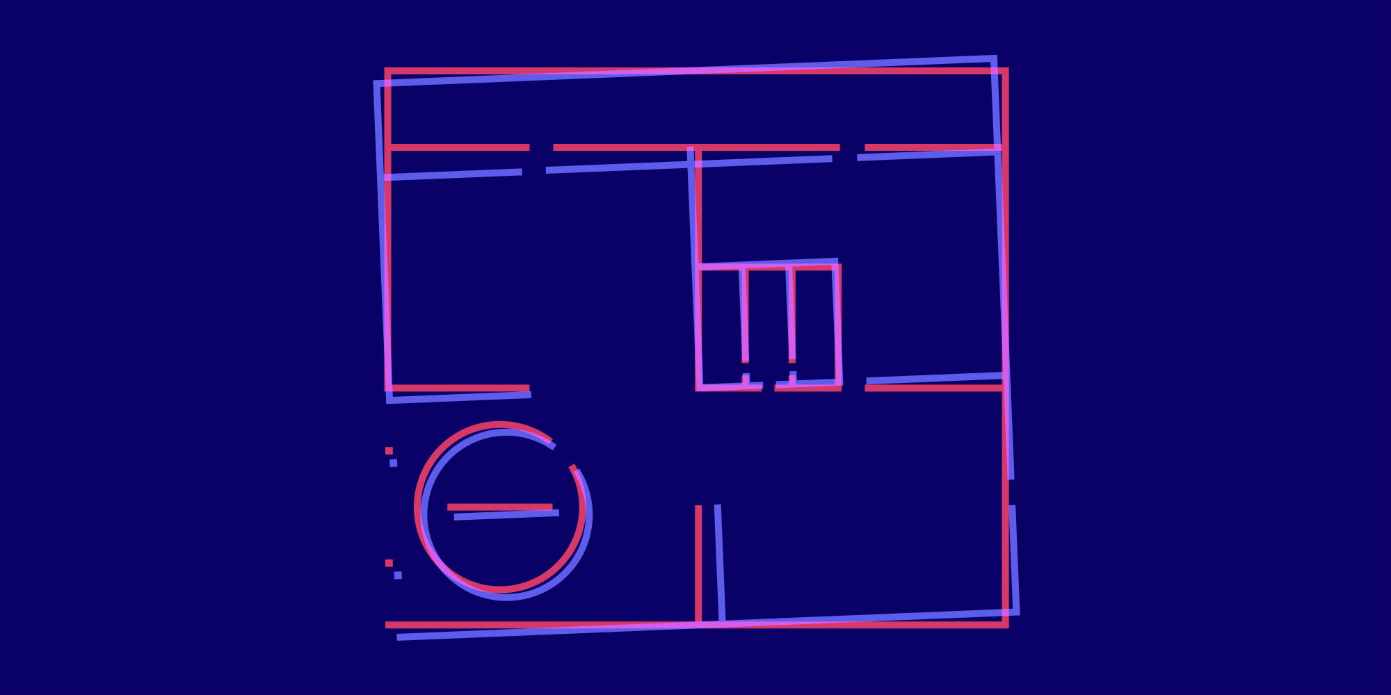
We wanted to make sure we understood the problems users face, so as to address them properly. We already knew that having an obvious visual indication of differences solves the issue of easily spotting changes. However, in cases where elements in two documents don’t overlap, yet the “regular” comparison shows nothing but differences (as seen in the image below), we needed to find a way to show only the true changes.
The answer was to add an option to manually align two documents, resulting in a comparison document that only shows the relevant differences.
What Was Important for Us
We knew precision had to be one of the most important features for Document Comparison, but we also wanted to maintain a simple workflow. So when we started work on the UI, we went into it prioritizing both of these things.
Precision
The key to noticing differences between vector drawings is the ability to create a precise overlapping of elements. If the unchanged elements don’t overlap, you can easily perceive everything as being changed, which is the opposite of what we were trying to achieve with the comparison tool — indication of actual changes.
When designing the UI and UX, the key factors in achieving a precise overlap were finding the right interaction for selecting the points, and enabling seamless zooming of documents based on the device being used.
Efficiency
We always strive to optimize workflows for our customers, and the best way to accomplish this is to make the process quick.
Not all documents need manual aligning, because in most cases, the dimensions and orientation of a design remain unchanged. As such, we want to keep the workflow for those documents simple without creating unnecessary steps.
For that reason, we decided to make the manual alignment optional — and if the documents need aligning, the process should be as automated and effortless as possible. Selection of the points only requires one tap or click, after which point, users are automatically transitioned to the next step. After completing all the steps, the comparison document is automatically generated.
How It Works
This section will provide an overview of how Document Comparison works.
-
Select two documents
Note that in our examples, the documents have already been preselected and this step is skipped.
-
Comparison document is created
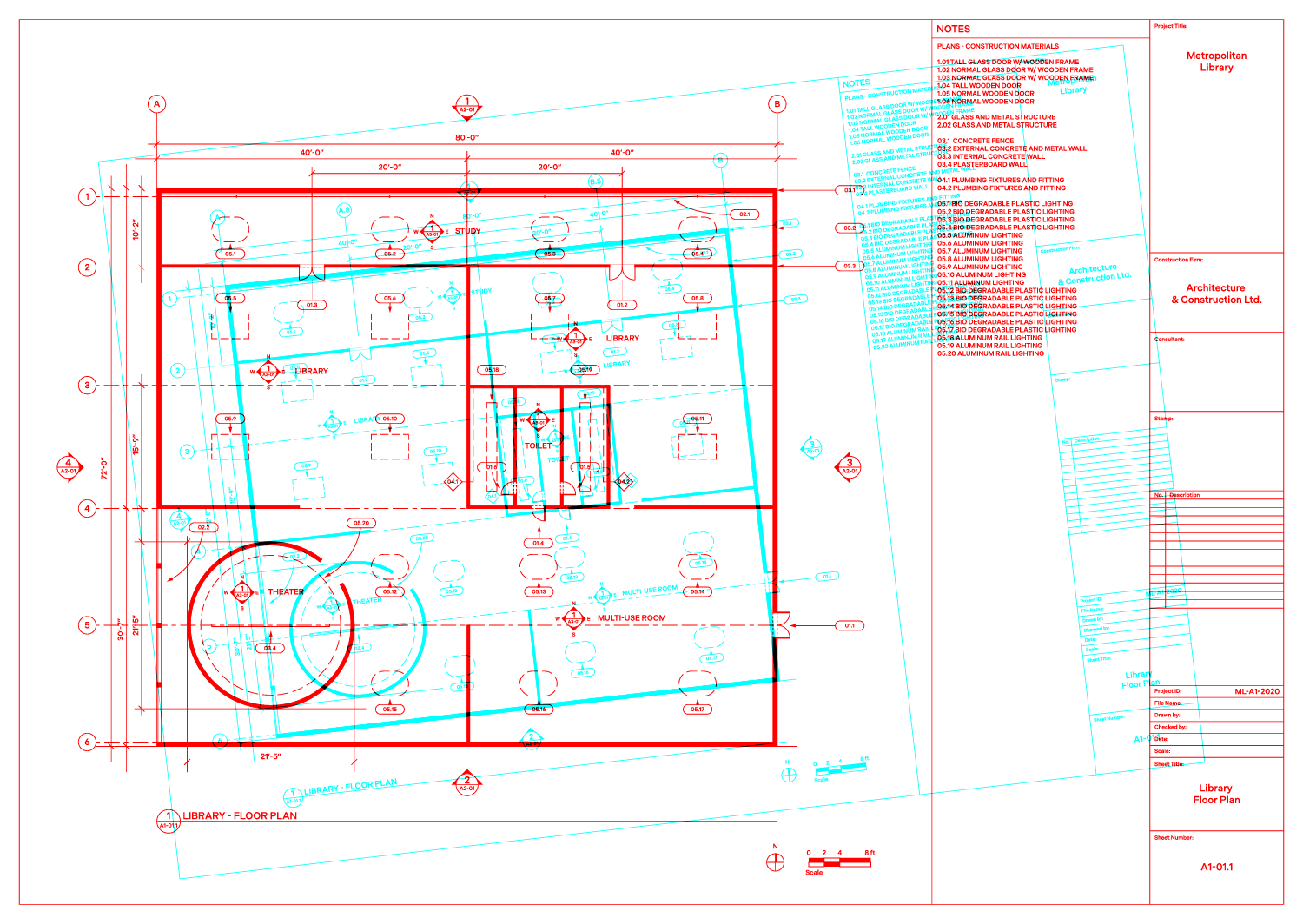
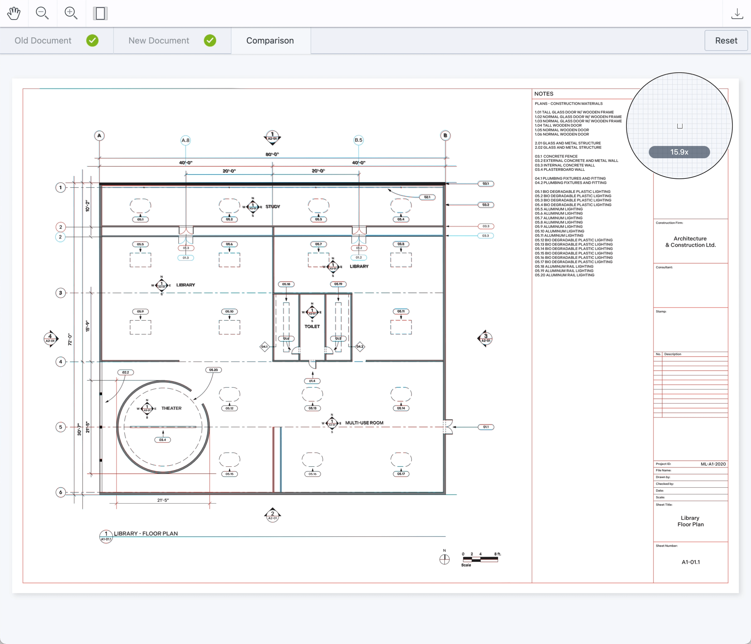
A comparison document is automatically created by coloring the strokes of two pages and overlaying them to visually highlight the differences between two drawing revisions.
By default, the strokes in the first document are colored red, and in the second document, they’re colored blue. The documents then get overlaid with a blend mode, Darken, which neutralizes the elements positioned in the same place and highlights the elements that don’t overlap. Users can optimize visibility based on their use case by recoloring the strokes and layering PDF pages with different blend modes using the API.
-
Optional manual alignment
If the position of the elements a user wants to compare is mismatched, they can manually align the two documents:
-
Select manual alignment.
-
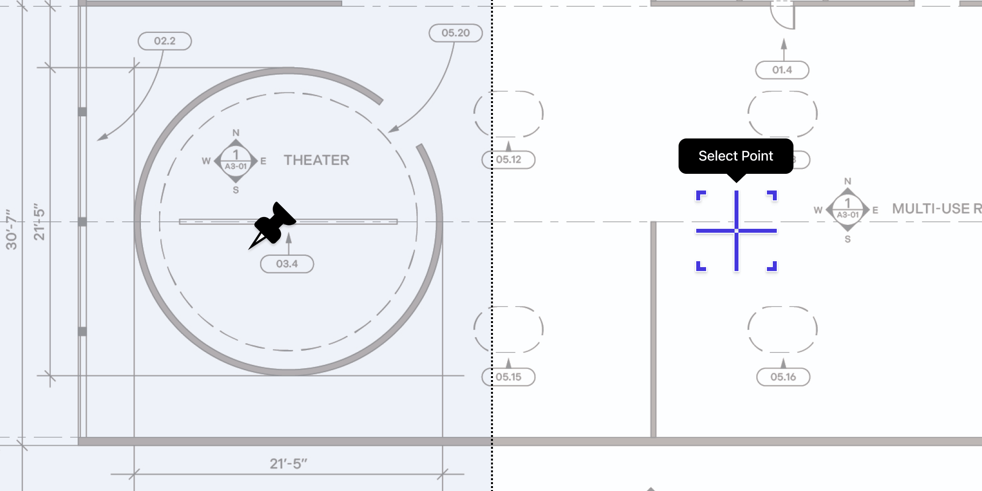
Select three points on the first document.
-
Select three points on the second document.
For best results, users should choose points near corners of the document and make sure to choose the points in the same order on both documents.
-
-
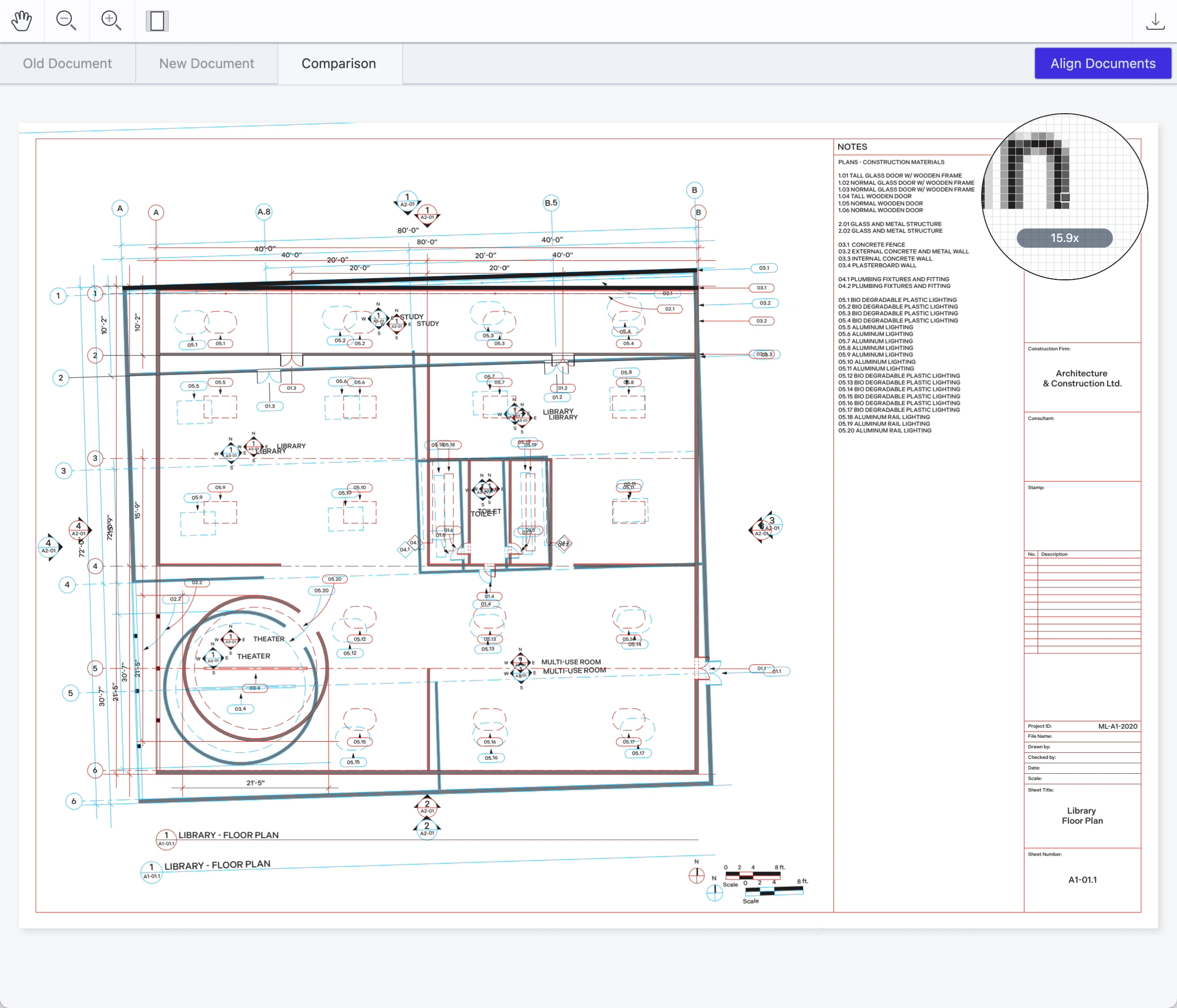
Realigned comparison document is created
After selecting the last point, the comparison document is automatically created.
Touch vs. Desktop Devices
Since user experiences on desktop can be very different from mobile — due to factors such as screen size and the fact that users are likely using a mouse or a trackpad to navigate — we wanted to also be sure to consider these.
On desktop computers, we can generally assume the presence of a mouse pointer, which enables a large amount of selection precision. In addition, users are generally working with a bigger screen, which results in a good overview of the document. Zooming might not even be necessary to make a precise point selection. To minimize the need for zooming even further, we also included a magnifier, which shows a detailed preview of a selection point while moving the cursor over the document.
But imagine doing that with a finger on your touch (possibly mobile) device. Not very precise, is it? The user would cover the area they’re trying to select with their own finger, making it impossible to see the exact selection point.
By dissecting the experience, we were able to identify these issues and provide a solution that would be fitting for touch devices. We came up with a static selector positioned to the center of the screen, and instead of moving the selector, users move the page while also having the option of zooming in or out. This way, they can zoom in and position the page elements to the center of the selector, instead of the other way around.
Conclusion
One of our company core values is continuous improvement, and we always strive to make meaningful improvements to our products that empower companies. We work closely with our customers on the enhancements that are important for their use cases — just like we did in this scenario.
Document Comparison is fully supported in our iOS, Android, and Web PDF SDK products. You can try it in your own project by using our free trial or you can see it in action in our interactive web demo. If you feel that the Document Comparison component can optimize your workflow, reach out to our sales team.

Maša is super fond of the challenges of the digital day and age. Her approach to design is driven by curiosity. You might also find her at a dance studio or exploring the streets to find inspirational architecture and design.

Petra loves to take on complex design problems. She believes that good design is a reflection of a company’s vision. When not designing, she can be found in nature or experimenting in the kitchen.