UI Theming with CSS Variable Mapping
 Veronica Marini

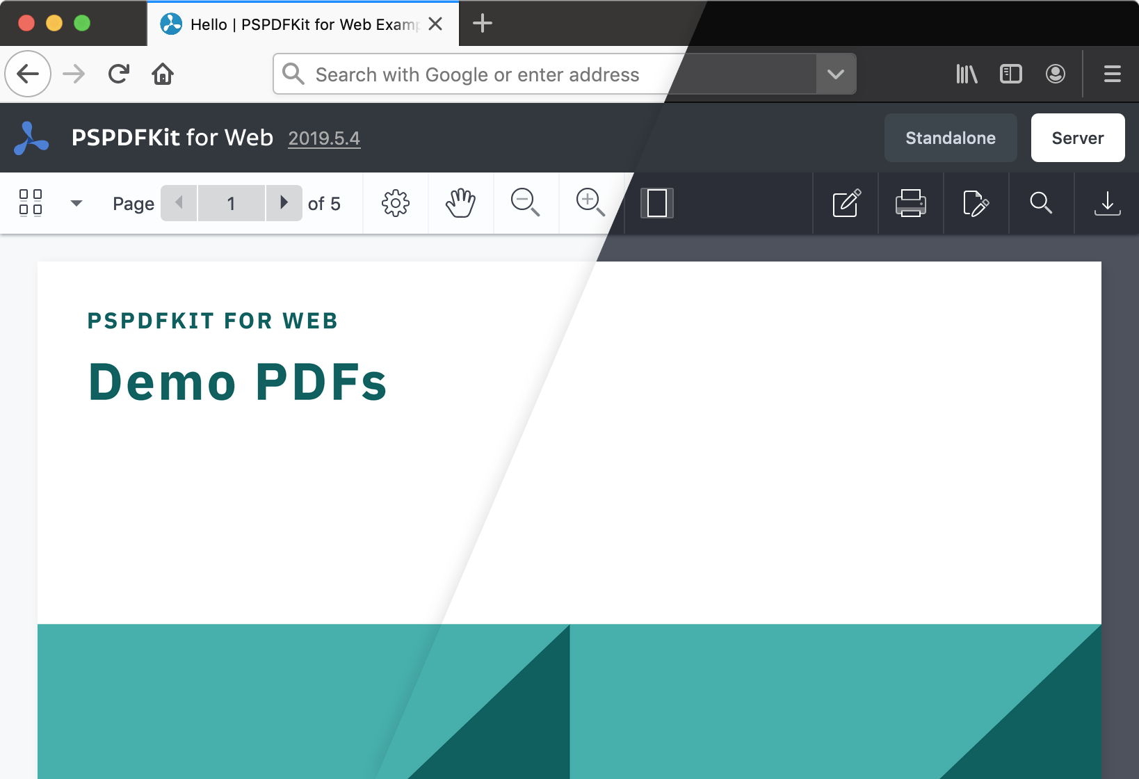
In 2019, we added support for light and dark themes to PSPDFKit for Web.
While working on support for these themes, we were faced with the question of what we should name our CSS theme variables.
As all programmers know, naming is hard. But especially with CSS variables, it’s easy for your names to get out of hand. That’s because the naming should be as self-descriptive as possible, which means you need to categorize things correctly without knowing future use cases. And naturally, doing the latter increases the risk of coming up with the wrong name and abstraction and not realizing it until much later.
Why Is Naming Important?
As Robert C. Martin wrote in his book Clean Code: “Naming is everywhere. We name our variables, our functions, our arguments, classes and packages… We name and name and name. Because we do so much of it, we’d better do it well.”
The book goes on to say that there is no universally accepted convention about naming, and indeed, a quick internet search about the subject returns an enormous number of blog posts and discussions, none of which are definitive: The only thing developers can do is abide by certain rules when choosing a name and be consistent throughout their projects.
The Problem
So naturally, while implementing our theming feature, the Web team had to decide how to organize our theme variables.
Instead of hardcoded values, we decided to use CSS custom properties throughout the app for colors, fonts, and spacing. In a design system, these are normally called design tokens, and they don’t hold any specific theme information. For example, you might have --color-white, --color-red, and --fontSize-1, but the themes use these tokens to define a particular presentation, e.g. a light mode theme.
Using design tokens, themes can either define maps of component-specific variables or give abstracted names to variables and use them right away in components.
Let’s look at an example of this:
:root {
  --color-black: #000;
}
The mapping approach of the above design tokens will produce an extra file where the variables, which are specific values to be reused throughout the project, are mapped. It will look like some version of the following:
/* light-theme.css */
:root {
  --Button-color: var(--color-black);
  --Modal-color: var(--color-black);
}

/* components/button.css */
.Button {
  color: var(--Button-color);
}

/* components/modal.css */
.Modal {
  color: var(--Modal-color);
}
The other option doesn’t involve any mapping, thanks to more abstract design token names, which we can use right away in our components:
/* light-theme.css */
:root {
  --primary-color: #000;
}

/* components/button.css */
.Button {
  color: var(--primary-color);
}

/* components/modal.css */
.Modal {
  color: var(--primary-color);
}
Tradeoffs
Each approach comes with pros and cons, which we’ll outline below.
Mapping
Pros
-
Having an extra file where we map our variables makes it easy to create new themes by simply creating and importing a new theme file.
-
The variable names are specific and unique, making them more flexible and reliable. This will ensure that the abstraction won’t easily break while adding new themeable components or implementing a new color scheme.
For example, with a change in the layout, the modal component color is now yellow. In this approach, all I have to do is go to the mapping file (in my case, light-theme.css) and change the color paired with the --Modal-color variable:
/* light-theme.css */
:root {
  --Button-color: var(--color-black);
  --Modal-color: var(--color-yellow);
}
Cons
-
This approach is verbose: The amount of custom properties grows quickly, as every theme-related property needs its own variable.
Using Generic Names
Pros
-
Using very generic names, like
color-primary, directly in our components without any further mapping is a less verbose approach. -
It’s faster.
Cons
-
The abstraction needs to be flexible. Otherwise, it’s likely to fail.
To explain this, let’s use the same example as before.
Obviously changing --primary-color to yellow is not an option. So when the abstraction isn’t flexible enough, most likely the naming convention will end up being corrupted:
/* light-theme.css */
:root {
  --primary-color: #000;
  --other-primary-color: #ffff00;
}
Conclusion
For our first iteration of themes, we decided to map our variables: We wanted to have a practical test to see how this approach would work out.
As this is a decision that every team that maintains a design system has to make, we would love to know about your use case and how you approach theming.
Please vote below!
Veronica’s passion for puzzles got her into programming. She likes everything frontend, bringing design to life, and measuring herself with coding. She also collects hobbies: from yoga to surfing to playing Brazilian drums.