The Case for Lists in UICollectionView

In 2017, we published The Case for Deprecating UITableView by Michael Ochs and PSPDFKit founder Peter Steinberger. In that post, we discussed how UICollectionView was a more flexible and modern alternative to UITableView.
It turns out Michael was more serious about this than we thought, because he presented the Lists in UICollectionView session at WWDC 2020. UICollectionView received numerous enhancements to make it more convenient to create UITableView-like lists, while offering far more power and flexibility compared to table view. While UITableView hasn’t been deprecated, the updates it received this year seem to mostly be following in the footsteps of collection view. Additionally, Apple’s iOS 14 apps make extensive use of new list styles, and these styles are easiest to set up using UICollectionView.
The aforementioned power and flexibility are exactly what I want to explore in this post. I’ll skip covering the basics of making a list with UICollectionView; for an introduction, please check out the WWDC session or Keith Harrison’s excellent API overview on Use Your Loaf.
Flexible
There are two components involved when making lists with UICollectionView:
-
The layout — This comes from a
UICollectionLayoutListConfigurationin aUICollectionViewCompositionalLayout. -
The cells — These are instances of
UICollectionViewListCell.
What’s interesting is that nothing in the API enforces that this layout and this cell type are used together. You can use custom cells with a list layout or use standard cells with any layout.
Custom Cells with a List Layout
With self-sizing table view cells, it works best to either use the built-in subviews like textLabel and imageView, or use only custom subviews you add yourself. Mixing these up usually leads to weird layout issues. Sometimes the built-in subviews of a UITableViewCell could be more of a hindrance than a help, because you might accidentally set text on textLabel instead of on your custom label.
With lists in UICollectionView, custom cells can start with a clean slate by subclassing UICollectionViewCell instead of UICollectionViewListCell.
As of Xcode 12 beta 2, swipe actions are possible with custom cells because these actions are set via the list configuration’s leadingSwipeActionsConfigurationProvider and trailingSwipeActionsConfigurationProvider.
Custom Layout with List Cells
Part of the elegance of the UICollectionView API is that no appearance is imposed on your cells; UICollectionViewCell is simply a container for whatever content your app wants to show. However, in many cases, a concrete cell class would be useful for prototyping or getting something working quickly. By concrete, I mean something that’s usable without further subclassing. UICollectionViewListCell is the first concrete subclass of UICollectionViewCell that UIKit has provided: It has subviews to display images, text and more.
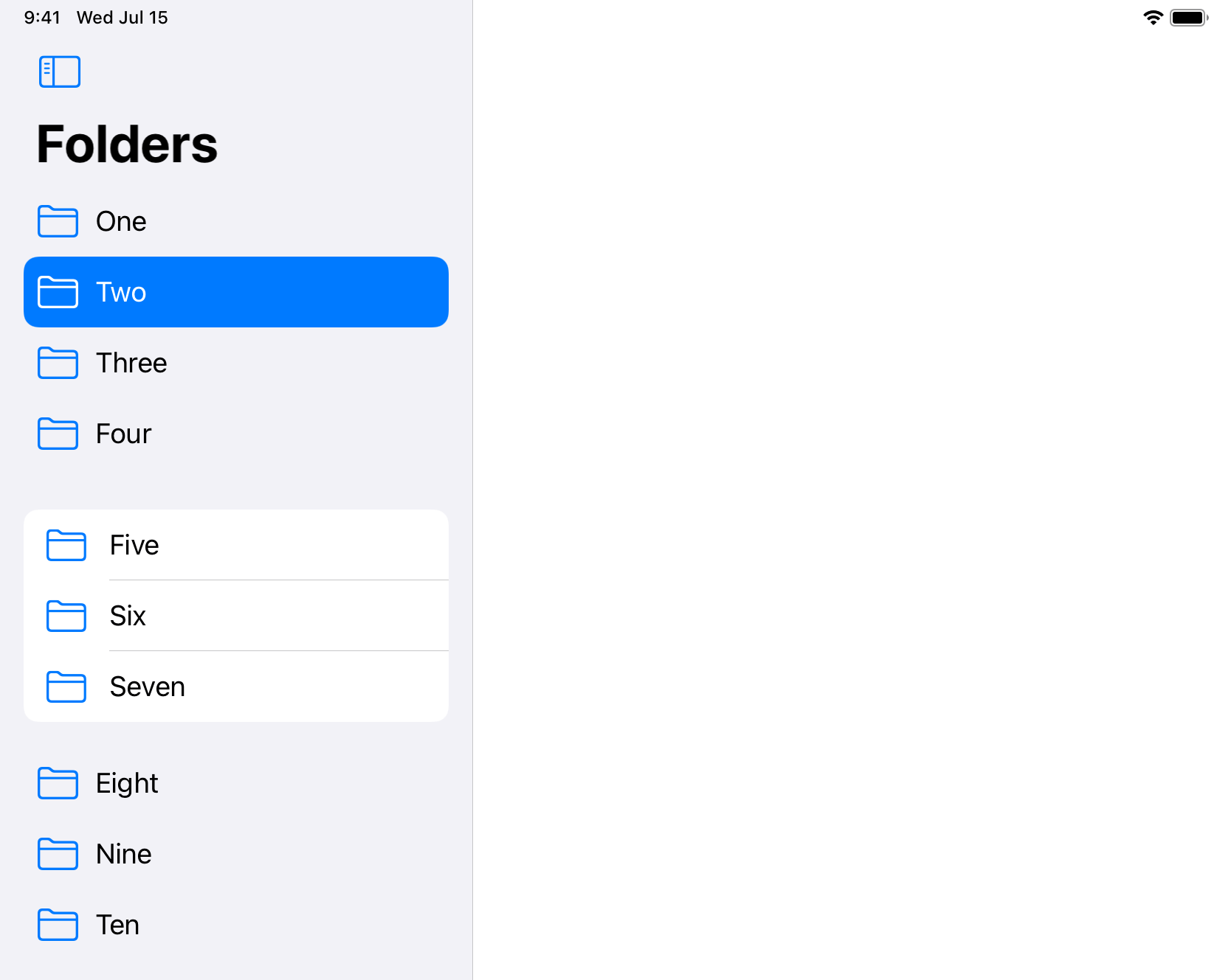
An example we presented in our 2017 post was switching between a list layout and a grid layout. While we have since updated PDF Viewer to use UIDocumentBrowserViewController, the document browser UI still shows either a list or a grid. Using UICollectionView, switching between a list and a grid is as easy as setting a new layout object:
if collectionView.collectionViewLayout == listLayout {
    collectionView.setCollectionViewLayout(gridLayout, animated: true)
} else {
    collectionView.setCollectionViewLayout(listLayout, animated: true)
}
There’s a slight hitch at the end of the animation from the grid to the list due to the cell heights being calculated incorrectly. This appears to be an iOS beta issue, but it’s possible I set something up wrong.
The improvements over what we had before are:
-
We don’t need to implement our own list layout. While a list with fixed row heights is straightforward to implement from scratch with
UICollectionViewLayout, implementing our own layout with self-sizing cells would be complex. -
We can use standard cell styles provided by UIKit, which have sensible accessibility built in.
-
We don’t need to implement our own version of swipe actions.
In the example above, I’m not making any changes to the cells themselves when switching layouts. If you want something like a larger image in the grid layout, you could perhaps model this with a custom state in the cell’s configurationState.
To learn more about the new cell configuration API, the best place is the Modern cell configuration WWDC session with Tyler Fox.
For completeness, here’s the list layout being used above:
lazy var listLayout: UICollectionViewLayout = {
    var listConfig = UICollectionLayoutListConfiguration(appearance: .plain)
    // Remove the separators for a smoother transition
    // because the grid does not show separators.
    listConfig.showsSeparators = false

    // Supporting swipe to delete in lists is easy.
    listConfig.trailingSwipeActionsConfigurationProvider = { indexPath in
        let deleteAction = UIContextualAction(style: .destructive, title: "Delete") {
            [weak self] action, view, completion in
            // Update the data source...
        }
        deleteAction.image = UIImage(systemName: "trash")
        return UISwipeActionsConfiguration(actions: [deleteAction])
    }

    return UICollectionViewCompositionalLayout.list(using: listConfig)
}()
The grid layout is a compositional layout. I’ve omitted the insets for the sake of brevity:
lazy var gridLayout: UICollectionViewLayout = {
    let ignored = NSCollectionLayoutDimension.absolute(999)

    let itemSize = NSCollectionLayoutSize(
        widthDimension: ignored,
        heightDimension: .fractionalHeight(1)
    )
    let item = NSCollectionLayoutItem(layoutSize: itemSize)

    let groupSize = NSCollectionLayoutSize(
        widthDimension: .fractionalWidth(1),
        heightDimension: .absolute(120)
    )
    let group = NSCollectionLayoutGroup.horizontal(
        layoutSize: groupSize,
        subitem: item,
        count: 3
    )

    let section = NSCollectionLayoutSection(group: group)

    return UICollectionViewCompositionalLayout(section: section)
}()
To ensure smoother transitions, I removed the background from the cells, except for when they’re selected using the new configuration update callback:
class ClearBackgroundCell: UICollectionViewListCell {
    override func updateConfiguration(using state: UICellConfigurationState) {
        var background = UIBackgroundConfiguration.listPlainCell().updated(for: state)

        if state.isSelected == false {
            background.backgroundColor = .clear
        }

        self.backgroundConfiguration = background
    }
}
Composable
The UIKit team members could have made a UICollectionViewListLayout and called it a day. However, they did something more ingenious by making a list a configuration that is applied to a single section in a UICollectionViewCompositionalLayout. As the name implies, this means the new way to make lists is much more composable.
For example, you can mix different styles of lists in one scrollable view:
let mixedListLayout = UICollectionViewCompositionalLayout { section, env -> NSCollectionLayoutSection? in
    let listConfig: UICollectionLayoutListConfiguration
    if section == 1 {
        listConfig = UICollectionLayoutListConfiguration(appearance: .insetGrouped)
    } else {
        listConfig = UICollectionLayoutListConfiguration(appearance: .sidebar)
    }

    return NSCollectionLayoutSection.list(using: listConfig, layoutEnvironment: env)
}
You can mix lists with other layouts, like grids, in one scrollable view; think of the pinned conversations in iOS 14 Messages. You could even make these other layouts scroll horizontally using UICollectionLayoutSectionOrthogonalScrollingBehavior.
Here’s a simple example showing a grid at the top. Once again, I’ve omitted setting the insets in the grid to keep things short:
let gridThenList = UICollectionViewCompositionalLayout { section, env -> NSCollectionLayoutSection? in
    let listConfig: UICollectionLayoutListConfiguration
    if section == 0 {
        let ignored = NSCollectionLayoutDimension.absolute(999)

        let itemSize = NSCollectionLayoutSize(
            widthDimension: ignored,
            heightDimension: .fractionalHeight(1)
        )
        let item = NSCollectionLayoutItem(layoutSize: itemSize)

        let groupSize = NSCollectionLayoutSize(
            widthDimension: .fractionalWidth(1),
            heightDimension: .absolute(60)
        )
        let group = NSCollectionLayoutGroup.horizontal(
            layoutSize: groupSize,
            subitem: item,
            count: 2
        )

        return NSCollectionLayoutSection(group: group)
    } else {
        return NSCollectionLayoutSection.list(
            using: UICollectionLayoutListConfiguration(appearance: .sidebar),
            layoutEnvironment: env
        )
    }
}
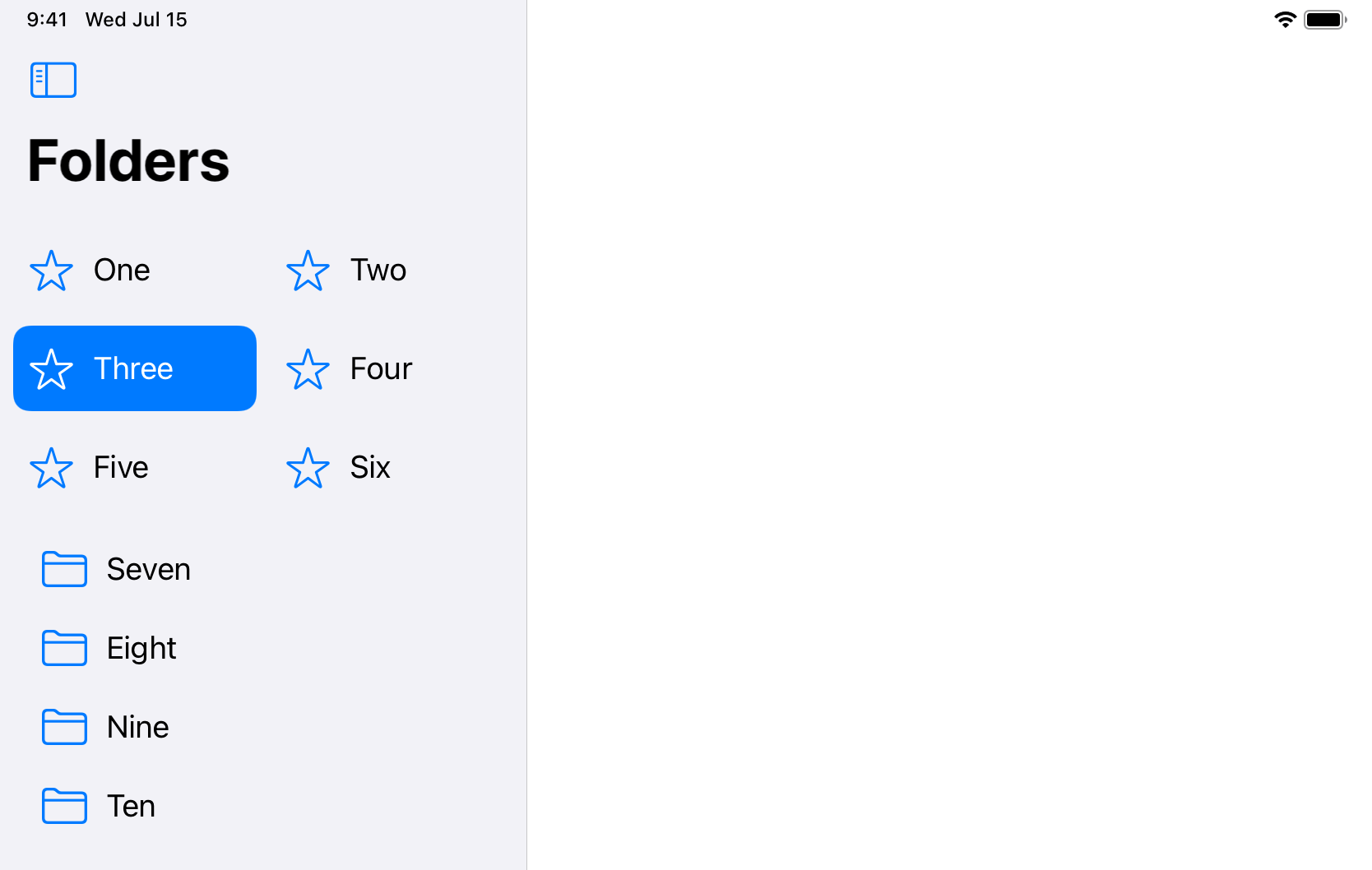
To ensure the cells in the grid match the style of the list, make sure you set both the contentConfiguration and the backgroundConfiguration to be appropriate for a sidebar:
var content = UIListContentConfiguration.sidebarCell()
content.text = item.text
content.image = UIImage(systemName: item.imageName)
cell.contentConfiguration = content

cell.backgroundConfiguration = UIBackgroundConfiguration.listSidebarCell()
With a compositional layout, the possibilities are endless. All of this was possible before, but if part of your layout involves a list, it’s now more convenient to set up with iOS 14.
The New List Styles
On iOS 14, Apple’s apps make extensive use of new list styles.
public struct UICollectionLayoutListConfiguration {
    public enum Appearance {
        case plain
        case grouped
        case insetGrouped
        case sidebar
        case sidebarPlain
    }
}
The sidebar style is used for the top-level navigation in Photos, Notes, Mail, Contacts, Shortcuts and Voice Memos. Cells with this style don’t generally use secondary text. This style seems best for a list of folders or other collections of items.
The sidebarPlain style is used for the top-level navigation in Messages and for mid-level navigation in Mail, Contacts and Voice Memos. This style seems best for lists of items that show secondary text.
I hope the Tables section in the iOS Human Interface Guidelines is updated soon to give details about the new list styles. It would be especially useful to know Apple’s rationale for sometimes using a bright blue selection state and sometimes using grey.
Getting these styles with UICollectionView is as simple as setting the style when creating your list configuration:
UICollectionLayoutListConfiguration(appearance: .sidebar))No new styles were added to UITableView.Style:
extension UITableView {
    public enum Style: Int {
        case plain = 0
        case grouped = 1
        @available(iOS 13.0, *)
        case insetGrouped = 2
    }
}
The omission of sidebar and sidebarPlain in UITableView.Style feels like a gentle nudge to choose collection view instead. However, with a bit more work, it’s possible to achieve a similar look with UITableView by setting each cell’s configurations as we did to make the grid above match the sidebar list. Note that this is only an approximation: Selection highlights and separators won’t behave exactly the same as they do when using UICollectionView, and it’s necessary to manually set the backgroundInsets:
var contentConfiguration = UIListContentConfiguration.sidebarCell()
contentConfiguration.text = item.text
contentConfiguration.image = UIImage(systemName: item.imageName)
tableViewCell.contentConfiguration = contentConfiguration

var backgroundConfiguration = UIBackgroundConfiguration.listSidebarCell()
backgroundConfiguration.backgroundInsets = NSDirectionalEdgeInsets(
    top: 0,
    leading: 8,
    bottom: 0,
    trailing: 8
)
tableViewCell.backgroundConfiguration = backgroundConfiguration
UITableView is not unloved. Between WWDC 2019 and 2020, it received support for diffable data sources, content configurations and background configurations. That said, I feel part of the reason for supporting these newer APIs is to abstract away some of the details of whether you’re using a table view or a collection view so that switching over is as easy as possible.
Conclusion
In the conclusion of our 2017 post, we wrote:
There’s no need to manically replace all your table views with collection views, but it’s time for Apple to offer API to allow collection views to be used like table views, so we all can make better apps with less code that are more flexible in this multi-size screen world.
That’s more or less how things have played out.
UITableView is such a foundational component of so many existing apps that I don’t see it being removed any time soon. Perhaps it will be deprecated in a number of years, but after that, it’s likely to stick around for compatibility for a very long time. But for new code, UICollectionView is clearly the way to go.
When you think about it, the name ‘table view’ never made much sense. A table has rows and columns, and while NSTableView on the Mac still supports columns, UITableView was designed for narrow iPhone screens and so it has only ever provided rows. We can stop calling lists table views; lists are just lists now.

Douglas makes the most of our fully remote setup by frequently traveling around Europe by train. He’s a proponent of iPad as a productivity platform and is obsessive about the details of great user experiences. He’s also an organizer of the NSLondon meetup.