Self-Sizing Table View Cells in Practice

Since the early days of iOS, it has been common for labels in a UITableView to use a fixed font size and a fixed number of lines, which means all rows could have the same fixed height. This enables the table view to calculate layouts quickly, which was important on old, slow devices. However, it means text can be truncated, which can be extremely frustrating for users.
Modern iOS apps ought to respect the user’s preferred text size with Dynamic Type and be localized to reach a global audience. But in some languages, such as German, text may be much longer than in English. Additionally, if your cells display user-generated text, that text could be any length. With all these factors, the only sensible solution to avoid truncating text is to use self-sizing table view cells.
That said, fixed-height cells can still be appropriate in a few cases. If your cells don’t display text, or if you decide showing a set number of lines is fine, you can just scale some fixed height with the Dynamic Text size.
Self-sizing cells in UITableView and UICollectionView were added as a feature in iOS 8. This feature allows each cell to determine its own size rather than using a fixed size or asking the table or collection view delegate for the size of each cell.
In this article, we will look at self-sizing cells in UITableView for apps supporting iOS 10, 11, and 12, covering three implementation approaches and some pitfalls I encountered supporting them across our UI in PSPDFKit.
Enabling Self-Sizing
On iOS 11 and later, self-sizing table view cells are enabled by default. You don’t need to set an estimatedRowHeight because UITableView will determine its own estimate if none is provided. So unless you invest the time to calculate a good estimate — considering the many factors that may affect the height, such as the content size category — it’s better to let UITableView handle this.
On iOS 10, you must specify an estimatedRowHeight or self-sizing won’t be enabled. It’s probably not worth coming up with a good estimate for such an old iOS version, so you could just set this to 44 (since that was the default cell height before self-sizing cells, and it’s the minimum recommend size for tap targets on iOS):
if #available(iOS 11.0, *) {} else {
    tableView.estimatedRowHeight = 44
}
if (@available(iOS 11.0, *)) {} else {
    tableView.estimatedRowHeight = 44;
}
For UICollectionViewFlowLayout, the requirement to set an estimated size was lifted in iOS 10.
Implementing the Cells
There are three ways to implement self-sizing cells: with a built-in layout, by setting up layout constraints that can resolve a height, or via using sizeThatFits: and layoutSubviews. Layout constraints seem to be the most well-discussed method, but this isn’t the one I’d recommend initially. Below I’ve outlined the three approaches.
Built-In Layout
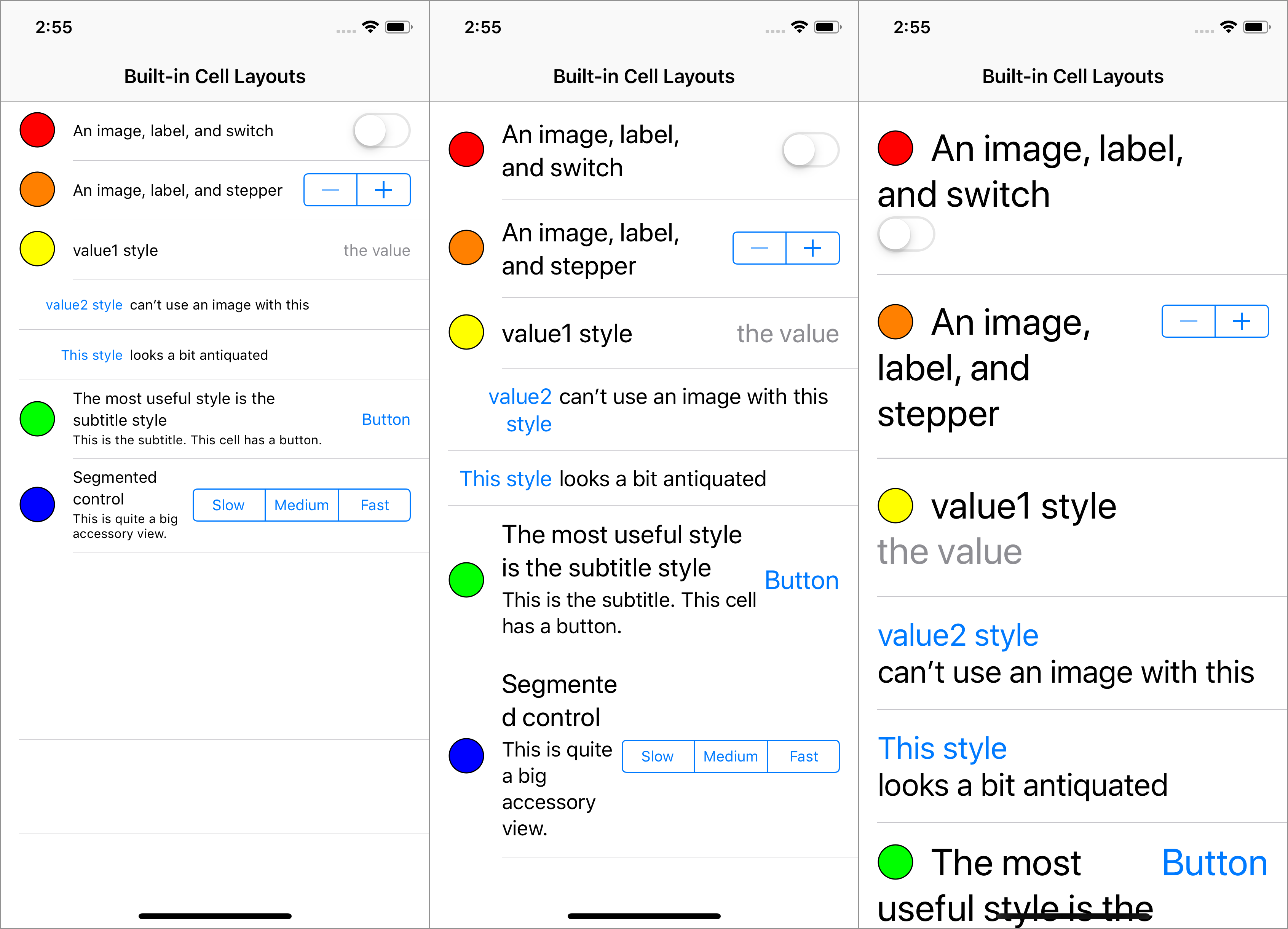
The simplest approach is to use the sizing and layout of the built-in UITableViewCell styles. By this, I mean configuring the provided subviews of the UITableViewCell without adding your own subviews. The available subviews are textLabel, detailTextLabel, imageView, backgroundView, and accessoryView.

There is one golden rule for using the built-in layout: Do not mix it with a custom layout, as doing so will result in strange behavior. You must stick with the built-in subviews of the cell. Don’t do any layout yourself beyond setting the accessory view’s size.
In addition to it being less work, the benefit of using the built-in layout is that it handles a few special cases.
The textLabel and detailTextLabel can use a side-by-side arrangement by creating cells with the value1 or value2 style. These styles switch to showing the two labels stacked vertically when using an Accessibility text size.
The most versatile subview is the accessoryView, which lets you supply any view to display at the trailing end of the cell. The size of the accessoryView must be determined by setting the size of its bounds or frame upfront: It can’t be dynamic using sizeThatFits: or layout constraints. One trick you can use to work around this is to unset and reset the accessoryView when something alters its size.
Using the built-in layout means you get its quirks, for better or worse. An example of this is that if the accessory view is a UISwitch, when using Accessibility content size categories, the switch is placed underneath the labels instead of to the right. This means your app will be consistent with Settings, but this will be inconsistent if you use some other accessory views in the same table view.
The built-in layouts improve with iOS updates. iOS 10 did not increase the cell height when the built-in labels were set to use multiple lines so the text would overflow the cell, while iOS 11 correctly makes the cells taller to accommodate multiple lines. This is especially noticeable when using large Accessibility content size categories, which are more likely to need multiple lines of text.
Layout Constraints
If the built-in layouts can’t do what you need, you’ll have to do a bit more work, which I’ll discuss now.
To determine the height of a self-sizing cell, UITableView calls systemLayoutSizeFittingSize:withHorizontalFittingPriority:verticalFittingPriority: on the cell. If a view uses constraints, this method uses those constraints to determine a height. Otherwise, it uses the height returned by sizeThatFits:.
When using layout constraints, you must add your own subviews to the cell’s contentView and add layout constraints so that when the width of the cell is provided, a height can be calculated unambiguously from the constraints.
You could consider using UIStackView since it provides a higher-level abstraction over layout constraints. For an example, check out Keith Harrison’s Making Space For Dynamic Type article on Use Your Loaf. This post covers how to use UIStackView to implement a cell that shows a switch to the side of the text when using smaller text sizes and below the text when using Accessibility text sizes. However, bear in mind that if you want exactly this layout, Apple already did this work, so you can implement it trivially using the built-in cell layout:
cell.accessoryView = UISwitch()cell.accessoryView = [[UISwitch alloc] init];
Margins
Cell content ought to be laid out within the correct margins. This is especially important to ensure the left and right safe areas are correctly considered on iPhone X in landscape and on possible future devices. Additionally, text should generally follow the readableContentGuide.
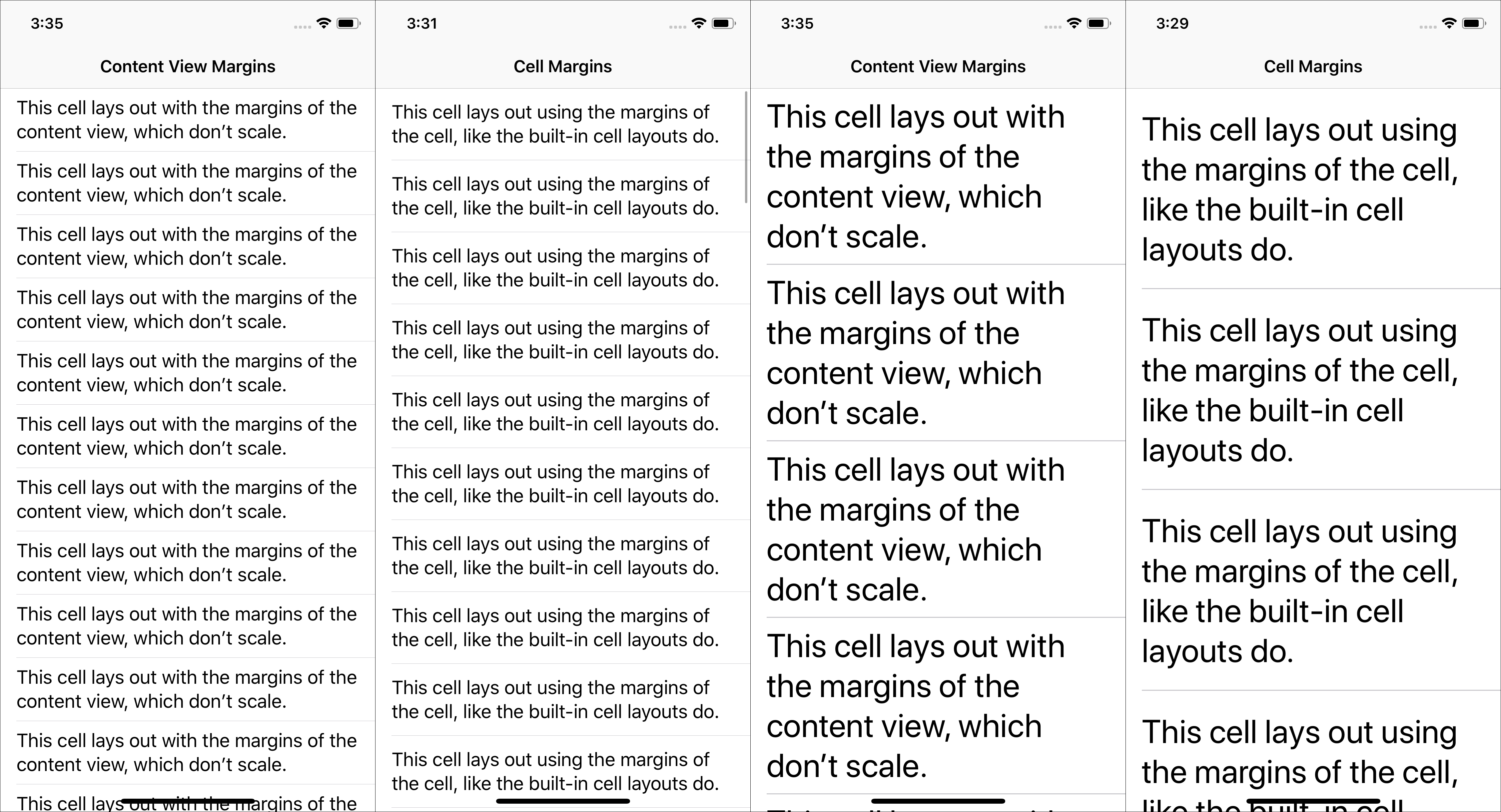
It’s desirable to use the same layout margins that the built-in cell layouts use, especially when a single table view mixes cells of different types, and some of those cells use a built-in layout, while others use a custom layout. You might not notice the difference at smaller text sizes, but when using larger text sizes, the vertical margins on the cell increase, so cells that don’t take this into account will appear cramped.

To match the layout of the built-in cells, you should use the cell’s layout margins and not the contentView’s layout margins. However, making constraints involving the cell’s layoutMarginsGuide results in UIKit logging this warning and using a height of 44 points, even on iOS 12.
Warning once only: Detected a case where constraints ambiguously suggest a height of zero for a tableview cell’s content view. We’re considering the collapse unintentional and using standard height instead.
Therefore, you should set preservesSuperviewLayoutMargins on the contentView and set up constraints to the contentView’s layoutMarginsGuide. Thanks to Stephan Tolksdorf for pointing this out. I’ve written this up as rdar://46234942.
We found that on iOS 10, constraints involving the contentView’s layoutMarginsGuide are removed before the cell appears for some reason, which breaks the layout. As a workaround, we add our own layoutGuide to the contentView and update it in layoutMarginsDidChange. You can see the full Objective-C implementation in this Gist.
Because the vertical margins increase with the text size, at very large text sizes, the top and bottom margins alone have a combined height greater than 44 points. There seems to sometimes be a problem where the table view manually sets the height of the cell to 44 points at some point during layout, which results in temporary unsatisfiable constraint warnings. We haven’t found a good solution to this, but there don’t seem to be any consequences except logging noise.
sizeThatFits: and layoutSubviews
An alternative to layout constraints is to implement sizeThatFits: and layoutSubviews. This way to implement layouts doesn’t seem very popular these days, but it remains the most flexible technique. The main difficulty is that these two methods must be consistent with each other. You also have more work to do to support right-to-left languages.
The strength of this approach is that you can measure if enough space is available and use an alternative layout if not. PSPDFKit uses this for slider cells, which switch to a multi-line layout when there isn’t sufficient width for a slider that can be practically interacted with.

Since the width passed to sizeThatFits: is the width of the cell and not the content view, and since layout should use the cell margins, a convenient trick that can be useful is to calculate all subview frames in the coordinate system of the cell, and then convert to the contentView coordinate system just as you set the property (since the contentView is the superview):
let sliderFrame: CGRect = ... // calculated relative to the cell.
slider.frame = convert(sliderFrame, to: contentView)
CGRect sliderFrame = ... // calculated relative to the cell.
self.slider.frame = [self convertRect:sliderFrame toView:self.contentView];
One problem on iOS 11 and earlier is that cell heights are measured before the final margins are known. The heights are calculated with the default UIView margins of 8 on the sides. Then the cell is laid out. Then the margins are set to 15 on the sides (inherited from the UITableView once it’s the superview). The cell is laid out again but the height is not updated. A hacky fix for this is to check for the initial incorrect default values and hardcode the correct values. Let me know if you know a better solution.
Fortunately, this is resolved in iOS 12:
@implementation PSPDFTableViewCell // UITableViewCell subclass

- (UIEdgeInsets)pspdf_layoutMargins {
    var layoutMargins = self.layoutMargins;

    if (@available(iOS 12.0, *)) {
        return layoutMargins;
    }

    if (layoutMargins.left == 8 && layoutMargins.right == 8) {
        // Apply the hack.
        layoutMargins.left = 15;
        layoutMargins.right = 15;
    }
    return layoutMargins;
}

@end
Pitfalls
Two Labels Side-by-Side
This must be the most common tricky cell layout situation. It works fine at small text sizes because the labels never meet in the middle, but what do you do when this happens at large text sizes? With a naive layout implementation, it is ambiguous which label should wrap to another line first.
One approach to take, if the labels would overlap if restricted to a single line of text, is to switch to laying out the labels vertically and using an unlimited number of lines. This is straightforward to implement with sizeThatFits: and layoutSubviews, but not with layout constraints. With constraints, you could approximate this behavior by switching to a vertical layout when using an Accessibility text size. This behavior matches the built-in cell layouts.
Another way is if one of the labels, such as a timestamp, is always short, is to limit that label to one line and not allow it to compress horizontally.
Late Changes
Make sure you don’t make any changes to the cell that would affect the layout in tableView:willDisplayCell:forRowAtIndexPath:, because this is usually called after the cell height is determined. Instead, set up all content in tableView:cellForRowAtIndexPath:.
Summary
In this article, we’ve seen how to implement self-sizing table view cells in iOS apps. Self-sizing is on by default in iOS 11 and later. The easiest way to implement a self-sizing table view cell is to use one of the built-in styles provided by UIKit. For custom cell layouts, make sure you consider the margins correctly. You can use layout constraints, although sizeThatFits: and layoutSubviews offer an alternative that can better respond to the size needed by the content.
You can read much more about adjusting the size of text to suit users’ preferences in our Improving Dynamic Type Support blog post, where we share how more than a quarter of the users of our PDF Viewer app use a non-default text size. We also have a blog post about our localization workflow that enables us to translate our SDK into almost 30 languages. The best WWDC session covering self-sizing cells is WWDC 2014 Session 226: What’s New in Table and Collection Views, and another complementary video is Carla Goldstein’s talk on Dynamic UITableViews from the NSLondon meetup.


