Part V — Mastering the Baseline UI Theme: An In-Depth Exploration

This post is part 5 in a six-part series about our design system, Baseline UI.
This post will explore the Baseline UI (BUI) theme in greater detail and provide insights into how you can customize it to align with your brand. But first, what is a theme?
A theme is a cohesive collection of elements and styles applied across various components to ensure a consistent design language. This consistency allows components and styles to be reused across an app, enhancing both aesthetics and functionality. By understanding the foundational elements of the BUI theme, you can effectively leverage and adapt it to create a seamless user experience that reflects your brand’s unique identity.
BUI Theme Elements
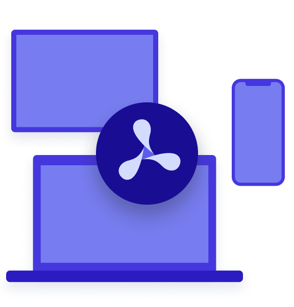
We use design tokens for theming. Design tokens are the core elements of a design system — like color, typography, spacing, and icons — that can be consistently applied across different platforms and devices. Theming is a comprehensive concept that includes all token elements, as well as our icon set. Our default themes include BUI Light Theme and BUI Dark Theme, which, by default, automatically switch based on a user’s system settings.
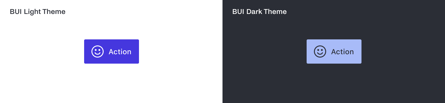 Example of our primary action button component in the default styles of the light and dark themes on a Mac.
Colors
Colors play a crucial role in setting the tone and mood of your application. The BUI theme utilizes a thoughtfully curated color palette designed to be versatile and adaptive.
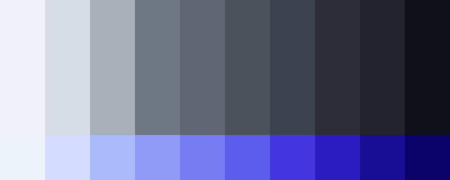
Main Palette — The primary color scheme is neutral, predominantly featuring shades of gray. This neutral palette serves as a foundation, providing a clean and minimalistic look. A blue color scheme is used to highlight interactive elements, giving the UI a duotone appearance that can easily transition to a single-tone concept if needed.
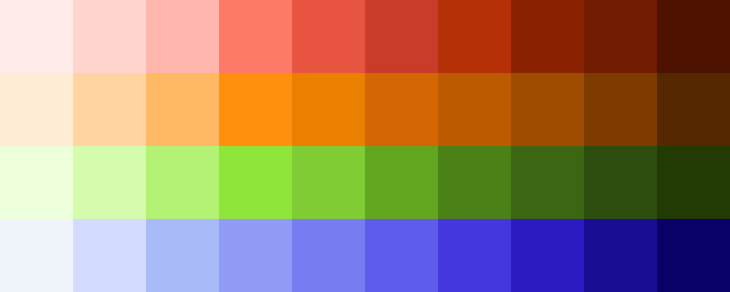
Supporting Colors — The theme also includes a supporting color scheme with reds, oranges, greens, and blues. These colors are typically used for indicating negative and positive actions within the UI. For example, red might signal an error or warning, while green could indicate success or confirmation.
Typography
Typography is essential for readability and conveying the right message. Our typographic styles are designed to be clear and accessible, ensuring a consistent reading experience across different devices.
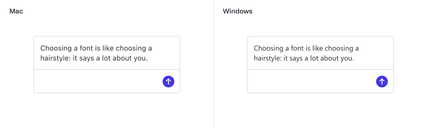
System Fonts — Our typographic styles inherit the system fonts. For Mac users, this means displaying all typographic styles in SF Pro, while Windows users will see the Segoe UI font. This approach ensures text appears natural and native to the operating system, enhancing user familiarity and comfort.
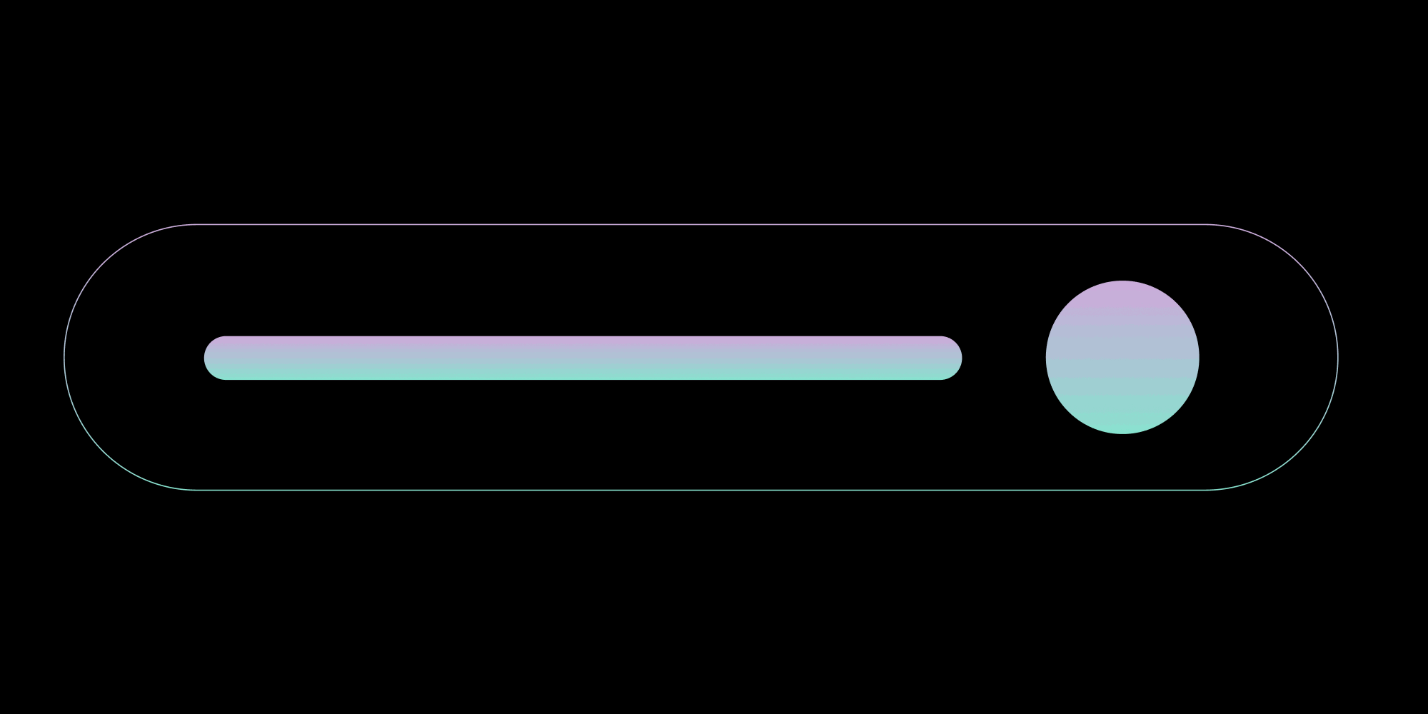
Object Roundedness
The shape and roundedness of UI elements can significantly impact the overall feel of your application. Rounded corners often create a more approachable and friendly interface.
Rounded Borders — Elements such as buttons, dialogs, popovers, form inputs, and dropdowns feature rounded borders. Roundedness can soften the appearance of the UI, making it feel more modern and accessible.
Range of Roundedness — We offer a variety of roundedness options, from extra small to 2× large, as well as fully rounded corners. This flexibility allows you to adjust the visual style to match your brand’s personality, depending on whether you prefer sharp, angular edges or smooth, rounded corners.
Spacing
Effective use of spacing is crucial for creating a well-organized and visually appealing layout. Consistent spacing helps maintain a balanced and harmonious design.
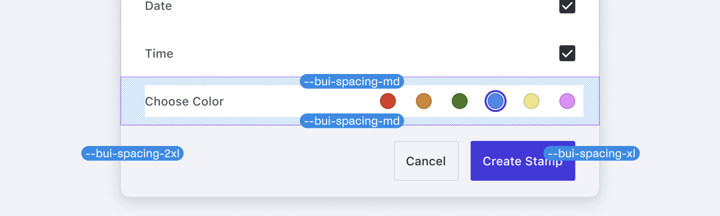
Consistent Spacing — We define a range of spacings, from extra small to 9x extra large. These are all multiples of 4px, with the sole exception being the 2px spacing. This approach ensures that elements are evenly distributed, contributing to a clean and structured layout.
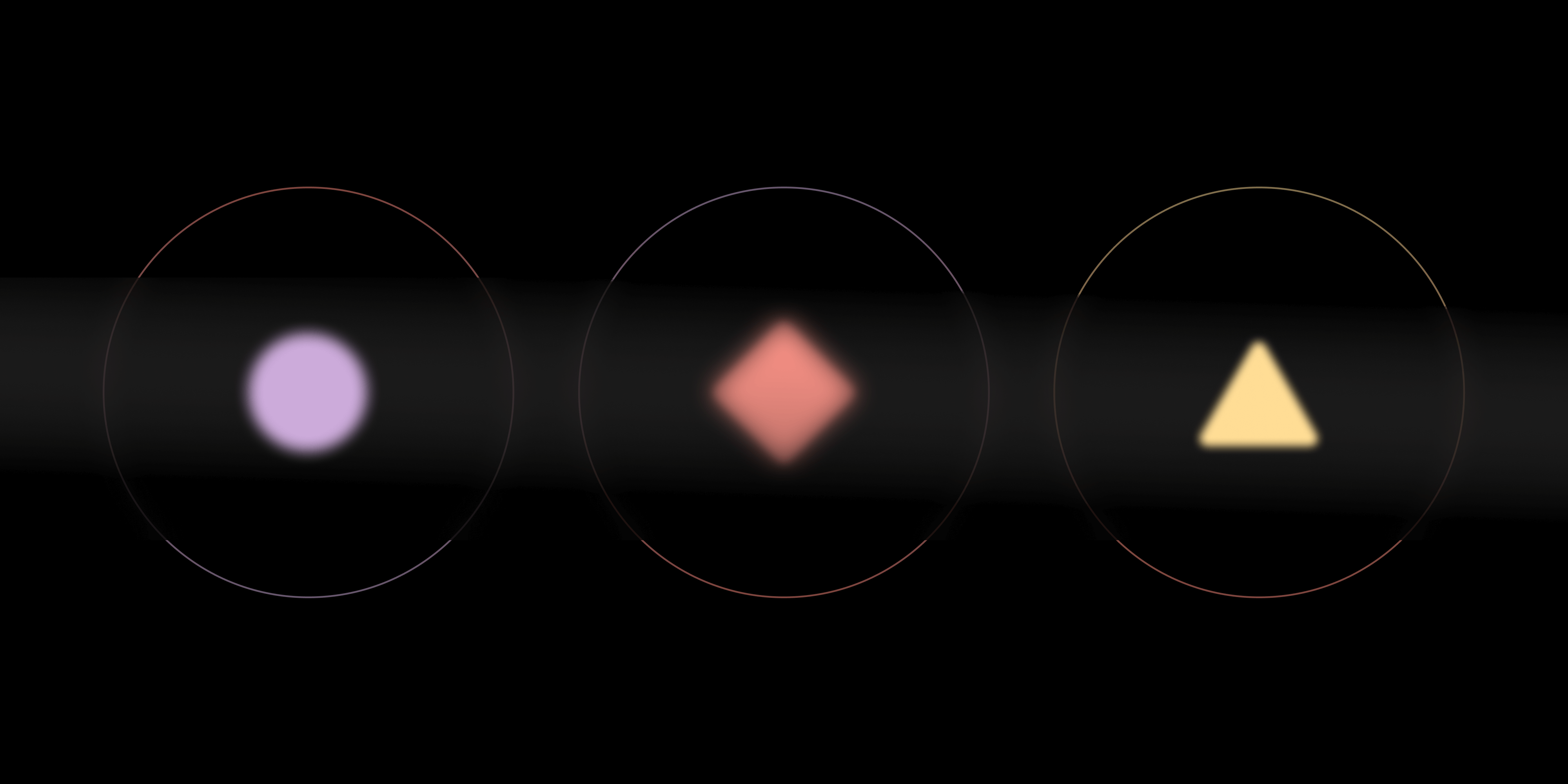
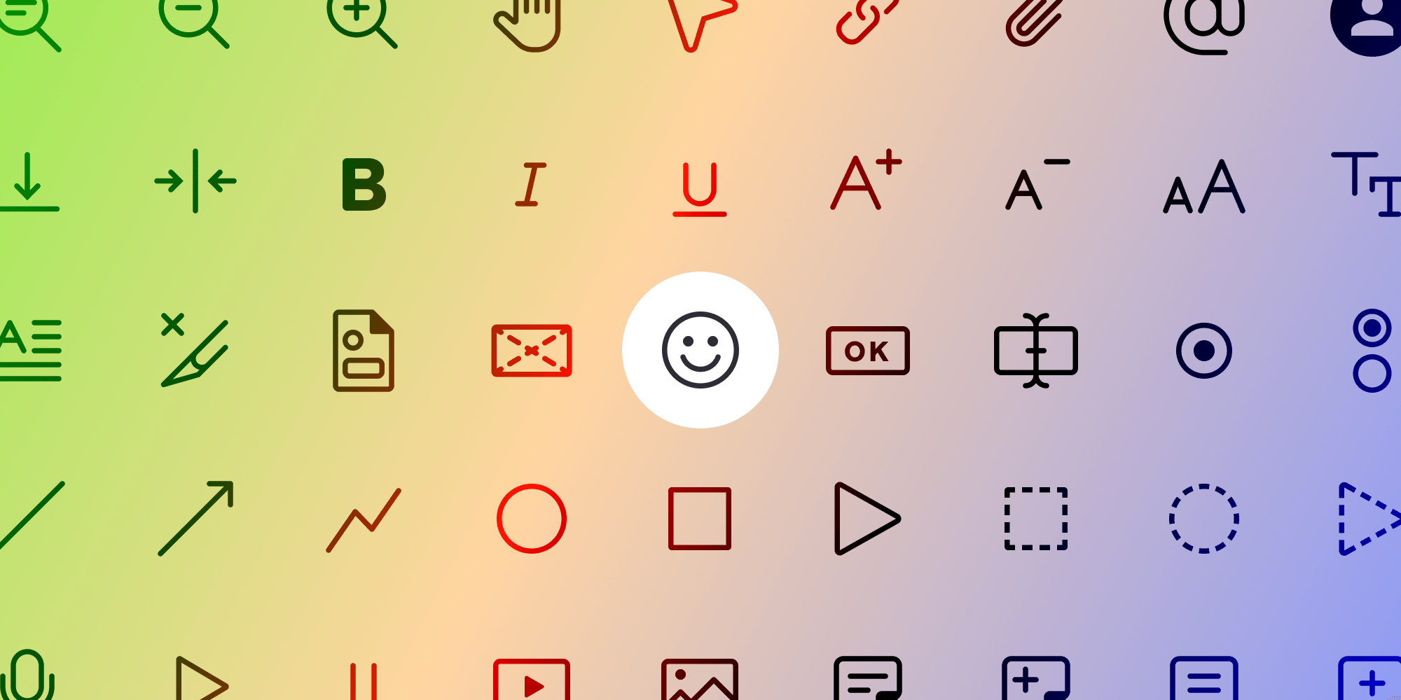
Icons
Icons are a vital part of UI design, providing visual cues that help users navigate the interface efficiently.
Neutral Design — Our icon set features a neutral aesthetic, with rounded caps and a consistent line thickness of 1.5px across all sizes. Some icons also have filled versions, and in certain cases, the line thickness can be adjusted to 1px for intricate details, in combination with the standard 1.5px lines. This design approach ensures that our icons are versatile and seamlessly integrate with various design styles.
Icon Sizes — We provide multiple icon size sets to suit different needs, including 24 × 24 px (Large), 20 × 20 px (Medium), 16 × 16 px (Small), 12 × 12 px (Extra Small), and 8 × 8 px (Extra Extra Small).
When choosing an icon size, it’s important to consider the level of detail required. Smaller icons, such as 8 × 8 pixels, are best suited for simple shapes like chevrons, which don’t require much detail. Conversely, intricate icons like a printer cannot be effectively rendered at such a small size due to the complexity and the need for recognizability. Therefore, it’s crucial to select icon sizes pragmatically based on their use case. These size variations allow you to use icons appropriately across different contexts, from large buttons to small indicators, ensuring clarity and visual harmony.
Elevation
Elevation effects, such as shadows, help differentiate elements and create a sense of depth in the user width.
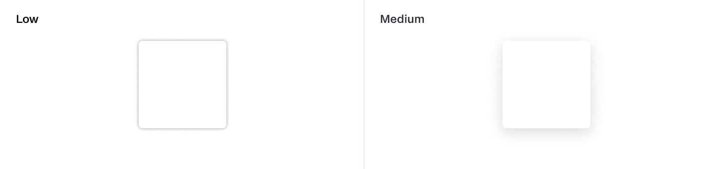
Drop Shadows — Our dialogs, popovers, and dropdowns feature drop shadows to elevate them from the background, ensuring they stand out more prominently. This technique adds visual hierarchy, guiding users’ attention to the most important elements.
Opacity
Opacity levels control the transparency of elements, allowing for layered designs and visual effects.
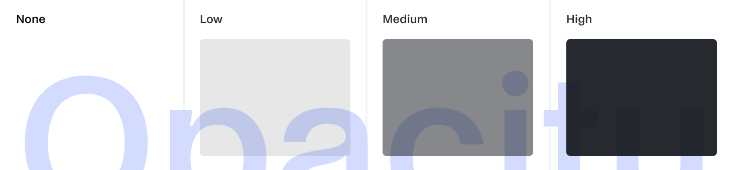
Opacity Levels — We define four opacity levels, ranging from invisible to high. These levels can be used to create subtle visual effects, such as disabled states and overlay screens.
Theme Customization
Customization is a key feature of our theme, enabling you to tailor it to meet your specific needs and branding requirements.
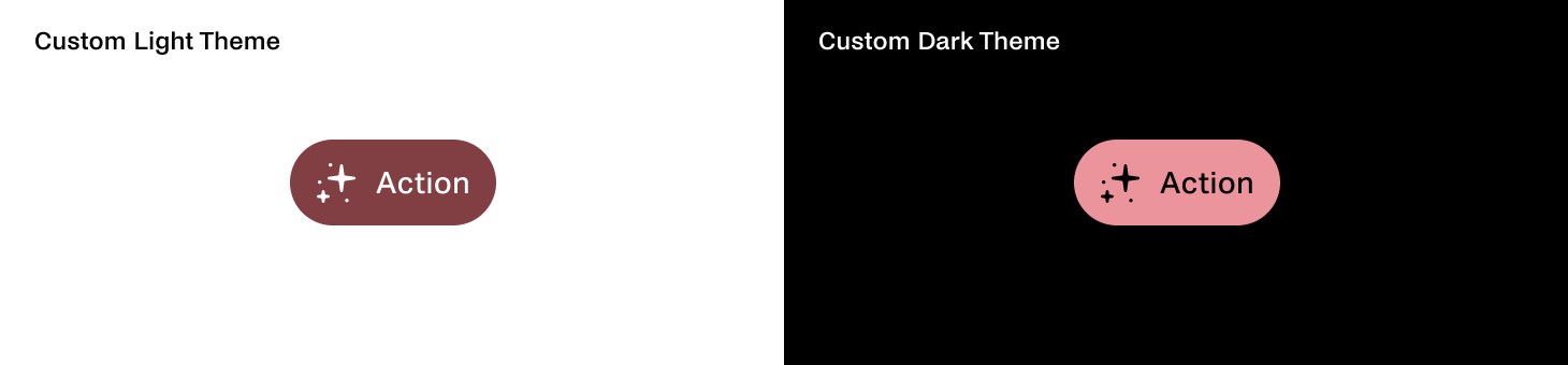 Example of our primary action button component in customized light and dark themes. It features fully rounded corners, custom interactive colors, and a custom font.
Changing Design Tokens
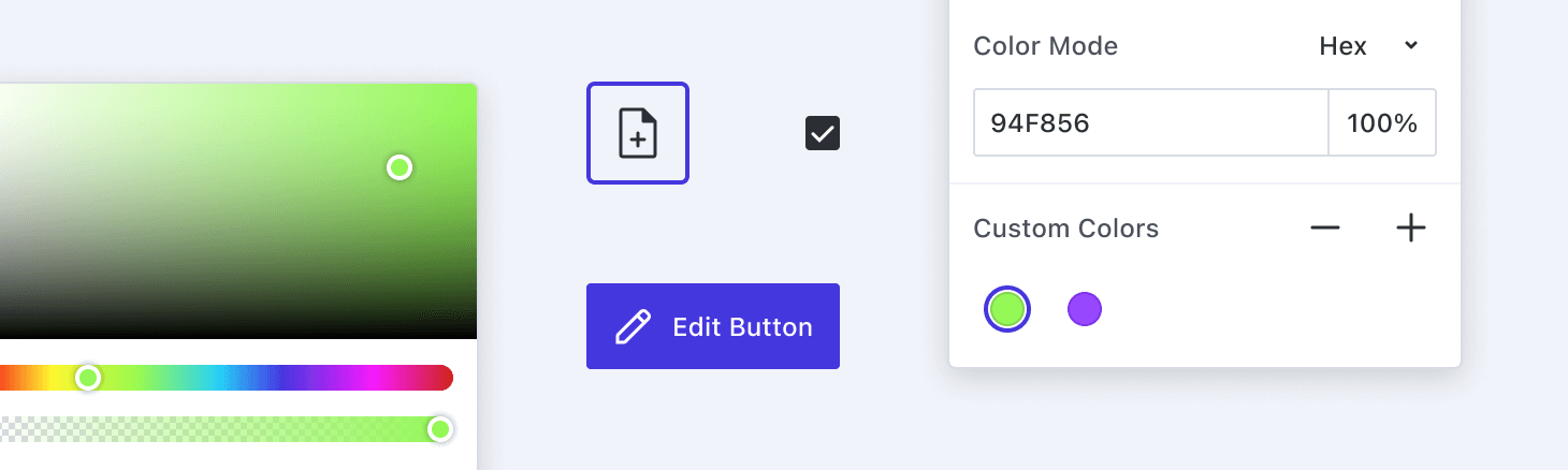
Modifying Values — You can easily customize the theme by changing the values of the design tokens. For instance, you can adjust color schemes, typography settings, and spacing values to match your brand’s style guide. This flexibility ensures that your application can maintain a consistent look and feel that aligns with your brand identity.
Replacing Icons
Custom Icon Sets — If you have a unique icon set that better represents your brand, you can replace our default icons with your own. This allows you to infuse your application with distinctive visual elements that resonate with your brand’s aesthetic.
By leveraging these customization options, you can create a UI that’s not only visually appealing but also reflective of your brand’s personality and values. Whether you’re aiming for a sleek, modern design or a more playful, vibrant interface, the Baseline UI theme provides the tools and flexibility you need to achieve your vision.
Conclusion
The Baseline UI theme offers a robust and flexible framework for designing a consistent and visually appealing user interface. By understanding and utilizing its core elements — colors, typography, object roundedness, spacing, icons, elevation, and opacity — you can create an application that’s not only functional but also aesthetically aligned with your brand.
The theme’s customization capabilities empower you to tailor every aspect of the design to fit your unique requirements, ensuring your application stands out in a crowded marketplace.
In Part VI, we’ll dive even deeper into how Baseline UI facilitates easy customization of user interfaces, allowing our customers to tailor solutions to fit their specific needs and preferences. We’ll explore the various customization options available in Baseline UI and how they contribute to improving user experiences. You can read Part I, Part II, Part III, and Part IV here.

Maša is super fond of the challenges of the digital day and age. Her approach to design is driven by curiosity. You might also find her at a dance studio or exploring the streets to find inspirational architecture and design.

Petra loves to take on complex design problems. She believes that good design is a reflection of a company’s vision. When not designing, she can be found in nature or experimenting in the kitchen.