What Are Color Profiles and How Are They Used in PDFs?
When trying to represent real-world colors with finite concepts such as RGB (red, green, blue) within a PDF, the end product is never going to present a true analog infinite result. That vibrant lavender field will be half dull, and the blue waters in the Mediterranean can look fake.
Part of the reason pictures often look “off” when viewing them onscreen is due to the reproduction of colors from the image. Not every monitor and screen can represent colors in the same way, and not every image produced contains a true representation of the real world. Because of this, careful choices need to be made depending on your desired outcome.
That’s where color profiles come in.
In this post, I’ll discuss how color profiles (also known color spaces) can be used to help truly represent images on your target device. And then I’ll dig into the PDF specification to expose color support across a range of different use cases.
What Are Color Profiles, and Why Do We Need Them?
In simplistic terms, a color profile provides the building blocks to represent an image. Most profiles use multiple finite ranges of color to build up a final color output.
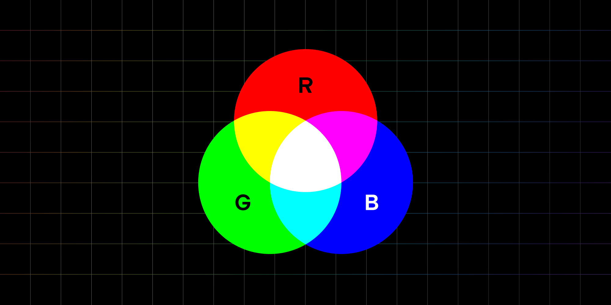
For example, RGB can represent the color red by setting the red component to its maximum and the green and blue components to their minimums. The range of these components is often 0–255.
RGB is common, but it doesn’t always do the best job at representing colors. For example, the finite range (gamut) of 0–255, which is an integer-based range, is limiting. This fact pushed Adobe to release a standard named AdobeRGB, which uses floating-point (high-resolution) values from 0–1, allowing for a much larger range to represent colors.
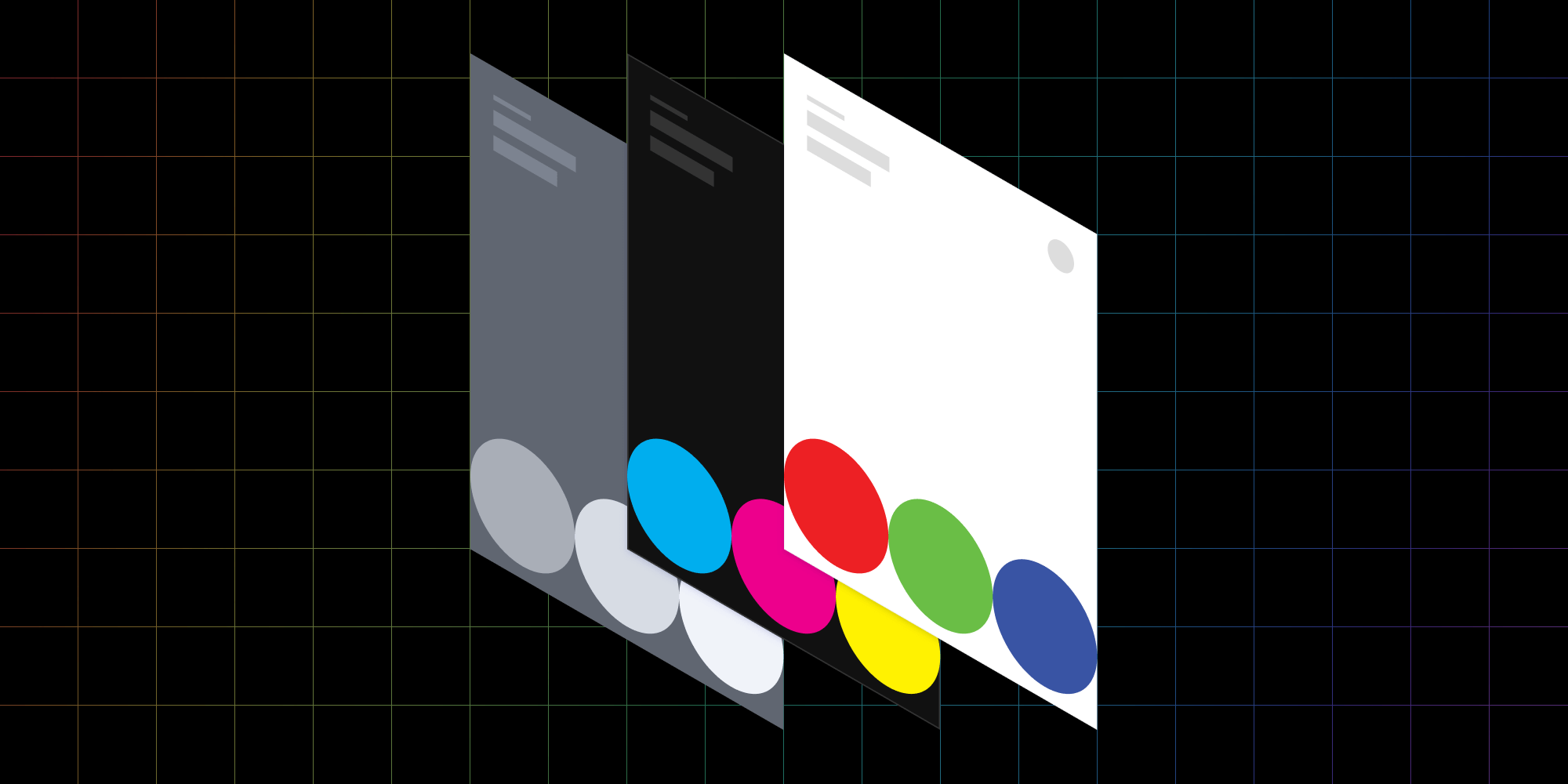
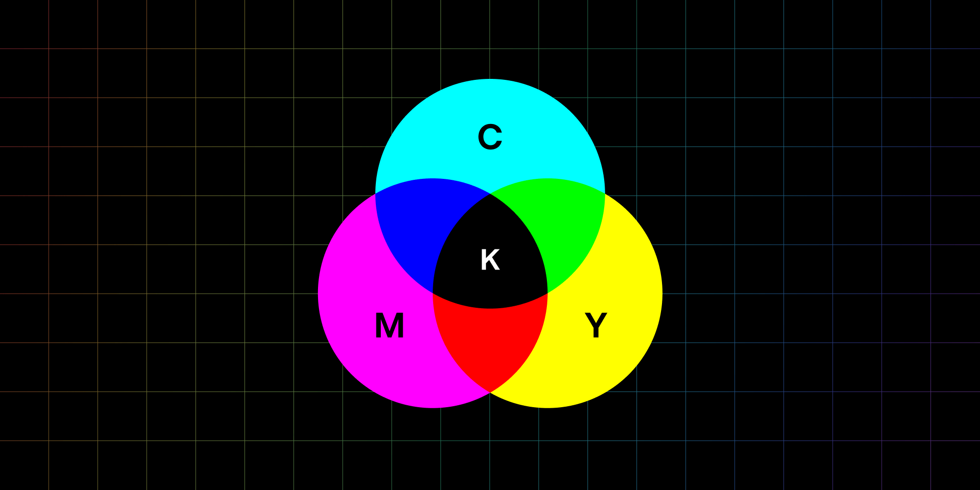
Other color profiles drop the RGB representation altogether and make use of a wider range of colors to reproduce a sometimes more accurate range. For example, CMYK is a profile typically used by printers because the four ink cartridges are split into cyan, magenta, yellow, and black.
The main reason for this difference is that white paper is regularly the print medium. Thus, the printer doesn’t need to represent white, which is something the CMYK color profile lends itself to. This is referred to as a subtractive color space. Meanwhile, RGB would have to achieve white by combining the maximum value of each component equally, which is why it’s referred to as an additive color space.
As you can see, context is what drives the choice of color profiles. And because PDFs cover a range of use cases, the specification has to be flexible enough to cover all those use cases.
What’s the Best Color Profile for Your Use Case?
In the previous section, I introduced three different color profiles (RGB, AdobeRGB, and CMYK). But in practice, there are many color profiles, and PDF supports most of them!
But first, where are color profiles used in a PDF?
-
Vector graphics
-
Content and annotation images
-
Image masks
Color profiles are useful in these cases, because it’s possible to produce a document that’s ready for printing (CMYK), perfect for a monitor to display (RGB), or anything else. There’s no need to translate the colors; just send the PDF straight to the device.
So, what color profiles are available?
Device Color Space
First, there are device color spaces, so named because they’re most useful when displaying graphics or images on a physical device, such as a monitor or screen.
Screens often use the RGB color space because the technology used is generally based on physical red LEDs, green LEDs, and blue LEDs, which means the colors map perfectly.
In PDFs, device color spaces can have the following values:
-
DeviceGray -
DeviceRGB -
DeviceCMYK
So if you know what your target device is, you can work backward to determine what device color space can be used.
CIE-Based Color Space
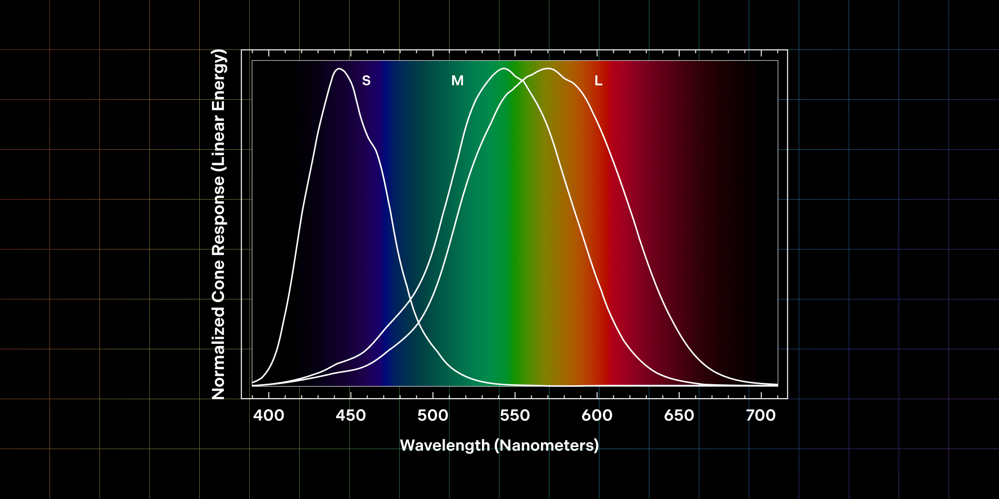
The simple explanation for CIE-based color spaces is they most closely represent the human perception of color. Short, medium, and long cone cells in the eye are each sensitive to a range of color wavelengths that are close to RGB, but aren’t perfectly spaced out across the color spectrum. For an in-depth explanation of the perception of color in the human eye, I suggest reading “The long, medium, and short of the cones” by John the Math Guy.
One would use a CIE-based color space when it’s important to reproduce the color of something independent of the target device. In other words, these color spaces are great at converting from one color profile to another, because they’re based on what a human can perceive, and not what a device emits.
CIE-based color spaces have an advantage because they’re device screen-agnostic. In the future, device screens may not use RGB color representation, and instead use some color profile we can’t even conceive of today. These device-independent color profiles have the advantage of defining colors in a way that makes no assumptions about the final target device, and thus, can be displayed exactly how they were intended.
Available options include:
-
CalGray -
CalRGB -
LAB -
ICC-based
CalGray and CalRGB are simple gray and RGB color spaces with additional calibration options to adjust the final color representation without changing the RGB values of the image. This allows for minor adjustments such as brightness.
LAB is similar, but it also contains a second transformation to adjust the range of each RGB component. Again, this allows for adjustments of the image without affecting the original values saved in the image data.
And lastly, the ICC-based color profile is a standardized format that can represent many color profiles as laid out by the International Color Consortium. ICC-based color profiles are useful because they’re future-proof, meaning when another color profile comes along, they can still be read by many PDF readers. Additionally, a PDF can define fallback color profiles if the ICC-based profiles aren’t supported.
So as you can see, CIE-based color spaces are useful when the target device is unknown or the PDF is device-agnostic, which many PDFs are. A reader can then take these color profiles and adjust according to the context of the situation — for example, sending to print or displaying onscreen.
Special Color Spaces
In addition to what’s covered above, there are four color spaces that are used in special cases:
-
Indexed -
Patterned -
Separation -
DeviceN
Because they’re relatively niche, I won’t go into them in this blog post for the sake of simplicity, but just know that there are many other color profiles that can be used!
Conclusion
I hope this blog post has been able to clear up the confusion around different color profiles used within PDFs, and hopefully it gives you some clues about which color space to use if you’re producing PDFs in the future.
When exporting to PDF from graphic design programs, you’ll find many of these color profile options because, in this context, color replication is often critical for the images being exported. For simple text documents, image color replication is less important, and it’ll likely have no options to adjust the color profile of images.
For most use cases, DeviceRGB will be the best choice, as the target device is often a display or a screen. But in special cases, such as when printing or when using specific displays, it may be best to work with CMYK or an ICC-based color profile to maintain flexibility.

When Nick started tinkering with guitar effects pedals, he didn’t realize it’d take him all the way to a career in software. He has worked on products that communicate with space, blast Metallica to packed stadiums, and enable millions to use documents through PSPDFKit, but in his personal life, he enjoys the simplicity of running in the mountains.