Building Accessible Modals with React

The web has come a long way since the days of plain markup documents. Nowadays we build complex client-side web applications with rich user interfaces. Content and secondary views are often rendered in modal dialogs, which are overlaid containers on either the primary window or another dialog.
Naively, many think that building a modal dialog is as easy as making it so that its visibility state can be toggled with a button and positioning the element with CSS so that its position is fixed.
The declarative nature of React has made it very easy to implement such a pattern to the point that many build modal dialogs in-house instead of relying on battle-tested third-party libraries.
This also happens because there is a lack of popular UI component libraries that are flexible enough to accommodate customizability needs. Many components come with opinionated HTML structure and styles, which, in many cases, make it impossible to implement a specific design.
To work around this issue, people have started building functional components that, using the so-called “render props” pattern, delegate the UI rendering part to the developer. This way, developers don’t need to care about implementing the logic to make a component work and can simply decide how it should appear.
Render props are the ultimate way to make a component customizable. However, by losing control over rendering, it becomes harder to incorporate accessibility into the components. Usually, though, this could be solved by also passing accessibility prop getters to the render methods and adding some checks when in dev mode to make sure that those props are used.
But what is wrong with the simplistic implementation above?
A modal dialog is similar to an independent page that is rendered inside of a container. Under this constraint, the modal from the example above fails at:
-
being on top of the window content or other dialogs.
-
being isolated from the rest of the document (screen readers can read it all).
-
allowing power users and people with disabilities to navigate its content with the keyboard TAB and SHIFT + TAB key combinations, among others.
-
setting initial focus inside of the dialog.
-
restoring focus (on close) to the element that opened the modal.
-
closing on ESC.
-
communicating to screen readers its role when opening.
In this blog post, we will look at some simple solutions that we use at PSPDFKit to make our modals more inclusive and accessible.
Layering
To make sure our modals are always stacked correctly, we use an open source library called react-layers-manager. This library leverages the power of React portals to render layers as siblings of the main application element.
By doing this, modals stack correctly following the mounting order, and we don’t have to use arbitrary high z-index values to work around stacking issues:
import React from "react";
import ReactDOM from "react-dom";
import { LayersManager, Layer } from "react-layers-manager";

class Modal extends React.Component {
  render() {
    return (
      <Layer>
        <div style={styles}>{this.props.children}</div>
      </Layer>
    );
  }
}

// ...

ReactDOM.render(
  <LayersManager>
    <App />
  </LayersManager>,
  document.querySelector("#root-element")
);
The library provides a LayersManager component that should wrap your application and a Layer component that is used every time you need a layer.
Isolation
If not hidden, the content of the page can still be read by assistive technologies. Entire parts of an application can be hidden from screen readers by setting the aria-hidden attribute to true on DOM elements.
When opening a modal dialog at PSPDFKit, we set aria-hidden="true" to every sibling of the modal, so that screen readers won’t accidentally read the content behind the modal. To do this, we keep a stack (an Array) of dialogs, and we update their aria-hidden values every time a dialog is mounted or unmounted, making sure that the dialog on top of the stack has aria-hidden="false", i.e. it is visible. We also make sure that the main application container is hidden by using the reference to it that we get when a layer mounts:
const stack = [];

function onStackUpdate() {
  const lastIndex = stack.length - 1;
  stack.forEach((instance, index) => {
    instance.setState({ isOnTop: index === lastIndex });
  });
}

class Modal extends React.Component {
  state = { isOnTop: true };

  onMount = appRoot => {
    if (stack.length === 0) {
      appRoot.setAttribute("aria-hidden", "true");
    }
    // Add a reference to the component instance
    // to the stack.
    stack.push(this);
    onStackUpdate();
  };

  onUnmount = appRoot => {
    stack.pop();
    if (stack.length === 0) {
      appRoot.removeAttribute("aria-hidden");
    }
    onStackUpdate();
  };

  render() {
    return (
      <Layer onMount={this.onMount} onUnmount={this.onUnmount}>
        <div style={styles} aria-hidden={!isOnTop}>
          {this.props.children}
        </div>
      </Layer>
    );
  }
}
Alternatively, from ARIA 1.1, one can use aria-modal="true" on the modal dialog without having to apply aria-hidden to the other elements. However, as this is a new property, not all screen readers might support it.
Focus Management
When activating a modal, it’s important to move the focus inside of the modal dialog — usually to the first focusable element if it’s present — so that users can start navigating its content with a keyboard.
Once the modal is active, the focus should be trapped within the modal in order to reproduce the behavior of a standalone page. Pressing the TAB key moves the focus to the next focusable element inside the dialog, and when the focus is on the last focusable element in the dialog, this moves the focus to the first focusable element in the dialog. This is also valid when tabbing in inverse order with SHIFT + TAB.
At PSPDFKit, we enforce this behavior with a FocusTrap component that we only mount on the active modal:
class Modal extends React.Component {
  state = { isOnTop: true };

  // ...

  render() {
    const FocusTrapIfActive = this.state.isOnTop
      ? FocusTrap
      : React.Fragment;

    return (
      <Layer onMount={this.onMount} onUnmount={this.onUnmount}>
        <FocusTrapIfActive>
          <div style={styles} aria-hidden={!isOnTop}>
            {this.props.children}
          </div>
        </FocusTrapIfActive>
      </Layer>
    );
  }
}
An alternative to the aria-hidden attribute discussed above is the new inert attribute. This attribute forces user agents to act as if the node is absent for the purposes of targeting user interaction events, and it causes assistive technologies to ignore it. If properly used, this attribute could be a valid alternative to adding aria-hidden and trapping the focus programmatically.
Restoring Focus
When dismissing the modal, we need to restore focus to the element that opened the modal. To do so, our modal component accepts a restoreFocusOnElement prop that defaults to document.activeElement.
When we unmount the component, we focus the element programmatically:
class Modal extends React.Component {

  restoreFocusOnElement = document.activeElement;

  componentWillUnmount() {
    if (this.restoreFocusOnElement) {
      this.restoreFocusOnElement.focus();
    }
  }

  // ...
}
Closing on ESC
Modals should also be dismissed when pressing the ESC key. Once again, we have a component for it! Our Escape component listens for keydown events and invokes a callback that closes the modal when the event.keyCode is 27:
<Layer onMount={this.onMount} onUnmount={this.onUnmount}>
+  <Escape callback={this.props.onEscape}>
    <FocusTrapIfActive>
      <div style={styles} aria-hidden={!isOnTop}>
        {this.props.children}
      </div>
    </FocusTrapIfActive>
+  </Escape>
</Layer>
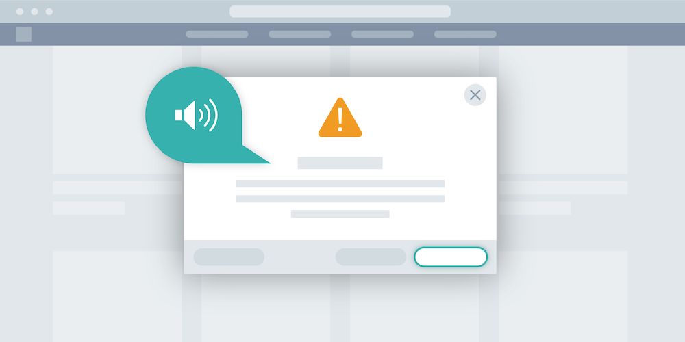
Making Screen Readers Compliant
It is important to give semantic meaning to the dialog so that screen readers can describe its type to users.
This is done by setting the role attribute on the wrapping element to either dialog or alertdialog:
<div
+  role={this.props.role || "dialog"}
  style={styles}
  aria-hidden={!isOnTop}
>
  {this.props.children}
</div>
An alert dialog is a modal dialog that interrupts the user’s workflow to communicate an important message and acquire a response. Examples include action confirmation prompts and error message confirmations.
It is also important to label the dialog and optionally provide a description. If the modal contains a title and description, these can be referenced by ID using the aria-labelledby and aria-describedby attributes:
<div
  role="dialog"
  aria-labelledby="my-modal-label"
  aria-describedby="my-modal-description"
>
  <h2 id="my-modal-label">Create Signature</h2>
  <p id="my-modal-description">
    Create a digital signature to insert into your document.
  </p>
</div>
Alternatively, the label can be set inline on the aria-label attribute if the information must not be displayed onscreen:
<div
  role="dialog"
  aria-label="Create Signature"
>
  <p>
    Create a digital signature to insert into your document.
  </p>
</div>
When you don’t provide an aria-describedby relationship, assistive technology can resort to its internal recovery mechanism to determine the contents of the alert message.
Conclusion
As we saw in this blog post, it takes a little work to make robust and accessible modal dialogs.
I highly recommend that you familiarize yourself with a screen reader and use it to navigate your page while developing. For example, macOS comes with a built-in one called VoiceOver, and it can be activated by pressing CMD + F5.
If you want to read more in-depth about accessibility and dialogs, I highly recommend you check out the W3C WAI-ARIA authoring practices site, which comes with descriptions and links to actual examples. If, instead, you are looking for an implementation of a modal that is easy to style, you might want to give @reach/dialog a try.
Make sure you also check out the following components:
-
a11y-dialog (for a vanilla JavaScript implementation)