Using the Bottom Navigation View in Android

In this article, we’re going to set up a simple (but functional) app with bottom navigation. We’ll also show some features of BottomNavigationView, along with customizations the Android system provides us with.
Bottom navigation wasn’t a part of Android design guidelines until recently. But once it was introduced in Google’s Material Design Guidelines, it was added in Android’s design support library version 25.
For some time, the bottom navigation view missed some crucial features (mostly related to bottom view item labels), and these were added in version 28 of the design support library — or, if you’re using the new AndroidX library that replaces the support library, they were added in version 1.0.0 of the new material components support library. But we’ll go more into this a bit later.
Importing Bottom Navigation View
To get the BottomNavigationView component, first we need to include the design support library or new material components library with AndroidX enabled.
Using the Android Design Support Library
In your build.gradle file, add the following:
dependencies {
    implementation 'com.android.support:design:28.0.0'
}
Using AndroidX with the Material Components Support Library
In your gradle.properties, add the following to enable AndroidX:
android.useAndroidX=true
android.enableJetifier=true
And then in your build.gradle file, add:
dependencies {
    implementation 'com.google.android.material:material:1.0.0'
}
Setting Up the Bottom Navigation View
As with all other views, you can add BottomNavigationView programmatically or via XML. Since it’s the component that will, in most cases, be constantly present in the activity, we’ll add it through the XML and perform the setup inside the code.
In this example, we’ll create a simple app that has a bottom navigation below the ViewPager that will be synced with it. It will also display some fragments/views above.
First, let’s define sample menu items that we’ll put inside our BottomNavigationView. We’ll create three sample items: ‘Logs’, ‘Progress’, and ‘Profile’:
<?xml version="1.0" encoding="utf-8"?>
<menu xmlns:android="http://schemas.android.com/apk/res/android">

    <item
        android:id="@+id/bottom_navigation_item_logs"
        android:icon="@drawable/ic_logs"
        android:title="@string/activity_main_bottom_screen_logs" />

    <item
        android:id="@+id/bottom_navigation_item_progress"
        android:icon="@drawable/ic_progress"
        android:title="@string/activity_main_bottom_screen_progress" />

    <item
        android:id="@+id/bottom_navigation_item_profile"
        android:icon="@drawable/ic_profile"
        android:title="@string/activity_main_bottom_screen_profile"/>

</menu>
Now let’s create a simple layout containing a ViewPager and a BottomNavigationView below it:
<?xml version="1.0" encoding="utf-8"?>
<LinearLayout xmlns:android="http://schemas.android.com/apk/res/android"
    xmlns:app="http://schemas.android.com/apk/res-auto"
    xmlns:tools="http://schemas.android.com/tools"
    android:layout_width="match_parent"
    android:layout_height="match_parent"
    android:orientation="vertical"
    tools:context=".MainActivity">

    <androidx.viewpager.widget.ViewPager
        android:id="@+id/view_pager"
        android:layout_width="match_parent"
        android:layout_height="0dp"
        android:layout_weight="1"/>

    <com.google.android.material.bottomnavigation.BottomNavigationView
        android:id="@+id/bottom_navigation_view"
        android:layout_width="match_parent"
        android:layout_height="wrap_content"
        app:menu="@menu/bottom_navigation_view_menu"/>

</LinearLayout>
Once we set this as the activity layout, we get the initial bottom navigation view with a working item selection:

Wiring the Bottom Navigation View and View Pager
Before we move to customizing the toolbar, we’ll initialize a ViewPager and wire it to the BottomNavigationView. We start by creating screens we’ll have in the pager:
/**
 * Screens available for display in the main screen, with their respective titles,
 * icons, and menu item IDs and fragments.
 */
enum class MainScreen(@IdRes val menuItemId: Int,
                      @DrawableRes val menuItemIconId: Int,
                      @StringRes val titleStringId: Int,
                      val fragment: Fragment) {
    LOGS(R.id.bottom_navigation_item_logs, R.drawable.ic_logs, R.string.activity_main_bottom_screen_logs, LogsFragment()),
    PROGRESS(R.id.bottom_navigation_item_progress, R.drawable.ic_progress, R.string.activity_main_bottom_screen_progress, ProgressFragment()),
    PROFILE(R.id.bottom_navigation_item_profile, R.drawable.ic_profile, R.string.activity_main_bottom_screen_profile, ProfileFragment())
}

fun getMainScreenForMenuItem(menuItemId: Int): MainScreen? {
    for (mainScreen in MainScreen.values()) {
        if (mainScreen.menuItemId == menuItemId) {
            return mainScreen
        }
    }
    return null
}
When LogsFragment, ProgressFragment, and ProfileFragment are the available MainActivity screens, you can switch between them by either scrolling with the ViewPager or clicking on the BottomNavigationView. Regardless of the screen switching method, ViewPager and BottomNavigationView should be synced.
Now we define the MainPagerAdapter we’ll use to populate the ViewPager:
class MainPagerAdapter(fm: FragmentManager) : FragmentStatePagerAdapter(fm) {

    private val screens = arrayListOf<MainScreen>()

    fun setItems(screens: List<MainScreen>) {
        this.screens.apply {
            clear()
            addAll(screens)
            notifyDataSetChanged()
        }
    }

    fun getItems(): List<MainScreen> {
        return screens
    }

    override fun getItem(position: Int): Fragment {
        return screens[position].fragment
    }

    override fun getCount(): Int {
        return screens.size
    }
}
We’re now ready to go, so let’s set it all up in the MainActivity. As a bonus, we’ll also show the title of the displayed screen in the toolbar:
class MainActivity : AppCompatActivity(), BottomNavigationView.OnNavigationItemSelectedListener {
    private lateinit var viewPager: ViewPager
    private lateinit var bottomNavigationView: BottomNavigationView
    private lateinit var mainPagerAdapter: MainPagerAdapter

    override fun onCreate(savedInstanceState: Bundle?) {
        super.onCreate(savedInstanceState)
        setContentView(R.layout.activity_main)

        // Initialize components/views.
        viewPager = findViewById(R.id.view_pager);
        bottomNavigationView = findViewById(R.id.bottom_navigation_view);
        mainPagerAdapter = MainPagerAdapter(supportFragmentManager)

        // Set items to be displayed.
        mainPagerAdapter.setItems(arrayListOf(MainScreen.LOGS, MainScreen.PROGRESS, MainScreen.PROFILE))

        // Show the default screen.
        val defaultScreen = MainScreen.LOGS
        scrollToScreen(defaultScreen)
        selectBottomNavigationViewMenuItem(defaultScreen.menuItemId)
        supportActionBar?.setTitle(defaultScreen.titleStringId)

        // Set the listener for item selection in the bottom navigation view.
        bottomNavigationView.setOnNavigationItemSelectedListener(this)

        // Attach an adapter to the view pager and make it select the bottom navigation
        // menu item and change the title to proper values when selected.
        viewPager.adapter = mainPagerAdapter
        viewPager.addOnPageChangeListener(object : ViewPager.SimpleOnPageChangeListener() {
            override fun onPageSelected(position: Int) {
                val selectedScreen = mainPagerAdapter.getItems()[position]
                selectBottomNavigationViewMenuItem(selectedScreen.menuItemId)
                supportActionBar?.setTitle(selectedScreen.titleStringId)
            }
        })
    }

    /**
     * Scrolls `ViewPager` to show the provided screen.
     */
    private fun scrollToScreen(mainScreen: MainScreen) {
        val screenPosition = mainPagerAdapter.getItems().indexOf(mainScreen)
        if (screenPosition != viewPager.currentItem) {
            viewPager.currentItem = screenPosition
        }
    }

    /**
     * Selects the specified item in the bottom navigation view.
     */
    private fun selectBottomNavigationViewMenuItem(@IdRes menuItemId: Int) {
        bottomNavigationView.setOnNavigationItemSelectedListener(null)
        bottomNavigationView.selectedItemId = menuItemId
        bottomNavigationView.setOnNavigationItemSelectedListener(this)
    }

    /**
     * Listener implementation for registering bottom navigation clicks.
     */
    override fun onNavigationItemSelected(menuItem: MenuItem): Boolean {
        getMainScreenForMenuItem(menuItem.itemId)?.let {
            scrollToScreen(it)
            supportActionBar?.setTitle(it.titleStringId)
            return true
        }
        return false
    }

}
Since we don’t have layouts for the screen fragments yet, we’re just going to put on some TextView placeholders instead. Here’s the result:
Additional Customization of the Bottom Navigation View
We’ve used the simplest look provided by the platform for the BottomNavigationView. Let’s explore some other properties we can change and see how they look when applied.
Setting Elevation on the Bottom Bar
To set the elevation on the bottom navigation bar, we’ll use the standard app:elevation. However, we also need to set the background to the bottom navigation bar so that the shadow can be shown (it doesn’t show if the background is transparent):
...

<com.google.android.material.bottomnavigation.BottomNavigationView
        ...
        android:background="@android:color/white"
        app:elevation="16dp" />
Setting the Item Tint
Item tint is basically defined by two properties: the icon tint and the text color. First, we must specify different colors for when the item is selected (checked) and when it is not:
<?xml version="1.0" encoding="utf-8"?>
<selector xmlns:android="http://schemas.android.com/apk/res/android">
    <item android:state_checked="true" android:color="@color/some_darker_blue_color" />
    <item android:color="@color/some_lighter_gray_color"  />
</selector>
Now we’ll apply the same selector to both icon tint and text color (you can use different selectors, of course):
...

<com.google.android.material.bottomnavigation.BottomNavigationView
        ...
        app:itemIconTint="@drawable/bottom_navigation_view_item_tint"
        app:itemTextColor="@drawable/bottom_navigation_view_item_tint" />
The result we get is a bit darker for the selected item and a bit lighter for non-selected items:

Label Visibility Modes
Lastly, as part of the new feature mentioned in the beginning (since support library version 28.0.0 and material components library version 1.0.0), there’s a new label visibility mode property, which allows you to choose between four visibility modes for the bottom navigation view:
-
auto— Label behaves as “labeled” when there are three items or less, or as “selected” when there are four items or more. -
labeled— Label is shown on all navigation items. -
selected— Label is shown on the selected navigation item -
unlabeled— Label is not shown on any navigation items.
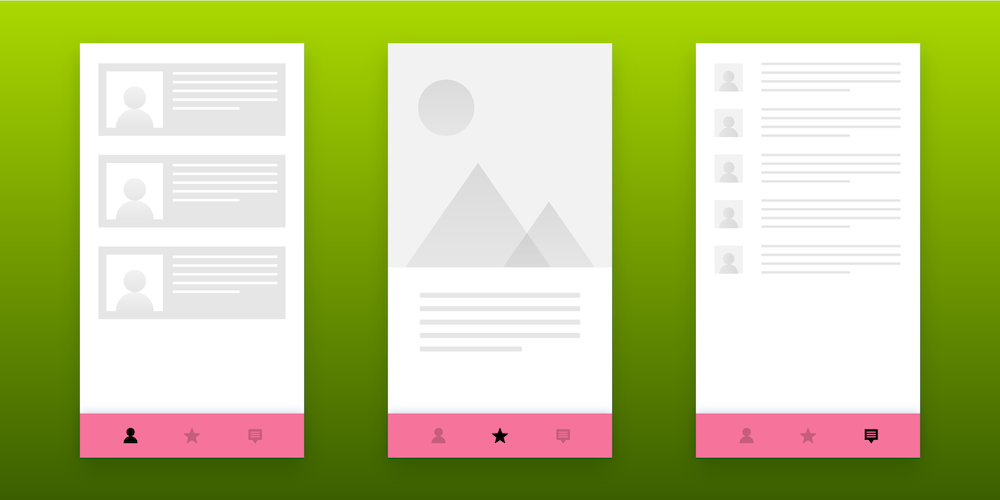
Here’s a sample with the label only on a selected item (app:labelVisibilityMode="selected"):

And here’s a sample with no labels (app:labelVisibilityMode="unlabeled"):

Conclusion
Bottom navigation is one of the most natural ways for users to navigate through their apps. It’s been a default choice for the Android system from the beginning, but not for the apps, even though some apps (like Instagram) have been using it despite no guideline specifications.
As a result, the bottom view being added to the Material Design Guidelines has been a welcome improvement in my opinion, and I’m glad that bottom navigation has been proposed as one of the solutions for app navigation.
This was an article that teaches you how the use the corresponding bottom navigation through BottomNavigationView and how to incorporate it into something meaningful, like the ViewPager that’s synced with it. I believe this provides more than a good start to handling your app’s main navigation if you go with the bottom bar — at least for most cases.