Challenges of Supporting iPhone X
Supporting the iPhone X was more difficult than initially anticipated, and it required much more work than adding support for any previously announced new iPhone model.
This time around, things were different, because not only did the screen size change — which was the case for previous hardware generations like the iPhone 6 and 6 Plus, and the 12.9” and 10.5” iPad Pro — but Apple also added a whole new concept with always visible elements. Because of this, if not laid out correctly, both the sensor housing and the indicator for accessing the Home screen will obscure content that would otherwise display fine on simple rectangular screens.
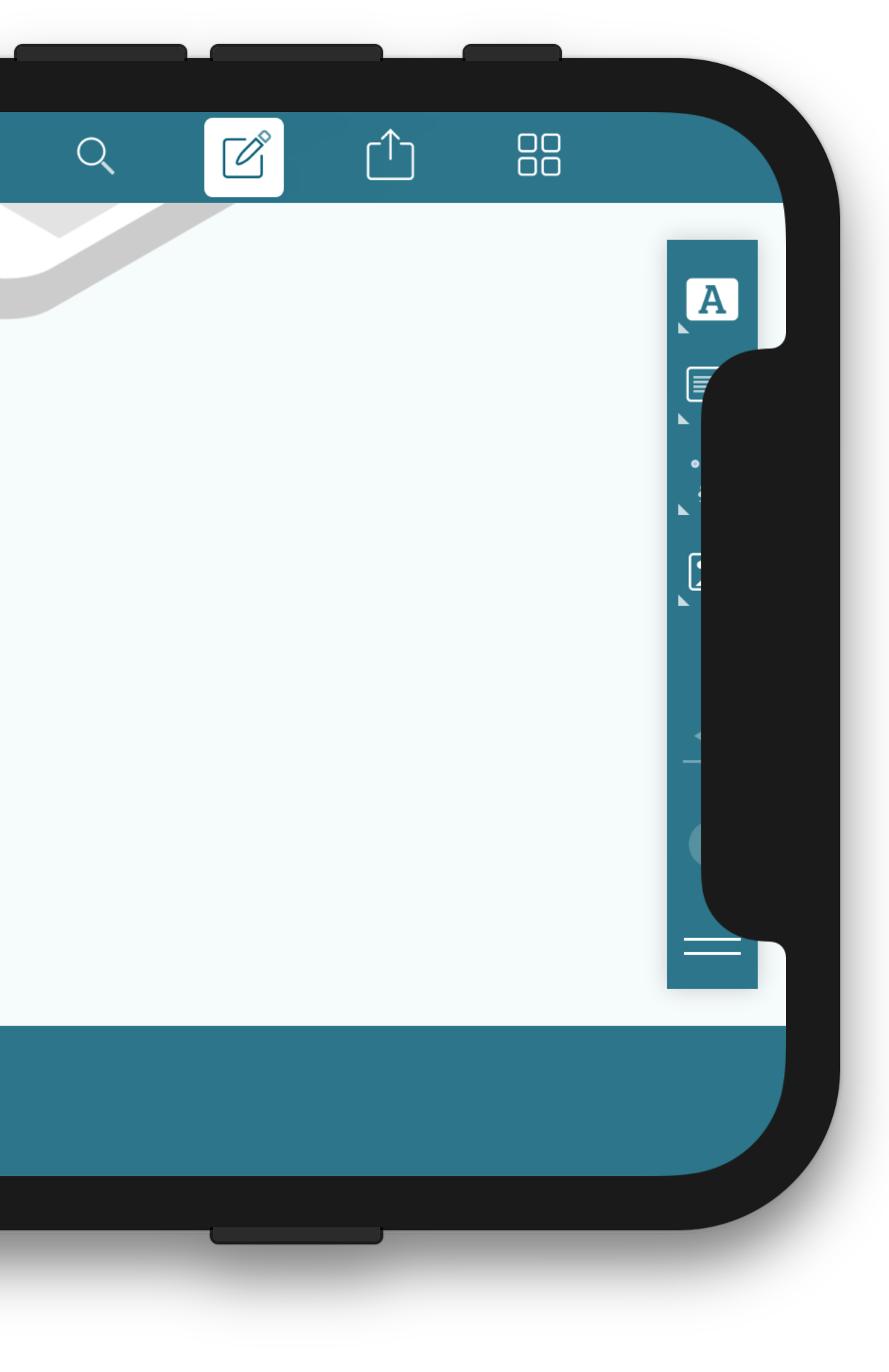
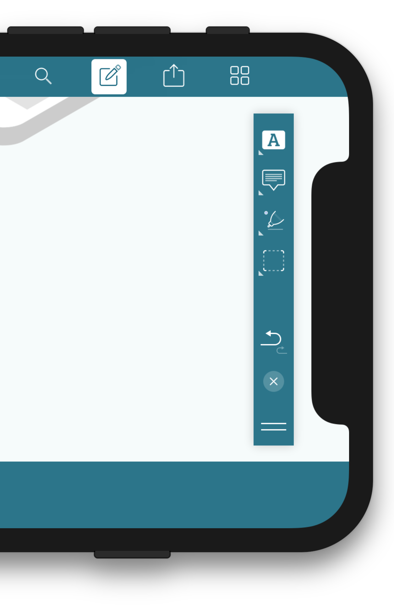
Most of the UI glitches we found were related to custom layout and landscape orientation, as the navigation bars and toolbars in portrait orientation are already handling top and bottom safe area insets pretty well out of the box. Due to no stock UI displayed on the left or the right edges, laying out content in landscape seemed more challenging.
By the way, if you’re not sure what the “sensor housing” referenced above is, it’s just the official naming for the notch. :)

Safe Area
The most integral part of supporting the new iPhone X is making sure your views are respecting the safe area. Additionally, you should only lay out content inside of this safe area. iOS 11 introduced new APIs to deal with the safe area, with the most important APIs being safeAreaLayoutGuide and safeAreaInsets. There is additional documentation available on how to best utilize this new API.
You can also add additional safe area insets for any custom views you show on any edge of the device’s screen by using additionalSafeAreaInsets. This is then automatically included in safeAreaLayoutGuide and safeAreaInsets. It will help lay out content that should not be obscured by your custom views.
Custom Views
This change is especially important to consider for custom views and controls and manually laid out views. Stock features, like a navigation controller with a navigation bar or toolbar, will respect the safe area by default and lay out content without any of your help. But as soon as you do anything manually, you will need to honor the insets — either via the layout guide when using Auto Layout, which is the simplest way to incorporate it, or via the insets to adjust the frame of your views manually:
 |
 |
Auto Layout
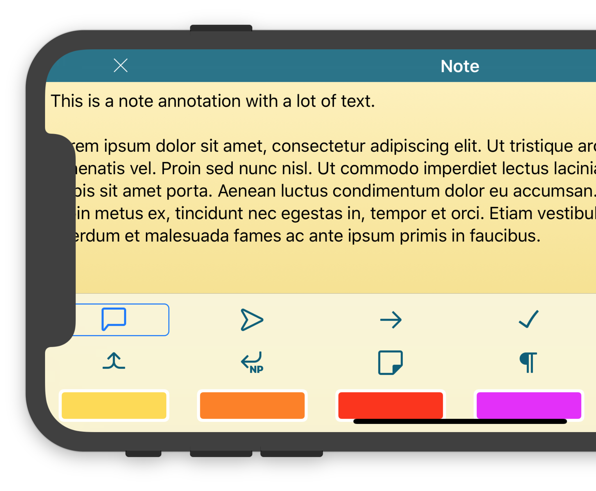
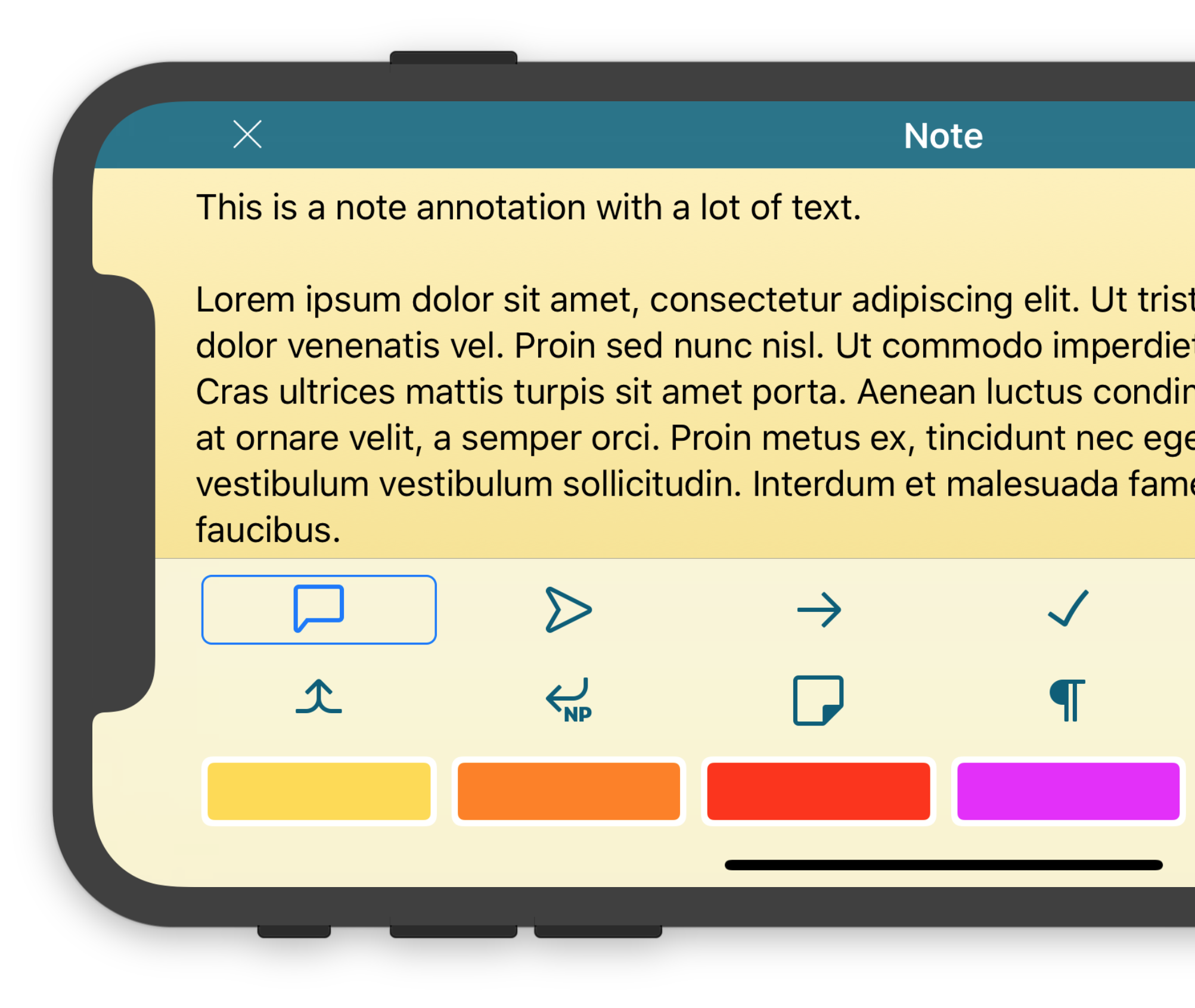
This was also a good time to clean up some of our pre-Auto Layout code and use the new bits and bytes. It’s perfectly doable to lay out everything manually by respecting the safe area insets without using Auto Layout, although since the introduction of layout anchors in iOS 9, there is almost no reason anymore to not use Auto Layout. A few of our views were upgraded from manual layout to Auto Layout with stack views, allowing for a more flexible layout, which in turn made honoring the safe area a breeze.
Here’s what we did with the icon and color picker in our note annotation view:
 |
 |
Footer Views
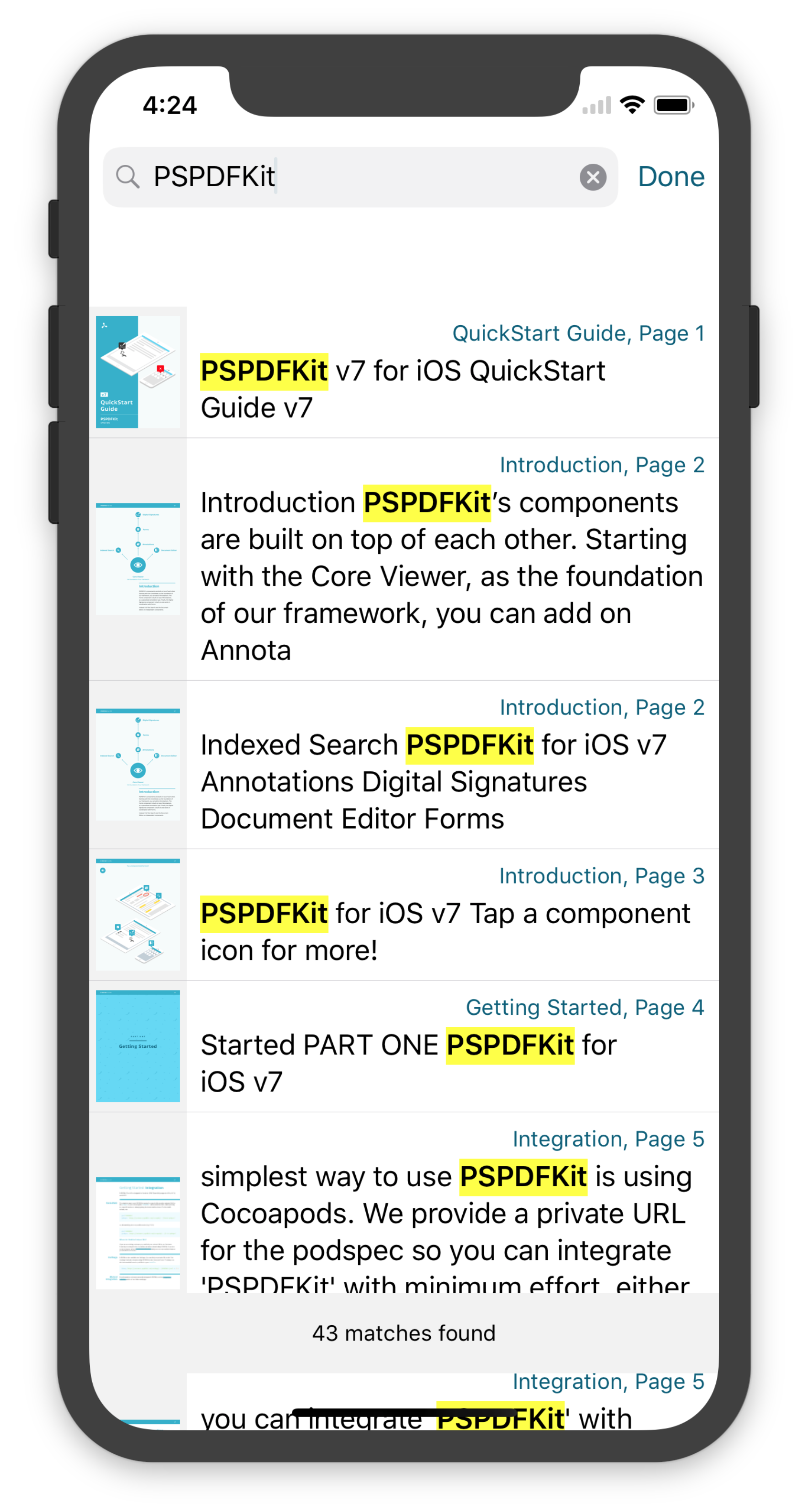
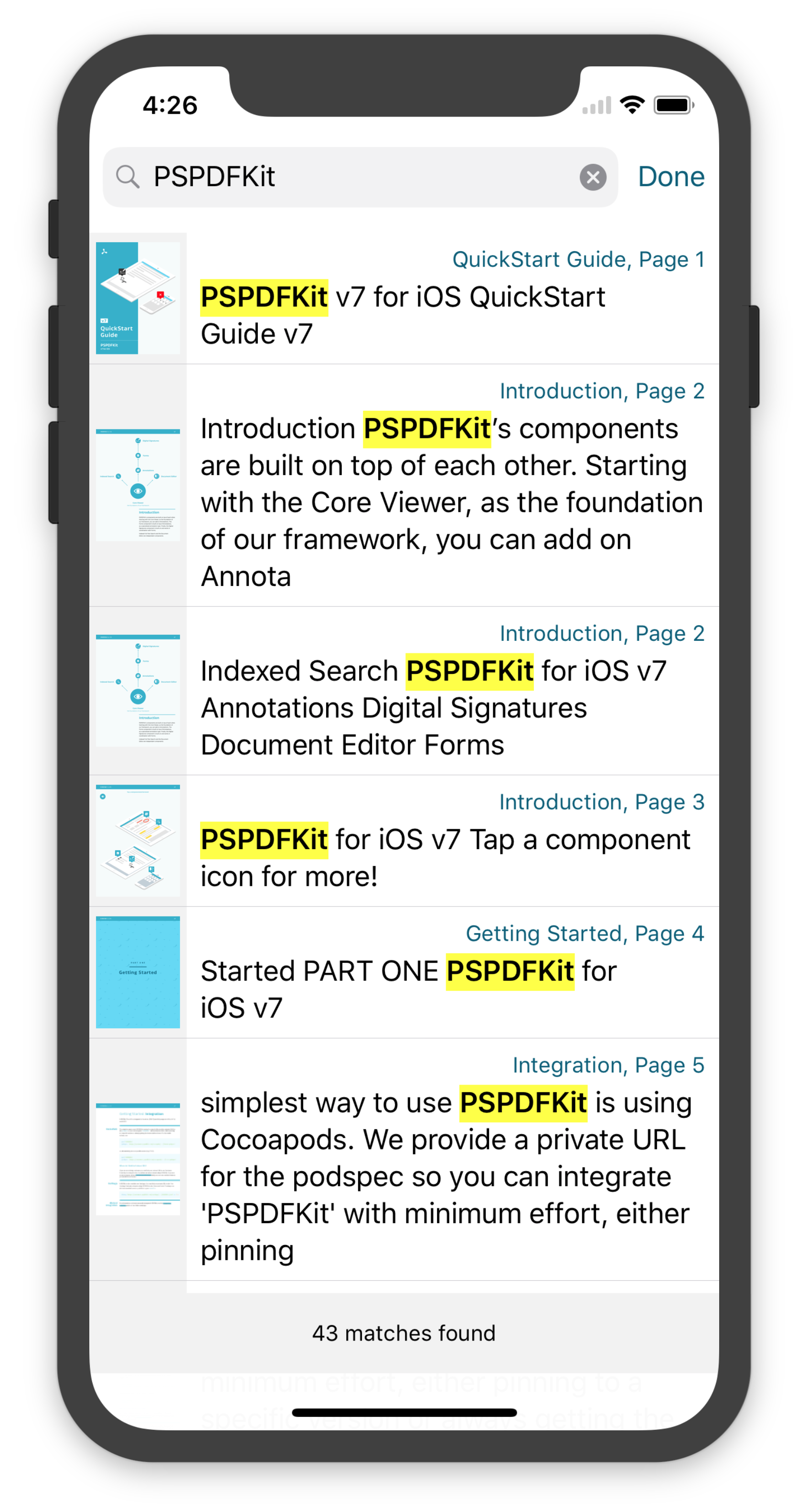
Not every gotcha was related to landscape orientation though. By default, the section footer for table views respects the safe area and is moved up to take this into account. This may lead to designs that aren’t ideal, as is the case with our search view. You see that the table view section footer covers content above the indicator for accessing the Home screen, but the search result cells are still shining through outside the safe area behind it. While this is usually the behavior you want when not having a section footer, it looks a bit off with the footer hovering over the indicator. We decided to not mess with the footer positioning and instead overlay a view outside of the bottom safe area to make this transition a bit nicer, as the section footer will be moved up if there are less cells in the table view. While our current solution is not the best, we are thinking of another approach where the footer is always shown at the bottom of the table view — no matter how many cells there are — and extending its background outside of the safe area, behind the indicator:
 |
 |
Background
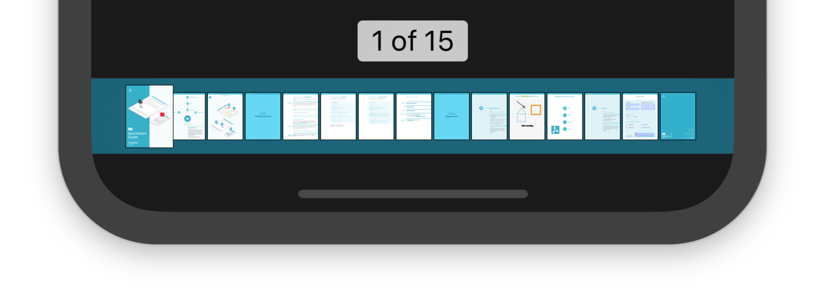
Another issue we encountered was that our custom scrubber bar on the bottom looked off on the iPhone X. That’s because it didn’t expand behind the indicator for accessing the Home screen. According to the HIG, any view that is shown on the bottom of the screen should expand its background outside of the safe area, in order to make it look connected, if applicable:
 |
 |
Backward Compatibility
As PSPDFKit for iOS still supports iOS 9 and 10, we had to come up with a simple and clean way to add safe area support for our views with the newly added API in iOS 11, while still supporting older iOS versions with a fallback layout. One way could have been to “pollute” the code for each class where we use the safe area API with an if(@available(iOS 11, *)) check. But we decided to avoid this boilerplate code and add our own safe area wrapper in a UIView category. That’s how pspdf_safeAreaInsets and pspdf_safeArea*Anchor were born. pspdf_safeAreaInsets uses the views’ safe area insets if on iOS 11, and it uses UIEdgeInsetsZero otherwise. pspdf_safeArea*Anchor exists for all four sides of the layout guide and uses safeAreaLayoutGuide, if available, falling back to the standard top-, bottom-, leading-, and trailingAnchor of UIView otherwise. Note that you may still have to add any potential top or bottom insets for navigation or toolbars, if applicable, when not using the iOS 11 API, as this is already automatically excluded from the safe area.
Background vs. Content
Apple’s HIG mentions two categories of views: background and content. Backgrounds should extend into the unsafe area, while actual content should stay within the safe area. Before the iPhone X, we treated a document like a background as long as our PDF view controller was configured to hide the navigation bar and the status bar when tapping. This meant you would get a nice blur behind the navigation bar but could easily access everything with a single tap. With the iPhone X, there’s now the sensor housing, which will never go away. You cannot switch from given safe area insets to UIEdgeInsetZero; on iPhone X, there will always be safe area insets, no matter what you do. This makes it different from any other device, as you do not want to lay out actual content behind the sensors. However, there is no such property as hardwareAreaInsets; figuring out which part of safe area insets is hardware and which is not is a non-trivial challenge with existing APIs if your code needs to work in all kind of environments. We agree that it may be time to change the current behavior and do what Apple wants us to do, which is to treat the sensor housing the same way as we do navigation bars and just use the safe area for content. We are still not completely sure what the best solution for users is, and there are a lot of details to think about when the area for the content can change while you are essentially displaying an image. So stay tuned for further iPhone X optimizations for this.
Status Bar
Make sure to search through your code for magic numbers like 20 or 40, which are the height of the status bar in default and in double-height mode, respectively, on all previous iOS devices. This changed on the iPhone X, and the status bar now has a height of 44. Manually checking or comparing the status bar height is generally not a good idea and will most likely break in one way or another when running on the iPhone X.
Content Insets
Note that by default, contentInsetAdjustmentBehavior automatically adds safe area insets to your scroll view, in order to make content that would normally be outside the safe area scrollable. Most of the time, this is what you want, although it can lead to more insets than usual, and you will need to adapt your logic to take these insets into account. This behavior bit us with our thumbnail view controller, which uses a custom collection view layout that makes it possible to scroll horizontally, even if the content is laid out to be vertically scrolling only. The problem is that safe area insets were not respected in the calculation of the cells’ layout, and therefore, the content size was too large. This can be fixed by insetting the frame used for calculating the layout via UIEdgeInsetsInsetRect(collectionView.bounds, safeAreaInsets). In this case, you may also want to implement viewSafeAreaInsetsDidChange and update your layout, in case there is a chance that any layout is calculated before the view is added to view hierarchy, resulting in not having any safe area insets yet set:
Another thing related to insets is how we deal with the text in the note annotation view, which is seen a few sections above. We now use textContainerInset, in addition to top and bottom contentInsets, to make sure the text always wraps correctly without requiring any horizontal scrolling. This also enables us to add some padding around the text, which makes it more legible on all devices.
Conclusion
There is a lot of extra work involved in adding support for iPhone X, as it is a drastically new hardware design that software needs to find its way around. We also noticed that many people are having problems with these changes.
You may want to check out Apples’ updated Human Interface Guidelines for iPhone X to get a general overview of designing for and adding support for the iPhone X to your app.
Also, there are some new developer videos that have been made available since the introduction of the iPhone X. They provide a good overview of what to consider when working on iPhone X support.
Now here’s your challenge: Buy an iPhone X, download our free PDF Viewer for iOS app, and ping us with any feedback using the in-app feedback feature.


