By default, PSPDFKit works with UINavigationController to show the UINavigationBar as the toolbar. You can use regular UIBarButtonItem objects to populate the navigation bar or the (bottom) view controller toolbar.
Since PSPDFKit uses custom toolbar logic (for example, when the thumbnails are displayed, we hide the annotation bar button item), PDFViewController has a custom navigationItem that you can use to configure the bar button items for different view modes. If you use the leftBarButtonItems and rightBarButtonItems API from UINavigationItem, you will set the items for all view modes. Most likely, this is not what you want. Instead, use setLeftBarButtonItems(_:for:animated:) or the equivalent for the right side and specify the view mode you want to alter with that call.
If the view mode you change is the one that is currently visible, the navigation bar will update to represent these changes.
PSPDFKit provides several custom bar button items for the most common features:
| Property | Description |
|---|---|
closeButtonItem |
Closes the PDFViewController if pushed modally. Default entry in leftBarButtonItems. |
outlineButtonItem |
Presents the OutlineViewController if there is an outline defined in the PDF. Default entry in rightBarButtonItems. |
searchButtonItem |
Shows the SearchViewController or the InlineSearchManager for searching text in the current document. See SearchMode in PDFConfiguration to configure this. Default entry in rightBarButtonItems. |
thumbnailsButtonItem |
Toggles between the document and the thumbnail view state. See ViewMode and setViewMode(_:animated:). Default entry in rightBarButtonItems. |
documentEditorButtonItem |
Toggles between the document and the Document Editor view state. |
printButtonItem |
Presents the UIPrintInteractionController for document printing. Only displayed if the document is allowed to be printed. See allowsPrinting in Document. You should use the activityButtonItem instead. Share to UIActivity.ActivityType.PSPDFActivityTypeOpenIn. |
openInButtonItem |
Presents the UIDocumentInteractionController controller to open documents in other apps. You should use the activityButtonItem instead. |
emailButtonItem |
Presents the MFMailComposeViewController to send the document via email. Will only work when sending emails is configured on the device. You should use the activityButtonItem instead. Share to UIActivity.ActivityType.mail. |
messageButtonItem |
Presents the MFMessageComposeViewController to send the document via SMS/iMessage. Will only work if iMessage or SMS is configured on the device. You should use the activityButtonItem instead. Share to UIActivity.ActivityType.message. |
annotationButtonItem |
Shows and hides the AnnotationToolbar toolbar for creating annotations. Requires the Features.annotationEditing feature flag. |
bookmarkButtonItem |
Presents the BookmarkViewController for creating/editing/viewing bookmarks. |
brightnessButtonItem |
Presents the BrightnessViewController to control screen brightness. iOS has a similar feature in the Control Center, but PSPDFKit includes an additional software brightener. |
activityButtonItem |
Presents the UIActivityViewController for various actions, including many of the above button items. You can configure which activities are included and excluded by setting applicationActivities and excludedActivityTypes in DocumentSharingConfiguration. |
Positioning Buttons
When setting navigation button items on either the left or the right side, PSPDFKit will check that no item on the left side is already set on the right side and vice versa, and it will throw an assertion if items on one side are also on the other side.
PSPDFKit for iOS distributes the default navigation button items into a corresponding ViewMode as follows:
| View Mode | Default Right Buttons |
|---|---|
.document |
thumbnailsButtonItem, activityButtonItem, outlineButtonItem, searchButtonItem, annotationButtonItem |
.documentEditor |
thumbnailsButtonItem, documentEditorButtonItem |
.thumbnails |
thumbnailsButtonItem, documentEditorButtonItem |
This means that if you ever want to have, for instance, the outlineButton on the left rather than on the right, you first need to modify the buttons set on the right side to remove the outlineButton and then set the left items:
// First clean up the buttons on the right.
controller.navigationItem.setRightBarButtonItems([], for: .document, animated: false)

// Then set the left buttons.
let leftButtons = [controller.settingsButtonItem, controller.outlineButtonItem]
controller.navigationItem.setLeftBarButtonItems(leftButtons, for: .document, animated: false)
// First clean up the buttons on the right.
[controller.navigationItem setRightBarButtonItems:@[] forViewMode:PSPDFViewModeDocument animated:NO];

// Then set the left buttons.
NSArray *leftButtons = @[controller.settingsButtonItem, controller.outlineButtonItem];
[controller.navigationItem setLeftBarButtonItems:leftButtons forViewMode:PSPDFViewModeDocument animated:NO];
Customizing Button Appearance
Instead of trying to customize existing bar button items, it’s better to create your own bar button item and connect both target and action from the predefined buttons that we offer to get both the same tap behavior and complete customizability in terms of appearance.
If you want to call your own code before our stock code is invoked, you can set the target/action to your method and then call the stock method of the bar button item. Note that the spec allows for an optional sender parameter on target/action pairs, so to be absolutely correct, you should use a helper like the psc_targetActionBlock that we ship in PSPDFKit Catalog. Our internal methods define a sender parameter, but this is a detail your code should not rely on.
Button Visibility
When document is nil or document.isValid returns NO, most buttons will be disabled and not displayed by default. If you need a button to always be visible, add your bar buttons to the barButtonItemsAlwaysEnabled array. By default, this contains the closeButtonItem.
Changing any of these bar button-related properties will trigger a reload of the gallery.
Hiding the Close Button
The close button, used to dismiss PDFViewController when pushed modally, is added automatically to leftBarButtonItems. If you choose to manage the close behavior yourself, or if you just want to hide the close button, you can set closeBarButtonItem on the PDFViewController’s navigationItem to nil.
Hiding the Toolbar Completely
The navigation toolbar used in the standard configuration of PSPDFKit can be removed via the setNavigationBarHidden(_:animated:) call from the standard UINavigationController that displays the PDFViewController. Since the PDFViewController also has logic to show/hide the HUD, you need to set PDFConfiguration.userInterfaceViewMode to UserInterfaceViewMode.always.
Alternatively, you can subclass the PDFViewController to make sure that the navigation bar is always hidden:
override func viewWillLayoutSubviews() {
    super.viewWillLayoutSubviews()

    self.navigationController?.setNavigationBarHidden(true, animated: false)
}
- (void)viewWillLayoutSubviews {
	[super viewWillLayoutSubviews];


	[self.navigationController setNavigationBarHidden:YES animated:NO];
}
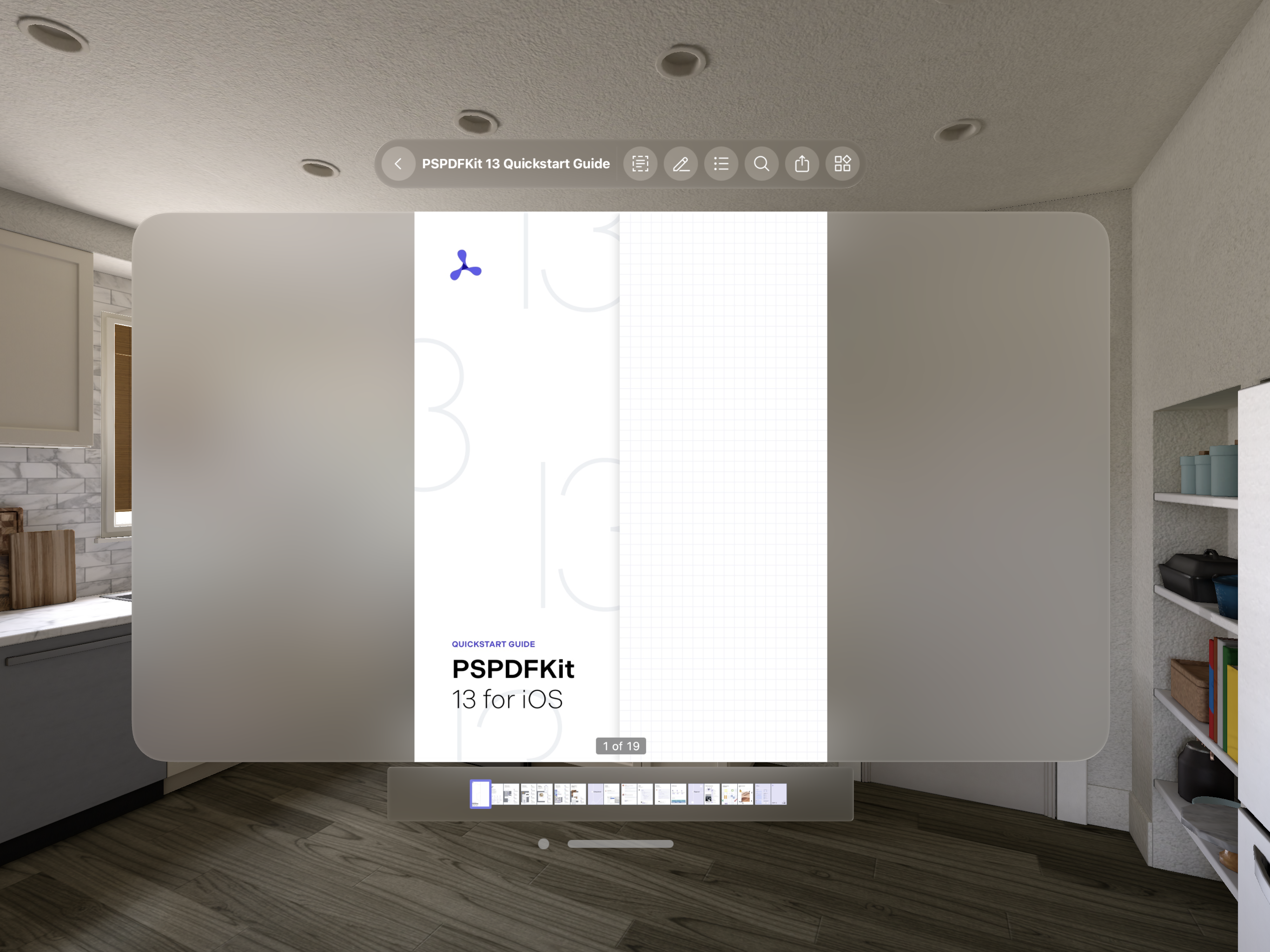
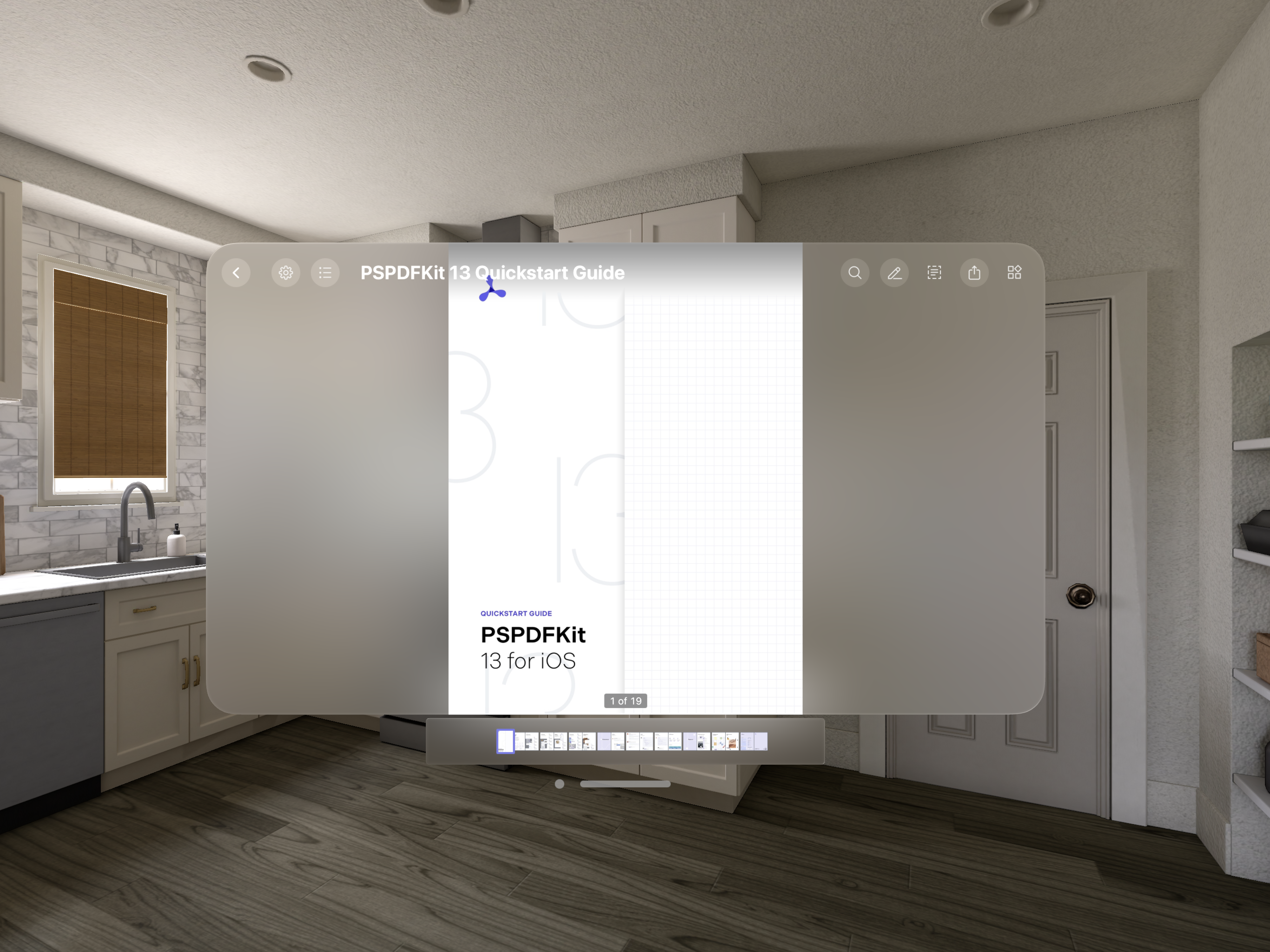
On visionOS, PSPDFKit’s main toolbar is, by default, added as an ornament anchored to the top of the window containing PDFViewController. This is in contrast to iOS and macOS, where PSPDFKit’s main toolbar buttons are inside the app window in a navigation bar.
Using Ornaments
The new system feature of ornaments in visionOS allows us to expand our user interface (UI) outside the scope of a window, making it easier to show auxiliary content when compared to other Apple platforms. This enables us to move the toolbar items to ornaments, compared to the traditional navigation bar. In turn, this makes the main content area, where the PDF page is displayed, free of clutter, allowing users to focus on the actual content.
With a new API designed for Swift, the toolbar is completely configurable and allows you to add custom items to it as well.
Customizing the Toolbar
The new toolbar makes use of a new OrnamentItem API that has been specifically designed for this purpose. The default ornament items provided by PSPDFKit can be found on PDFViewController (similar to our longstanding bar button item API for iOS and Mac Catalyst).
PDFViewController has several view modes. Specify a different set of ornament items for each of these modes using PDFViewController.setMainToolbarOrnamentItems(_ items: [OrnamentItem], for viewMode: ViewMode):
let controller = PDFViewController(document: ...)

// Specifying a set of ornament items for the document view mode.
controller.setMainToolbarOrnamentItems([
    controller.backOrnamentItem,
    controller.titleOrnamentItem,
    OrnamentItem(kind: .divider),
    controller.contentEditingOrnamentItem,
    controller.annotationToolsOrnamentItem
], for: .document)

// Ornament items for the content editing view mode.
controller.setMainToolbarOrnamentItems([
    controller.backOrnamentItem,
    controller.titleOrnamentItem,
    OrnamentItem(kind: .divider),
    controller.contentEditingOrnamentItem,
], for: .contentEditing)
The order of the ornament items in the array determines the position in the toolbar. You’ll have to manually add backOrnamentItem and titleOrnamentItem if you want to display the back button and the title, respectively, on your toolbar.
Adding Custom Items to the Toolbar
Create custom toolbar items using the OrnamentItem(kind:) API. This API allows you to add three kinds of items defined with OrnamentItem.Kind:
-
Button — To add a custom button, use
OrnamentItem.Kind.button. This enum case has an associated value of typeButtonConfiguration, which you should use to specify the button title, image, and action.
let customItem = OrnamentItem(kind: .button(configuration: .init(title: "Custom Item Title", image: UIImage(named: "customImage"),
     action: { sender in
     // Perform custom action here on ornament item tap.
}, showTitle: true, isHighlightable: true)))
-
Title — Use
OrnamentItem.Kind.titleto add title text to the toolbar.
let customTitleItem = OrnamentItem(kind: .title(provider: { getMyCustomTitle() }))
-
Divider — This item can be created using
OrnamentItem.Kind.divider, which adds a horizontal divider between two items. This is useful for creating a visible segregation between different kinds of items.
All the above custom items can be added to the toolbar using the PDFViewController.setMainToolbarOrnamentItems(_ items: [OrnamentItem], for viewMode: ViewMode) API.
Showing an Ornament when PDFViewController Is a Child View Controller
PDFViewController displays the main toolbar, annotation toolbar, and scrubber bar as ornaments. Ornaments have to be added to the ornaments property on the UIViewController when using UIKit.
PDFViewController ornaments, if specified, will automatically be displayed along with the ornaments of their parent view controller, as this is the default system behavior.

If you’re displaying
PDFViewControllerdeeper in the hierarchy — i.e. not as the root controller of a window or the child controller of the root — you’ll have to manually assignPDFViewController.ornamentsto theornamentsproperty of theUIViewControllerbeing displayed at the the root level.
Displaying Main Toolbar Buttons in the Navigation Bar
Use PDFConfiguration.mainToolbarMode to set the kind of the main toolbar on visionOS. PSPDFKit defaults to PDFConfiguration.MainToolbarMode.ornament, where the toolbar is added as an ornament. To show the main toolbar buttons in a navigation bar, set the mainToolbarMode property to .navigationBar.
let pdfController = PDFViewController(document: ...) {
    // Displays the main toolbar as a navigation bar.
    $0.mainToolbarMode = .navigationBar
}