Introduction to SwiftUI for React Developers (Part 1)


Building user interfaces declaratively is something the Web community has widely adopted thanks to frameworks like React, and nowadays, large applications are built following these principles. React Native introduced the same fundamental mental model to native mobile app development, and it seems to be inspiring people to rethink the underlying core technologies of each platform. For example, Google recently launched the developer preview of Jetpack Compose, and Apple announced SwiftUI at WWDC19, receiving an immensely positive response from developers.
Here at PSPDFKit, we are always excited about new advancements in development technologies, and shortly after the initial announcement of SwiftUI, we were able to integrate PSPDFKit for iOS on a SwiftUI app, the process of which we wrote about.
In this article, we’ll explain some basic concepts of SwiftUI in a way that will hopefully be familiar to React developers — even those who have never worked on an iOS app before. If the idea of getting into building native iOS applications was daunting to you as a React developer in the past, we would like to show you in this post how SwiftUI can be a good technology to try out, since most of the concepts you might be familiar with also apply to SwiftUI.
First of all, make sure to have the latest version of Xcode installed on your Mac. You can get it here. Xcode is the IDE Apple uses for developing software for its platforms (including macOS, iOS, and watchOS). We will be using it both to develop our SwiftUI app and to take advantage of its previewing features.
Prerequisites
-
macOS Catalina
-
Xcode 11
-
iOS device running iOS 13, or the iOS Simulator that is included with Xcode
Getting Started
Modern iOS development is primarily done using the Swift programming language. If you are used to JavaScript and don’t have experience with Swift, I recommend taking the official Swift tour, which will help you familiarize yourself with the basic concepts you’ll encounter in this post. But even if you aren’t familiar with Swift, the underlying declarative model should soon look similar to what you’ll find in a React application. Don’t get discouraged by the strange syntax; it should make sense after a while.
Basic Concepts
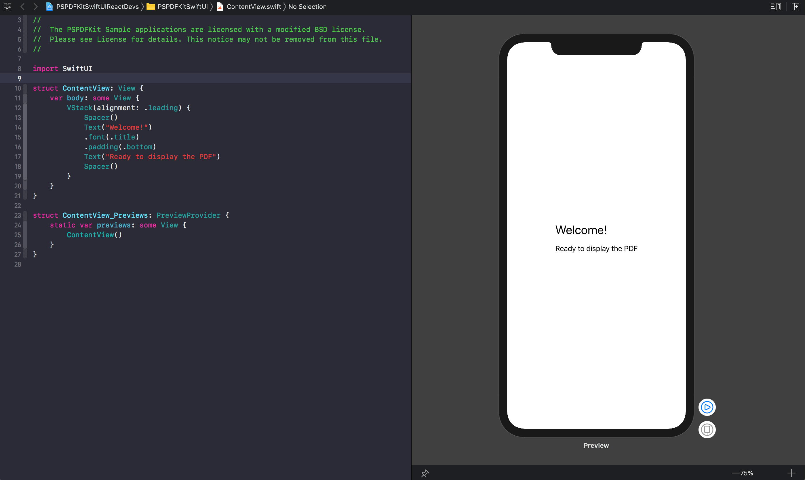
First of all, use Xcode to open the PSPDFKitSwiftUIReactDevs.xcodeproj file from the downloaded project. Once Xcode is open, browse to the ContentView.swift file. This is the root view of our SwiftUI application. Each view from SwiftUI is equivalent to a component in React.
After the initial comments, we can find the import declaration for SwiftUI:
import SwiftUI
Then, we have this code:
// ContentView.swift

struct ContentView: View {
    var body: some View {
        VStack(alignment: .leading) {
            Spacer()
            Text("Welcome!")
            .font(.title)
            .padding(.bottom)
            Text("Ready to display the PDF")
            Spacer()
        }
    }
}
The equivalent of our render method on a classic React class component is adding a body computed property to the view we are defining. SwiftUI’s views are limited to returning a single view as its body, just like a React component did before fragments were introduced. With SwiftUI, views like HStack, VStack, and ZStack exist to help you stack multiple children.
-
HStackarranges its children in a horizontal line, similarly to Flexbox withflex-direction: row. -
VStackarranges its children in a vertical line, similarly to Flexbox withflex-direction: column. -
ZStackstacks its children by overlapping each one on top of the other. This is similar to how you’d arrange DOM elements by changing theirz-indexproperty.
Right now, our body is quite simple. It consists of a VStack with a horizontal alignment of leading that has two Text views as its main elements. These views have the simple duty of rendering text content. Our “Welcome!” title has two modifier methods that are used to adjust the font size and the padding. This is the general pattern followed on SwiftUI for styling the UI. Additionally, we have two Spacer views before and after our Text instances. Spacer is used for adding a flexible space that expands across the containing stack, filling the gap between the top of the screen and the welcome message Text, and between the last Text and the bottom of the screen.
Unlike most modern web development flows where a server listens for changes and live reloads almost instantly with the updated result, building an iOS app and refreshing it with the latest changes usually takes more time and slows down design and development iteration. SwiftUI includes a solution for this in the form of a design canvas, where code changes are almost instantly previewed, and any changes performed to the preview are immediately applied to the code.
The preview shown on the design canvas is defined by adding a type that conforms to the PreviewProvider protocol. It’s standard to find a code snippet alongside views on a SwiftUI app:
struct ContentView_Previews: PreviewProvider {
    static var previews: some View {
        ContentView()
    }
}
If you have the design canvas active, you should be able to see how the user interface of the application is going to look on a real device. Congratulations! You have written your first SwiftUI application.
You can take it a step further by previewing your app on the iOS simulator that Xcode incorporates. To do so, you can go to the Product menu and click Run. As an alternative, you can use the ⌘ + R keyboard shortcut. After a while, a simulator of an iOS device with our app running on it should appear.
Displaying a PDF
Now let’s add some interesting functionality to our app by integrating PSPDFKit for iOS. Our next goal will be to display a PDF document from our app, along with having the ability to annotate it. If you’re an existing customer, download PSPDFKit for iOS from the PSPDFKit Portal. Otherwise, if you don’t already have PSPDFKit, trial page to download a free trial.
Once you’ve downloaded PSPDFKit for iOS, copy PSPDFKit.xcframework and PSPDFKitUI.xcframework into PSPDFKitSwiftUI/PSPDFKit in the sample project directory.
In our initial project, we have already included a PSPDFKitView.swift file, and this represents a custom SwiftUI view. We create custom views by declaring types that conform to the View protocol. We can define properties on these views, which we can think of like props of a React component. The equivalent of our render method on a classic React class component is adding a body computed property to the view we are defining. All of the previous constructs can be observed in our PSPDFKitView custom view:
// PSPDFKitView.swift

import SwiftUI
import PSPDFKitUI

struct PSPDFKitView: View {
    var url: URL
    var configuration: PSPDFConfiguration?

    var body: some View {
        PDFViewController(url, configuration: configuration)
    }
}
url and configuration are properties that will be specified as arguments when declaring instances of the PSPDFKitView struct, just like when passing props to a React component. This simple wrapper view will return a new instance of PDFViewController as its body.
PDFViewController is a struct that conforms to the UIViewControllerRepresentable protocol. This is used for bridging UIKit (traditional UI framework) to SwiftUI. It allows us to use PSPDFKit for iOS from SwiftUI. Right now, we have implemented the makeUIViewController method, where we initialize our PSPDFViewController and specify both the document to open and the PSPDFConfiguration to use. You can think of it like wrapping a jQuery plugin in a React component to abstract the underlying imperative logic:
// PSPDFKitView.swift

struct PSPDFKitView_Preview: PreviewProvider {
    static var previews: some View {
        PSPDFKitView(url: Bundle.main.bundleURL.appendingPathComponent("PSPDFKit 9 QuickStart Guide.pdf"), configuration: PSPDFConfiguration { $0.pageTransition = .scrollPerSpread })
    }
}
State
Let’s adjust our application so that we can switch between displaying a PDF document using PSPDFKit and displaying the existing welcome message to the user. Let’s integrate it in our main ContentView by adding a state variable that will indicate if we should display the PDF or not. Then we can add the views for our welcome message:
struct ContentView: View {
    // ...

    @State var showViewer = false

    var body: some View {
        VStack(alignment: .leading) {
            Toggle(isOn: $showViewer) {
                Text("Display PDF")
            }
            if showViewer {
                PSPDFKitView(url: documentURL, configuration: configuration)
            } else {
                Spacer()
                Text("Welcome!")
                .font(.title)
                .padding(.bottom)
                Text("Ready to display the PDF")
                Spacer()
            }
        }.padding()
    }
}
On SwiftUI, we declare state variables by adding the @State property wrapper. In this case, we added a Boolean to toggle between rendering PSPDFKitView and our welcome text. Notice how SwiftUI, like React, allow us to model the view as a function of the state. We just need to declare, using an if statement, that if the showViewer variable is true, we will use PSPDFKitView, and if it’s false, the other UI should be used instead. SwiftUI will take care of updating the view whenever the state changes. To update the state, we added a Toggle view that passes a binding reference to our state using $showViewer.
Integrating our custom PSPDFKitView didn’t require any special syntax on the call site. It is treated like any other view on our document. Additionally, notice that we added a padding() modifier to the wrapper VStack to improve the layout of the elements. That’s it! Go ahead and try toggling a few times and see how the UI changes.
Lifecycle Events
SwiftUI gives us the option of responding to the view lifecycle events with the onAppear() and onDisappear() modifiers. We can attach any code we want to these. Let’s see a basic example by printing messages to the console when we switch between showing and hiding the PDF viewer:
if showViewer {
    PSPDFKitView(url: documentURL, configuration: configuration)
    .onAppear {
        print("Displaying the PDF")
    }
} else {
    Spacer()
    Text("Welcome!")
    .font(.title)
    .padding(.bottom)
    Text("Ready to display the PDF")
    Spacer()
    .onAppear {
        print("Displaying the welcome message")
    }
}
That’s it! If you run this application using the iOS simulator at this point, you should see messages popping up in the Xcode console whenever you toggle between the PDF viewer and the welcome message.
Conclusion
Even though starting with iOS development is delving into an entirely different world for a web developer, SwiftUI allows you to think in terms of state and then model the view as a function of it, just like one could do with web frameworks like React, Vue, or Svelte. The main challenge is in learning the Swift programming language and getting to know what the native UI controls are, discovering how the styling and layout work, and understanding how idiomatic code appears in this context. I hope this post sparks your curiosity to keep exploring how SwiftUI works, along with the different ways you can model your app with it.
In the second part of this post, we are going to add styling and animation to our app, in order to achieve a smoother transition between the views. Additionally, we are going to introduce the environment object concept, which will provide us with an additional way of connecting our data with our UI.